
By default, Excel sets the axis properties automatically for charts. These properties include axis options like maximum & minimum value, major & minor unit, major & minor tick mark type, axis labels position, axis across value and whether values in reverse order. Sometimes we need to set those properties manually to beautify and perfect the charts. This article is going to introduce the method to customize axis setting for Excel chart in C# using Spire.XLS.
Note: before start, please download the latest version of Spire.XLS and add the .dll in the bin folder as the reference of Visual Studio.
Step 1: Create a workbook and add a sheet filled with some sample data.
            Workbook workbook = new Workbook();
            workbook.CreateEmptySheets(1);
            Worksheet sheet = workbook.Worksheets[0];
            sheet.Name = "Demo";
            sheet.Range["A1"].Value = "Month";
            sheet.Range["A2"].Value = "Jan";
            sheet.Range["A3"].Value = "Feb";
            sheet.Range["A4"].Value = "Mar";
            sheet.Range["A5"].Value = "Apr";
            sheet.Range["A6"].Value = "May";
            sheet.Range["A7"].Value = "Jun";
            sheet.Range["A8"].Value = "Jul";
            sheet.Range["A9"].Value = "Aug";
            sheet.Range["B1"].Value = "Planned";
            sheet.Range["B2"].NumberValue = 38;
            sheet.Range["B3"].NumberValue = 47;
            sheet.Range["B4"].NumberValue = 39;
            sheet.Range["B5"].NumberValue = 36;
            sheet.Range["B6"].NumberValue = 27;
            sheet.Range["B7"].NumberValue = 25;
            sheet.Range["B8"].NumberValue = 36;
            sheet.Range["B9"].NumberValue = 48;
Step 2: Create a column clustered chart based on the sample data.
            Chart chart = sheet.Charts.Add(ExcelChartType.ColumnClustered);
            chart.DataRange = sheet.Range["B1:B9"];
            chart.SeriesDataFromRange = false;
            chart.PlotArea.Visible = false;
            chart.TopRow = 6;
            chart.BottomRow = 25;
            chart.LeftColumn = 2;
            chart.RightColumn = 9;
            chart.ChartTitle = "Chart with Customized Axis";
            chart.ChartTitleArea.IsBold = true;
            chart.ChartTitleArea.Size = 12;
            Spire.Xls.Charts.ChartSerie cs1 = chart.Series[0];
            cs1.CategoryLabels = sheet.Range["A2:A9"];
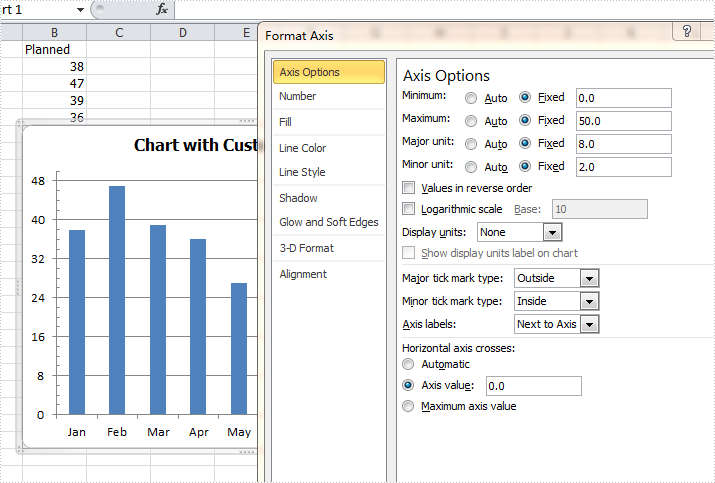
Step 3: Set the customized axis properties for the chart.
            chart.PrimaryValueAxis.MajorUnit = 8;
            chart.PrimaryValueAxis.MinorUnit = 2;
            chart.PrimaryValueAxis.MaxValue = 50;
            chart.PrimaryValueAxis.MinValue = 0;
            chart.PrimaryValueAxis.IsReverseOrder = false;
            chart.PrimaryValueAxis.MajorTickMark = TickMarkType.TickMarkOutside;
            chart.PrimaryValueAxis.MinorTickMark = TickMarkType.TickMarkInside;
            chart.PrimaryValueAxis.TickLabelPosition = TickLabelPositionType.TickLabelPositionNextToAxis;
            chart.PrimaryValueAxis.CrossesAt = 0;
Step 4: Save the document and launch to see effects.
            workbook.SaveToFile("Result.xlsx", ExcelVersion.Version2010);
            System.Diagnostics.Process.Start("Result.xlsx");
Effects:
Full codes:
using System;
using System.Collections.Generic;
using System.Linq;
using System.Text;
using Spire.Xls;
using System.Drawing;

namespace ConsoleApplication2
{
    class Program
    {
        static void Main(string[] args)
        {
            Workbook workbook = new Workbook();
            workbook.CreateEmptySheets(1);
            Worksheet sheet = workbook.Worksheets[0];
            sheet.Name = "Demo";
            sheet.Range["A1"].Value = "Month";
            sheet.Range["A2"].Value = "Jan";
            sheet.Range["A3"].Value = "Feb";
            sheet.Range["A4"].Value = "Mar";
            sheet.Range["A5"].Value = "Apr";
            sheet.Range["A6"].Value = "May";
            sheet.Range["A7"].Value = "Jun";
            sheet.Range["A8"].Value = "Jul";
            sheet.Range["A9"].Value = "Aug";
            sheet.Range["B1"].Value = "Planned";
            sheet.Range["B2"].NumberValue = 38;
            sheet.Range["B3"].NumberValue = 47;
            sheet.Range["B4"].NumberValue = 39;
            sheet.Range["B5"].NumberValue = 36;
            sheet.Range["B6"].NumberValue = 27;
            sheet.Range["B7"].NumberValue = 25;
            sheet.Range["B8"].NumberValue = 36;
            sheet.Range["B9"].NumberValue = 48;

            Chart chart = sheet.Charts.Add(ExcelChartType.ColumnClustered);
            chart.DataRange = sheet.Range["B1:B9"];
            chart.SeriesDataFromRange = false;
            chart.PlotArea.Visible = false;
            chart.TopRow = 6;
            chart.BottomRow = 25;
            chart.LeftColumn = 2;
            chart.RightColumn = 9;
            chart.ChartTitle = "Chart with Customized Axis";
            chart.ChartTitleArea.IsBold = true;
            chart.ChartTitleArea.Size = 12;
            Spire.Xls.Charts.ChartSerie cs1 = chart.Series[0];
            cs1.CategoryLabels = sheet.Range["A2:A9"];

            chart.PrimaryValueAxis.MajorUnit = 8;
            chart.PrimaryValueAxis.MinorUnit = 2;
            chart.PrimaryValueAxis.MaxValue = 50;
            chart.PrimaryValueAxis.MinValue = 0;
            chart.PrimaryValueAxis.IsReverseOrder = false;
            chart.PrimaryValueAxis.MajorTickMark = TickMarkType.TickMarkOutside;
            chart.PrimaryValueAxis.MinorTickMark = TickMarkType.TickMarkInside;
            chart.PrimaryValueAxis.TickLabelPosition = TickLabelPositionType.TickLabelPositionNextToAxis;
            chart.PrimaryValueAxis.CrossesAt = 0;

            workbook.SaveToFile("Result.xlsx", ExcelVersion.Version2010);
            System.Diagnostics.Process.Start("Result.xlsx");
        }
    }
}
