When a chart is inserted, Excel determines a scale automatically: the lower and upper bounds of the value axis and its intervals are all derived from the data range. These defaults are adequate in most cases, but they fall short in two situations. First, when the data is concentrated in a narrow band that sits well away from zero, the automatic scale lifts the bottom of the axis to just below the data, so a modest fluctuation is drawn as a near full-height swing and the differences between the columns bear no proportion to the differences between the values. Second, because the tick labels follow the formatting of the source cells, values carrying decimals fill the value axis with fractional digits, which are both harder to read and wider on the page. Axis formatting addresses both: setting the scale and the units keeps the axis from shifting with the data, holds the column heights in proportion to the values, and places every chart on the same measure, choosing the tick marks and the label position controls where the readings fall, rewriting the number format makes the labels easier to compare, and adding titles to both axes tells the reader what each direction represents. Spire.XLS for JavaScript does all of this in the browser on top of WebAssembly, managing input and output files through a virtual file system (VFS), with no backend service required.
This article covers two key features:
For installation and project setup, see Integrating Spire.XLS for JavaScript in a React Project. The examples below assume Spire.XLS is installed and the WebAssembly module has been initialised.
Format the value axis scale
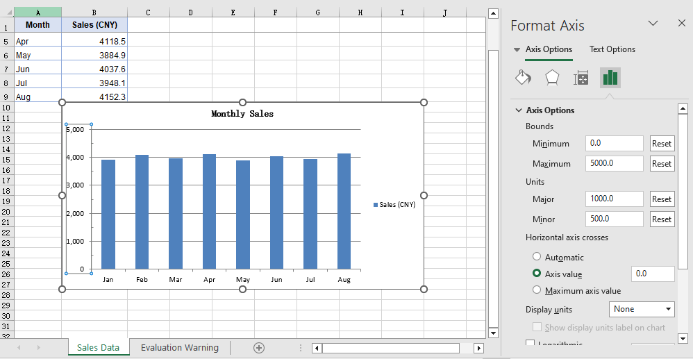
An automatic scale is derived by Excel from the data range, and it is chosen to make the chart look even rather than to make the readings easy to compare. When the data is concentrated in a narrow band that sits well away from zero, that derivation lifts the bottom of the axis to just below the data: with the axis no longer starting at 0, the columns only show their differences from one another, and a modest fluctuation is drawn as a near full-height swing, out of proportion to the values behind it. The tick labels, too, follow the display format of the source cells by default, so data carrying decimals produces a run of fractional values along the value axis, which is both harder to read and wider on the page. Setting the value axis scale by hand addresses both at once: once the scale and the intervals are given by the code, the bottom and top of the axis no longer shift with the data, the column heights stay in proportion to the values, and a set of charts can be measured against the same ruler; once the label format is independent of the source cells, the readings are more even as well. The steps are:
- Load the font and the test data file into the VFS.
- Load the workbook with
workbook.LoadFromFileand get the first worksheet withworkbook.Worksheets.get(0). - Add a column chart with
sheet.Charts.Add, pointchart.DataRangeat the sales column, and assign the month column toserie.CategoryLabels. - On
chart.PrimaryValueAxis, set the scale withMinValueandMaxValue, and the steps of the major and minor divisions withMajorUnitandMinorUnit. - Set the types of the major and minor tick marks with
MajorTickMarkandMinorTickMark, and the position of the tick labels withTickLabelPosition. - Set
NumberFormatto#,##0for the label number format, setIsSourceLinkedtofalseto unlink the format from the source cells, and save the workbook.
The complete code example below shows how to format the value axis scale in React:
function App() {
  const formatValueAxis = async () => {
    // Get the Spire.XLS WASM module
    const xlsModule = window.wasmModule?.spirexls;

    // Check that the module is ready
    if (!xlsModule) {
      alert('Spire.Xls is not ready yet');
      return;
    }

    // Load the font and the sample workbook into the VFS
    await window.spire.FetchFileToVFS('ARIAL.TTF', '/Library/Fonts/', `${process.env.PUBLIC_URL}/font/`);
    const inputFileName = 'ChartAxisData.xlsx';
    await window.spire.FetchFileToVFS(inputFileName, '', `${process.env.PUBLIC_URL}data/`);

    // Load the workbook and get the first worksheet
    const workbook = new xlsModule.Workbook();
    workbook.LoadFromFile({ fileName: inputFileName });
    const sheet = workbook.Worksheets.get(0);

    // Add a column chart whose data range is the sales column
    const chart = sheet.Charts.Add({ chartType: xlsModule.ExcelChartType.ColumnClustered });
    chart.ChartTitle = "Monthly Sales";
    chart.ChartTitleArea.IsBold = true;
    chart.ChartTitleArea.Size = 12;
    chart.DataRange = sheet.Range.get("B1:B9");
    chart.SeriesDataFromRange = false;
    chart.PlotArea.Visible = false;

    // Place the chart on the worksheet
    chart.TopRow = 10;
    chart.BottomRow = 28;
    chart.LeftColumn = 2;
    chart.RightColumn = 10;

    // Take the series and use the month column as its category labels
    const serie = chart.Series.get(0);
    serie.CategoryLabels = sheet.Range.get("A2:A9");

    // Set the value axis bounds: 0 at the bottom, 5000 at the top
    const valueAxis = chart.PrimaryValueAxis;
    valueAxis.MinValue = 0;
    valueAxis.MaxValue = 5000;

    // Set the major unit to 1000 and the minor unit to 500
    valueAxis.MajorUnit = 1000;
    valueAxis.MinorUnit = 500;

    // Major tick marks outside the axis, minor tick marks inside
    valueAxis.MajorTickMark = xlsModule.TickMarkType.TickMarkOutside;
    valueAxis.MinorTickMark = xlsModule.TickMarkType.TickMarkInside;

    // Tick labels sit next to the axis, which the category axis crosses at 0
    valueAxis.TickLabelPosition = xlsModule.TickLabelPositionType.TickLabelPositionNextToAxis;
    valueAxis.CrossesAt = 0;

    // Give the tick labels a thousands separator and drop the decimals
    valueAxis.NumberFormat = "#,##0";

    // Unlink the source format so the tick labels follow NumberFormat
    valueAxis.IsSourceLinked = false;

    // Save the workbook
    const outputFileName = "AxisFormat.xlsx";
    workbook.SaveToFile({ fileName: outputFileName });

    // Dispose of the workbook object to free resources
    workbook.Dispose();

    // Read the result file from the VFS and trigger the download
    const fileArray = window.dotnetRuntime.Module.FS.readFile(outputFileName);
    const blob = new Blob([fileArray], { type: 'application/vnd.openxmlformats-officedocument.spreadsheetml.sheet' });
    const url = URL.createObjectURL(blob);
    const a = document.createElement('a');
    a.href = url;
    a.download = outputFileName;
    a.click();
    URL.revokeObjectURL(url);
  };

  return (
    <div style={{ textAlign: 'center', height: '300px' }}>
      <h1>Value Axis Scale</h1>
      <button onClick={formatValueAxis}>Start</button>
    </div>
  );
}

export default App;
After running, the effect of formatting the value axis scale:
Add axis titles
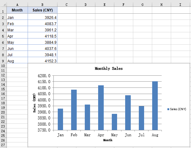
The axes carry only their own divisions and categories, so the chart itself does not state what each data point represents or what unit the numbers are in; opening the file again after some time, a reader often has to check the chart title first to confirm the subject. Axis titles supply precisely that context: the category axis title states what each data point represents, the value axis title states the unit of the numbers, and together with the chart title they complete the chart so that it can be read without its surrounding context. The size of an axis title can also be adjusted separately, which keeps it distinct from the chart title. The steps are:
- Load the font and the test data file into the VFS.
- Load the workbook with
workbook.LoadFromFileand get the first worksheet withworkbook.Worksheets.get(0). - Add a column chart with
sheet.Charts.Add, pointchart.DataRangeat the sales column, and assign the month column toserie.CategoryLabels. - Assign the title text to
chart.PrimaryCategoryAxis.Titleandchart.PrimaryValueAxis.Titlerespectively. - Set both titles to size 12 through the
Font.Sizeof the two axis objects, and save the workbook.
The complete code example below shows how to add titles to the axes in React:
function App() {
  const setAxisTitle = async () => {
    // Get the Spire.XLS WASM module
    const xlsModule = window.wasmModule?.spirexls;

    // Check that the module is ready
    if (!xlsModule) {
      alert('Spire.Xls is not ready yet');
      return;
    }

    // Load the font and the sample workbook into the VFS
    await window.spire.FetchFileToVFS('ARIAL.TTF', '/Library/Fonts/', `${process.env.PUBLIC_URL}/font/`);
    const inputFileName = 'ChartAxisData.xlsx';
    await window.spire.FetchFileToVFS(inputFileName, '', `${process.env.PUBLIC_URL}data/`);

    // Load the workbook and get the first worksheet
    const workbook = new xlsModule.Workbook();
    workbook.LoadFromFile({ fileName: inputFileName });
    const sheet = workbook.Worksheets.get(0);

    // Add a column chart whose data range is the sales column
    const chart = sheet.Charts.Add({ chartType: xlsModule.ExcelChartType.ColumnClustered });
    chart.ChartTitle = "Monthly Sales";
    chart.ChartTitleArea.IsBold = true;
    chart.ChartTitleArea.Size = 12;
    chart.DataRange = sheet.Range.get("B1:B9");
    chart.SeriesDataFromRange = false;
    chart.PlotArea.Visible = false;

    // Place the chart on the worksheet
    chart.TopRow = 10;
    chart.BottomRow = 28;
    chart.LeftColumn = 2;
    chart.RightColumn = 10;

    // Take the series and use the month column as its category labels
    const serie = chart.Series.get(0);
    serie.CategoryLabels = sheet.Range.get("A2:A9");

    // Give the category axis and the value axis their titles
    chart.PrimaryCategoryAxis.Title = "Month";
    chart.PrimaryValueAxis.Title = "Sales (CNY)";

    // Set both axis titles to size 12
    chart.PrimaryCategoryAxis.Font.Size = 12;
    chart.PrimaryValueAxis.Font.Size = 12;

    // Save the workbook
    const outputFileName = "AxisTitle.xlsx";
    workbook.SaveToFile({ fileName: outputFileName });

    // Dispose of the workbook object to free resources
    workbook.Dispose();

    // Read the result file from the VFS and trigger the download
    const fileArray = window.dotnetRuntime.Module.FS.readFile(outputFileName);
    const blob = new Blob([fileArray], { type: 'application/vnd.openxmlformats-officedocument.spreadsheetml.sheet' });
    const url = URL.createObjectURL(blob);
    const a = document.createElement('a');
    a.href = url;
    a.download = outputFileName;
    a.click();
    URL.revokeObjectURL(url);
  };

  return (
    <div style={{ textAlign: 'center', height: '300px' }}>
      <h1>Axis Titles</h1>
      <button onClick={setAxisTitle}>Start</button>
    </div>
  );
}

export default App;
After running, the effect of adding axis titles:
FAQ
MinorUnit is set but no minor tick marks show up
Cause: MinorUnit determines only the interval of the minor divisions — how many steps each major division is split into. Whether those steps are drawn as short strokes is decided by a separate property. MinorTickMark defaults to TickMarkNone, and in that state the interval is in effect but no strokes are drawn.
Fix: Set MinorTickMark at the same time, taking its value from TickMarkType:
const valueAxis = chart.PrimaryValueAxis;
valueAxis.MinorUnit = 500;
valueAxis.MinorTickMark = xlsModule.TickMarkType.TickMarkInside;
CrossesAt is set but the category axis does not move
Cause: CrossesAt determines where the category axis meets the value axis, and the move becomes visible only when it is set to a position on the scale other than the one the category axis already occupies. With the value axis starting at 0, the category axis already sits at the bottom of the axis line, so setting CrossesAt to 0 leaves it in place.
Fix: Set CrossesAt to another position on the value axis scale, 3000 for example, and the category axis moves up to that level:
const valueAxis = chart.PrimaryValueAxis;
valueAxis.MinValue = 0;
valueAxis.MaxValue = 5000;
valueAxis.CrossesAt = 3000;
Get a Free License
Spire.XLS for JavaScript offers a 30-day full-featured free trial license with no functional limitations. Apply here to evaluate before purchasing.
