Chart (7)
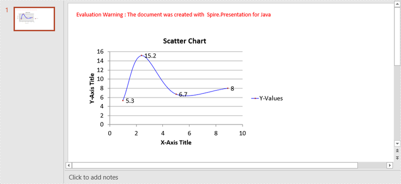
A scatter (XY) chart is a two-dimensional chart that shows the relationship between two sets of variables. Each scatter chart has two axes: a horizontal axis (x-axis) and a vertical axis (y-axis), and it accepts only one data series. In this article, you will learn how to add a scatter chart to a PowerPoint slide using Spire.Presentation for Java.
Install Spire.Presentation for Java
First of all, you're required to add the Spire.Presentation.jar file as a dependency in your Java program. The JAR file can be downloaded from this link. If you use Maven, you can easily import the JAR file in your application by adding the following code to your project's pom.xml file.
<repositories>
    <repository>
        <id>com.e-iceblue</id>
        <name>e-iceblue</name>
        <url>https://repo.e-iceblue.com/nexus/content/groups/public/</url>
    </repository>
</repositories>
<dependencies>
    <dependency>
        <groupId>e-iceblue</groupId>
        <artifactId>spire.presentation</artifactId>
        <version>11.5.1</version>
    </dependency>
</dependencies>
Create a Scatter Chart in PowerPoint
Spire.Presentation for Java provides the ShapeCollection.appendChart(ChartType type, Rectangle2D rectangle, boolean init) method to add charts of a certain type to a presentation slide. The ChartType enumeration pre-defines 73 chart types, including scatter chart, column chart, pie chart, etc. The following are the main steps to add a scatter chart in PowerPoint.
- Create a Presentation object.
- Append a scatter chart to the specific slide using ShapeCollection.appendChart() method.
- Set the chart data through ChartData.get().setValue() method.
- Set the chart title, axes titles, series labels, etc. using the methods under IChart interface.
- Set the grid line style and data point line style.
- Save the document to file using Presentation.saveToFile() method.
- Java
import com.spire.presentation.FileFormat;
import com.spire.presentation.Presentation;
import com.spire.presentation.SlideSizeType;
import com.spire.presentation.TextLineStyle;
import com.spire.presentation.charts.ChartType;
import com.spire.presentation.charts.IChart;
import com.spire.presentation.charts.entity.ChartDataLabel;
import com.spire.presentation.drawing.FillFormatType;

import java.awt.*;
import java.awt.geom.Rectangle2D;

public class CreateScatterChart {

    public static void main(String[] args) throws Exception {

        //Create a Presentation object
        Presentation presentation = new Presentation();
        presentation.getSlideSize().setType(SlideSizeType.SCREEN_16_X_9);

        //Add a scatter chart to the first slide
        IChart chart = presentation.getSlides().get(0).getShapes().appendChart(ChartType.SCATTER_SMOOTH_LINES_AND_MARKERS,new Rectangle2D.Float(40, 80, 550, 320),false);

        //Set the chart title
        chart.getChartTitle().getTextProperties().setText("Scatter Chart");
        chart.getChartTitle().getTextProperties().isCentered(true);
        chart.getChartTitle().setHeight(20f);
        chart.hasTitle(true);

        //Set the chart data
        Double[] xData = new Double[] { 1.0, 2.4, 5.0, 8.9 };
        Double[] yData = new Double[] { 5.3, 15.2, 6.7, 8.0 };
        chart.getChartData().get(0,0).setText("X-Values");
        chart.getChartData().get(0,1).setText("Y-Values");
        for (int i = 0; i < xData.length; i++) {
            chart.getChartData().get(i+1,0).setValue(xData[i]);
            chart.getChartData().get(i+1,1).setValue(yData[i]);
        }

        //Set the series label
        chart.getSeries().setSeriesLabel(chart.getChartData().get("B1","B1"));

        //Set the X and Y values
        chart.getSeries().get(0).setXValues(chart.getChartData().get("A2","A5"));
        chart.getSeries().get(0).setYValues(chart.getChartData().get("B2","B5"));

        //Add data labels
        for (int i = 0; i < 4; i++)
        {
            ChartDataLabel dataLabel = chart.getSeries().get(0).getDataLabels().add();
            dataLabel.setLabelValueVisible(true);
        }

        //Set the primary axis title and the secondary axis title
        chart.getPrimaryValueAxis().hasTitle(true);
        chart.getPrimaryValueAxis().getTitle().getTextProperties().setText("X-Axis Title");
        chart.getSecondaryValueAxis().hasTitle(true);
        chart.getSecondaryValueAxis().getTitle().getTextProperties().setText("Y-Axis Title");

        //Set the grid line
        chart.getSecondaryValueAxis().getMajorGridTextLines().setFillType(FillFormatType.SOLID);
        chart.getSecondaryValueAxis().getMajorGridTextLines().setStyle(TextLineStyle.THIN_THIN);
        chart.getSecondaryValueAxis().getMajorGridTextLines().getSolidFillColor().setColor(Color.GRAY);
        chart.getPrimaryValueAxis().getMajorGridTextLines().setFillType(FillFormatType.NONE);

        //Set the data point line
        chart.getSeries().get(0).getLine().setFillType(FillFormatType.SOLID);
        chart.getSeries().get(0).getLine().setWidth(0.1f);
        chart.getSeries().get(0).getLine().getSolidFillColor().setColor(Color.BLUE);

        //Save the document to file
        presentation.saveToFile("output/ScatterChart.pptx", FileFormat.PPTX_2016);
    }
}
Apply for a Temporary License
If you'd like to remove the evaluation message from the generated documents, or to get rid of the function limitations, please request a 30-day trial license for yourself.
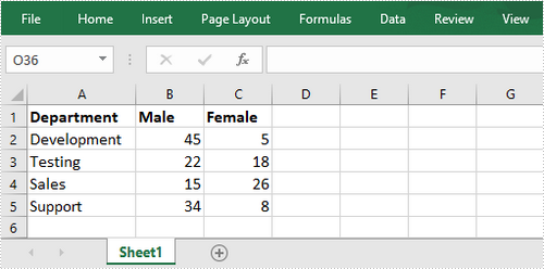
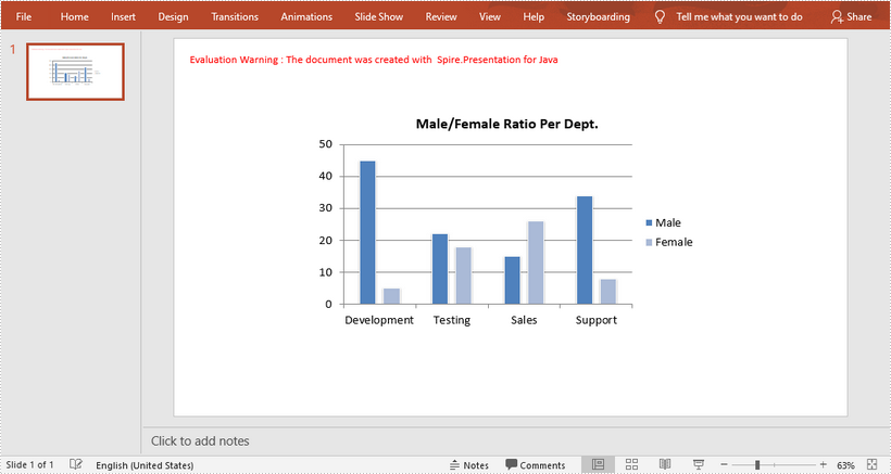
This article shows you how to create a chart in PowerPoint using the data from an existing Excel document. This solution relies on Spire.Office.jar. Please download the latest version from here and add it as a dependency in your project.
Below is a screenshot of the Excel document.
import com.spire.presentation.FileFormat;
import com.spire.presentation.Presentation;
import com.spire.presentation.SlideSizeType;
import com.spire.presentation.charts.ChartStyle;
import com.spire.presentation.charts.ChartType;
import com.spire.presentation.charts.IChart;
import com.spire.xls.Workbook;
import com.spire.xls.Worksheet;

import java.awt.geom.Rectangle2D;

public class CreateChartFromExcelData {

    public static void main(String[] args) throws Exception {

        //Create a Presentation object
        Presentation presentation = new Presentation();
        presentation.getSlideSize().setType(SlideSizeType.SCREEN_16_X_9);

        //Add a clustered column chart to slide
        Rectangle2D rect = new Rectangle2D.Float(200, 100, 550, 320);
        IChart chart = presentation.getSlides().get(0).getShapes().appendChart(ChartType.COLUMN_CLUSTERED,rect);

        //Clear the default dummy data
        chart.getChartData().clear(0,0,5,5 );

        //Load an existing Excel file to Workbook object
        Workbook wb = new Workbook();
        wb.loadFromFile("C:\\Users\\Administrator\\Desktop\\data.xlsx");

        //Get the first worksheet
        Worksheet sheet = wb.getWorksheets().get(0);

        //Import data from the sheet to chart table
        for (int r = 0; r < sheet.getAllocatedRange().getRowCount(); r++)
        {
            for (int c = 0; c < sheet.getAllocatedRange().getColumnCount(); c++)
            {
                chart.getChartData().get(r,c).setValue(sheet.getCellRange(r+1, c+1).getValue2());
            }
        }

        //Add chart title
        chart.getChartTitle().getTextProperties().setText("Male/Female Ratio Per Dept.");
        chart.getChartTitle().getTextProperties().isCentered(true);
        chart.getChartTitle().setHeight(25f);
        chart.hasTitle(true);

        //Set the series label
        chart.getSeries().setSeriesLabel(chart.getChartData().get("B1","C1"));

        //Set the category labels
        chart.getCategories().setCategoryLabels(chart.getChartData().get("A2","A5"));

        //Set the series values
        chart.getSeries().get(0).setValues(chart.getChartData().get("B2","B5"));
        chart.getSeries().get(1).setValues(chart.getChartData().get("C2", "C5"));

        //Apply built-in chart style
        chart.setChartStyle(ChartStyle.STYLE_11);

        //Set overlap
        chart.setOverLap(-50);

        //Set gap width
        chart.setGapWidth(200);

        //Save to file
        presentation.saveToFile("output/Chart.pptx", FileFormat.PPTX_2013);
    }
}
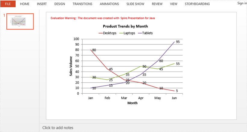
This article demonstrates how to create a line chart in a PowerPoint document using Spire.Presentation for Java.
import com.spire.presentation.FileFormat;
import com.spire.presentation.Presentation;
import com.spire.presentation.SlideSizeType;
import com.spire.presentation.charts.ChartLegendPositionType;
import com.spire.presentation.charts.ChartType;
import com.spire.presentation.charts.IChart;

import java.awt.geom.Rectangle2D;

public class LineChart {
    public static void main(String[] args) throws Exception {

        //Create a Presentation object
        Presentation presentation = new Presentation();
        presentation.getSlideSize().setType(SlideSizeType.SCREEN_16_X_9);

        //Insert a line chart
        Rectangle2D.Double rect = new   Rectangle2D.Double(100, 50, 600, 430);
        IChart chart = presentation.getSlides().get(0).getShapes().appendChart(ChartType.LINE, rect);

        //Set chart title
        chart.getChartTitle().getTextProperties().setText("Product Trends by Month");
        chart.getChartTitle().getTextProperties().isCentered(true);
        chart.getChartTitle().setHeight(30);
        chart.hasTitle(true);

        //Set axis title
        chart.getPrimaryCategoryAxis().getTitle().getTextProperties().setText("Month");
        chart.getPrimaryCategoryAxis().hasTitle(true);
        chart.getPrimaryValueAxis().getTitle().getTextProperties().setText("Sales Volume");
        chart.getPrimaryValueAxis().hasTitle(true);

        //Write data to chart as chart data
        chart.getChartData().get(0,0).setText("Month");
        chart.getChartData().get(1,0).setText("Jan");
        chart.getChartData().get(2,0).setText("Feb");
        chart.getChartData().get(3,0).setText("Mar");
        chart.getChartData().get(4,0).setText("Apr");
        chart.getChartData().get(5,0).setText("May");
        chart.getChartData().get(6,0).setText("Jun");

        chart.getChartData().get(0,1).setText("Desktops");
        chart.getChartData().get(1,1).setNumberValue(80);
        chart.getChartData().get(2,1).setNumberValue(45);
        chart.getChartData().get(3,1).setNumberValue(25);
        chart.getChartData().get(4,1).setNumberValue(20);
        chart.getChartData().get(5,1).setNumberValue(10);
        chart.getChartData().get(6,1).setNumberValue(5);

        chart.getChartData().get(0,2).setText("Laptops");
        chart.getChartData().get(1,2).setNumberValue(30);
        chart.getChartData().get(2,2).setNumberValue(25);
        chart.getChartData().get(3,2).setNumberValue(35);
        chart.getChartData().get(4,2).setNumberValue(50);
        chart.getChartData().get(5,2).setNumberValue(45);
        chart.getChartData().get(6,2).setNumberValue(55);

        chart.getChartData().get(0,3).setText("Tablets");
        chart.getChartData().get(1,3).setNumberValue(10);
        chart.getChartData().get(2,3).setNumberValue(15);
        chart.getChartData().get(3,3).setNumberValue(20);
        chart.getChartData().get(4,3).setNumberValue(35);
        chart.getChartData().get(5,3).setNumberValue(60);
        chart.getChartData().get(6,3).setNumberValue(95);

        //Set series labels
        chart.getSeries().setSeriesLabel(chart.getChartData().get("B1", "D1"));

        //Set categories labels
        chart.getCategories().setCategoryLabels(chart.getChartData().get("A2", "A7"));

        //Assign data to series values
        chart.getSeries().get(0).setValues(chart.getChartData().get("B2", "B7"));
        chart.getSeries().get(1).setValues(chart.getChartData().get("C2", "C7"));
        chart.getSeries().get(2).setValues(chart.getChartData().get("D2", "D7"));

        //Display values in data labels
        chart.getSeries().get(0).getDataLabels().setLabelValueVisible(true);
        chart.getSeries().get(1).getDataLabels().setLabelValueVisible(true);
        chart.getSeries().get(2).getDataLabels().setLabelValueVisible(true);

        //Set chart legend position
        chart.getChartLegend().setPosition(ChartLegendPositionType.TOP);

        //Save to file
        presentation.saveToFile("LineChart.pptx", FileFormat.PPTX_2013);
    }
}
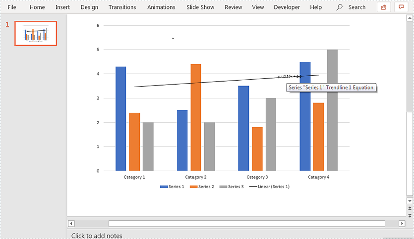
A trendline is a line superimposed on a chart revealing the overall direction of the data. Spire.Presentation for Java supports adding six different types of trendlines to chart, i.e. linear, logarithmic, polynomial, power, exponential and moving average.
The below example demonstrates how to use Spire.Presentation for Java to add a linear trendline to a chart.
import com.spire.presentation.FileFormat;
import com.spire.presentation.ISlide;
import com.spire.presentation.Presentation;
import com.spire.presentation.charts.IChart;
import com.spire.presentation.charts.ITrendlines;
import com.spire.presentation.charts.TrendlineSimpleType;

public class AddTrendlineToChart {
    public static void main(String[] args) throws Exception {
        //create a Presentation instance
        Presentation ppt = new Presentation();
        //load the PowerPoint document
        ppt.loadFromFile("Chart.pptx");

        //get the first slide
        ISlide slide = ppt.getSlides().get(0);
        //get the chart on the slide
        IChart chart = (IChart)slide.getShapes().get(0);

        //add a linear trendline to the first series of the chart
        ITrendlines trendLine = chart.getSeries().get(0).addTrendLine(TrendlineSimpleType.LINEAR);
        //display equation
        trendLine.setdisplayEquation(true);

        //save the resultant document
        ppt.saveToFile("AddTrendline.pptx", FileFormat.PPTX_2013);
    }
}
Output:
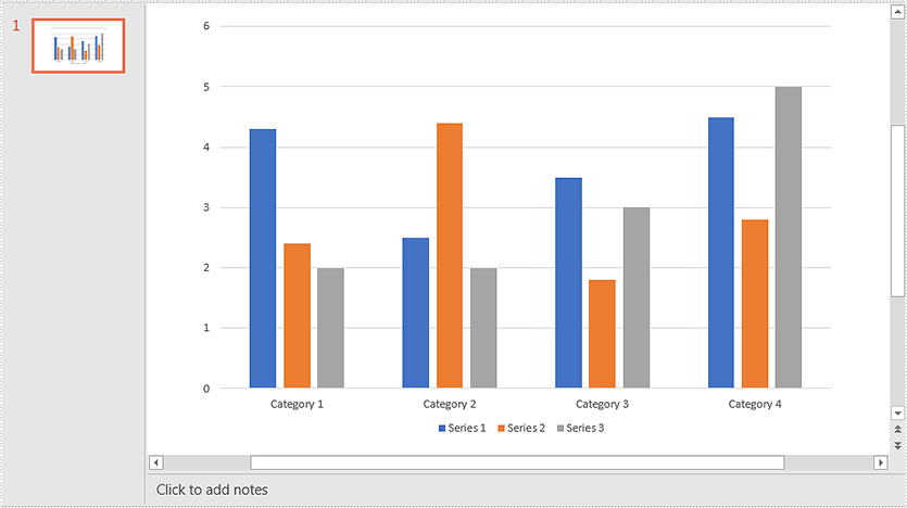
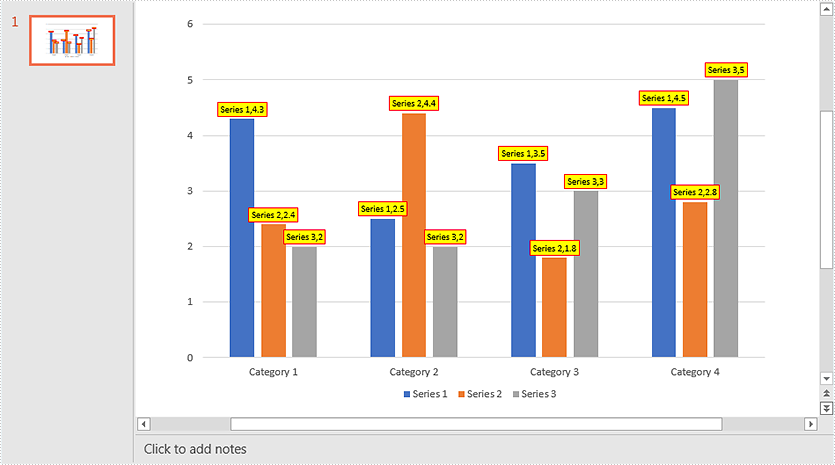
This article demonstrates how to add data labels to a chart and set the appearance (border style and fill style) for the data labels in PowerPoint using Spire.Presentation for Java. Note some chart types like Surface3D, Surface3DNoColor, Contour and ContourNoColor do not support data labels.
Below screenshot shows the original chart before adding data labels:
import com.spire.presentation.FileFormat;
import com.spire.presentation.ISlide;
import com.spire.presentation.Presentation;
import com.spire.presentation.charts.IChart;
import com.spire.presentation.charts.entity.ChartDataLabel;
import com.spire.presentation.charts.entity.ChartSeriesDataFormat;
import com.spire.presentation.drawing.FillFormatType;

import java.awt.*;

public class AddDataLabelsToChart {
    public static void main(String[] args) throws Exception {
        //Load the PowerPoint document
        Presentation ppt = new Presentation();
        ppt.loadFromFile("Chart.pptx");

        //Get the first slide
        ISlide slide = ppt.getSlides().get(0);
        //Get the chart in the slide
        IChart chart = (IChart)slide.getShapes().get(0);

        //Loop through the series in the chart
        for (ChartSeriesDataFormat series:(Iterable<ChartSeriesDataFormat>)chart.getSeries()) {
             ) {
            //Add data labels for the data points in each series
            for(int i = 0; i < 4; i++){
                ChartDataLabel dataLabel = series.getDataLabels().add();
                //Show label value
                dataLabel.setLabelValueVisible(true);
                //Show series name
                dataLabel.setSeriesNameVisible(true);
                //Set border line style
                dataLabel.getLine().setFillType(FillFormatType.SOLID);
                dataLabel.getLine().getSolidFillColor().setColor(Color.RED);
                //Set fill style
                dataLabel.getFill().setFillType(FillFormatType.SOLID);
                dataLabel.getFill().getSolidColor().setColor(Color.YELLOW);
            }
        }

        //Save the resultant document
        ppt.saveToFile("DataLabels.pptx", FileFormat.PPTX_2013);
    }
}
Output:
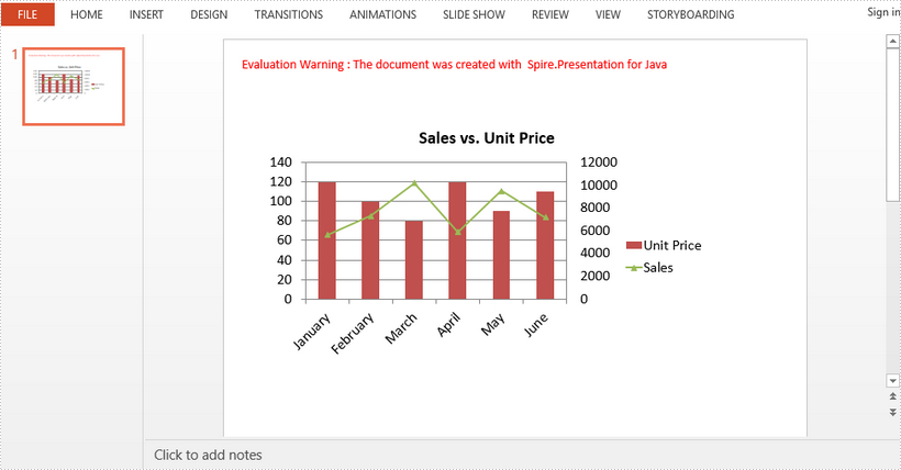
A combination chart is a chart that combines at least two chart types in a single chart. This article introduces how to combine clustered column and line chart in PowerPoint using Spire.Presentation for Java.
import com.spire.presentation.FileFormat;
import com.spire.presentation.Presentation;
import com.spire.presentation.charts.ChartType;
import com.spire.presentation.charts.IChart;
import com.spire.presentation.drawing.FillFormatType;

import java.awt.geom.Rectangle2D;

public class CombinationChart {

    public static void main(String[] args) throws Exception {

        //create a PowerPoint document
        Presentation presentation = new Presentation();

        //insert a column clustered chart
        Rectangle2D.Double rect = new   Rectangle2D.Double(50, 100, 550, 300);
        IChart chart = presentation.getSlides().get(0).getShapes().appendChart(ChartType.COLUMN_CLUSTERED, rect);

        //set chart title
        chart.getChartTitle().getTextProperties().setText("Sales vs. Unit Price");
        chart.getChartTitle().getTextProperties().isCentered(true);
        chart.getChartTitle().setHeight(30);
        chart.hasTitle(true);

        //write data to chart as chart data
        chart.getChartData().get(0,0).setText("Month");
        chart.getChartData().get(0,1).setText("Unit Price");
        chart.getChartData().get(0,2).setText("Sales");
        chart.getChartData().get(1,0).setText("January");
        chart.getChartData().get(1,1).setNumberValue(120);
        chart.getChartData().get(1,2).setNumberValue(5600);
        chart.getChartData().get(2,0).setText("February");
        chart.getChartData().get(2,1).setNumberValue(100);
        chart.getChartData().get(2,2).setNumberValue(7300);
        chart.getChartData().get(3,0).setText("March");
        chart.getChartData().get(3,1).setNumberValue(80);
        chart.getChartData().get(3,2).setNumberValue(10200);
        chart.getChartData().get(4,0).setText("April");
        chart.getChartData().get(4,1).setNumberValue(120);
        chart.getChartData().get(4,2).setNumberValue(5900);
        chart.getChartData().get(5,0).setText("May");
        chart.getChartData().get(5,1).setNumberValue(90);
        chart.getChartData().get(5,2).setNumberValue(9500);
        chart.getChartData().get(6,0).setText("June");
        chart.getChartData().get(6,1).setNumberValue(110);
        chart.getChartData().get(6,2).setNumberValue(7200);

        //set series labels
        chart.getSeries().setSeriesLabel(chart.getChartData().get("B1", "C1"));

        //set categories labels
        chart.getCategories().setCategoryLabels(chart.getChartData().get("A2", "A7"));

        //assign data to series values
        chart.getSeries().get(0).setValues(chart.getChartData().get("B2", "B7"));
        chart.getSeries().get(1).setValues(chart.getChartData().get("C2", "C7"));

        //change the chart type of series 2 to line with markers
        chart.getSeries().get(1).setType(ChartType.LINE_MARKERS);

        //plot data of series 2 on the secondary axis
        chart.getSeries().get(1).setUseSecondAxis(true);

        //hide grid links of secondary axis
        chart.getSecondaryValueAxis().getMajorGridTextLines().setFillType(FillFormatType.NONE);

        //set overlap
        chart.setOverLap(-50);

        //set gap width
        chart.setGapDepth(200);

        //save the document
        presentation.saveToFile("CombinationChart.pptx", FileFormat.PPTX_2010);
    }
}
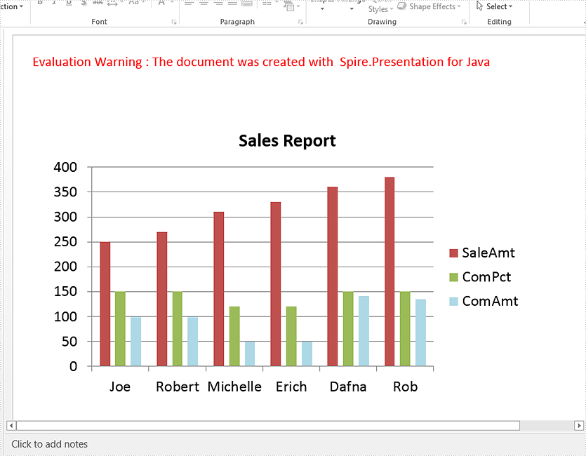
This article demonstrates how to create a chart in a PowerPoint document using Spire.Presentation for Java.
import com.spire.presentation.*;
import com.spire.pdf.tables.table.*;
import com.spire.presentation.charts.*;
import com.spire.presentation.drawing.FillFormatType;
import java.awt.geom.Rectangle2D;
import java.lang.Object;


public class CreateChart {
    public static void main(String[] args) throws Exception {

        //Create a presentation instance
        Presentation presentation = new Presentation();

        //Add a column clustered chart
        Rectangle2D.Double rect = new Rectangle2D.Double(40, 100, 550, 320);
        IChart chart = null;
        chart = presentation.getSlides().get(0).getShapes().appendChart(ChartType.COLUMN_CLUSTERED, rect);

        //Set chart title
        chart.getChartTitle().getTextProperties().setText("Sales Report");
        chart.getChartTitle().getTextProperties().isCentered(true);
        chart.getChartTitle().setHeight(30);
        chart.hasTitle(true);

        //Create a dataTable
        DataTable dataTable = new DataTable();
        dataTable.getColumns().add(new DataColumn("SalesPers", DataTypes.DATATABLE_STRING));
        dataTable.getColumns().add(new DataColumn("SaleAmt", DataTypes.DATATABLE_INT));
        dataTable.getColumns().add(new DataColumn("ComPct", DataTypes.DATATABLE_INT));
        dataTable.getColumns().add(new DataColumn("ComAmt", DataTypes.DATATABLE_INT));
        DataRow row1 = dataTable.newRow();
        row1.setString("SalesPers", "Joe");
        row1.setInt("SaleAmt", 250);
        row1.setInt("ComPct", 150);
        row1.setInt("ComAmt", 99);
        DataRow row2 = dataTable.newRow();
        row2.setString("SalesPers", "Robert");
        row2.setInt("SaleAmt", 270);
        row2.setInt("ComPct", 150);
        row2.setInt("ComAmt", 99);
        DataRow row3 = dataTable.newRow();
        row3.setString("SalesPers", "Michelle");
        row3.setInt("SaleAmt", 310);
        row3.setInt("ComPct", 120);
        row3.setInt("ComAmt", 49);
        DataRow row4 = dataTable.newRow();
        row4.setString("SalesPers", "Erich");
        row4.setInt("SaleAmt", 330);
        row4.setInt("ComPct", 120);
        row4.setInt("ComAmt", 49);
        DataRow row5 = dataTable.newRow();
        row5.setString("SalesPers", "Dafna");
        row5.setInt("SaleAmt", 360);
        row5.setInt("ComPct", 150);
        row5.setInt("ComAmt", 141);
        DataRow row6 = dataTable.newRow();
        row6.setString("SalesPers", "Rob");
        row6.setInt("SaleAmt", 380);
        row6.setInt("ComPct", 150);
        row6.setInt("ComAmt", 135);
        dataTable.getRows().add(row1);
        dataTable.getRows().add(row2);
        dataTable.getRows().add(row3);
        dataTable.getRows().add(row4);
        dataTable.getRows().add(row5);
        dataTable.getRows().add(row6);

        //Import data from dataTable to chart data
        for (int c = 0; c < dataTable.getColumns().size(); c++) {
            chart.getChartData().get(0, c).setText(dataTable.getColumns().get(c).getColumnName());
        }
        for (int r = 0; r < dataTable.getRows().size(); r++) {
            Object[] datas = dataTable.getRows().get(r).getArrayList();
            for (int c = 0; c < datas.length; c++) {
                chart.getChartData().get(r + 1, c).setValue(datas[c]);

            }
        }

        chart.getSeries().setSeriesLabel(chart.getChartData().get("B1", "D1"));
        chart.getCategories().setCategoryLabels(chart.getChartData().get("A2", "A7"));
        chart.getSeries().get(0).setValues(chart.getChartData().get("B2", "B7"));

        chart.getSeries().get(1).setValues(chart.getChartData().get("C2", "C7"));

        chart.getSeries().get(2).setValues(chart.getChartData().get("D2", "D7"));
        chart.getSeries().get(2).getFill().setFillType(FillFormatType.SOLID);
      chart.getSeries().get(2).getFill().getSolidColor().setKnownColor(KnownColors.LIGHT_BLUE);

        //Set overlap
        chart.setOverLap(-50);

        //Set gap width
        chart.setGapDepth(200);

        //Save the document
        presentation.saveToFile("output/CreateChart.pptx", FileFormat.PPTX_2010);
    }
}