
Chart (45)
How to set and format data labels for Excel charts in C#
2015-09-15 02:32:32 Written by support iceblueThere are articles in our tutorials that introduce how to add trendline, error bars and data tables to Excel charts in C# using Spire.XLS. It's worthy of mention that Spire.XLS also supports data labels which are widely used to quickly identify a data series in a chart. In label options, we could set whether label contains series name, category name, value, percentages (pie chart) and legend key. This article is going to introduce the method to set and format data labels for Excel charts in C# using Spire.XLS.
Note: before start, please download the latest version of Spire.XLS and add the .dll in the bin folder as the reference of Visual Studio.
Step 1: Create an Excel document and add sample data.
            Workbook workbook = new Workbook();
            workbook.CreateEmptySheets(1);
            Worksheet sheet = workbook.Worksheets[0];
            sheet.Name = "Demo";
            sheet.Range["A1"].Value = "Month";
            sheet.Range["A2"].Value = "Jan";
            sheet.Range["A3"].Value = "Feb";
            sheet.Range["A4"].Value = "Mar";
            sheet.Range["A5"].Value = "Apr";
            sheet.Range["A6"].Value = "May";
            sheet.Range["A7"].Value = "Jun";
            sheet.Range["B1"].Value = "Peter";
            sheet.Range["B2"].NumberValue = 25;
            sheet.Range["B3"].NumberValue = 18;
            sheet.Range["B4"].NumberValue = 8;
            sheet.Range["B5"].NumberValue = 13;
            sheet.Range["B6"].NumberValue = 22;
            sheet.Range["B7"].NumberValue = 28;
Step 2: Create a line markers chart based on the sample data.
            Chart chart = sheet.Charts.Add(ExcelChartType.LineMarkers);
            chart.DataRange = sheet.Range["B1:B7"];
            chart.PlotArea.Visible = false;
            chart.SeriesDataFromRange = false;
            chart.TopRow = 5;
            chart.BottomRow = 26;
            chart.LeftColumn = 2;
            chart.RightColumn =11;
            chart.ChartTitle = "Data Labels Demo";
            chart.ChartTitleArea.IsBold = true;
            chart.ChartTitleArea.Size = 12;
            Spire.Xls.Charts.ChartSerie cs1 = chart.Series[0];
            cs1.CategoryLabels = sheet.Range["A2:A7"];
Step 3: Set which parts are displayed in the data labels and the delimiter to separate them.
            cs1.DataPoints.DefaultDataPoint.DataLabels.HasValue = true;
            cs1.DataPoints.DefaultDataPoint.DataLabels.HasLegendKey = false;
            cs1.DataPoints.DefaultDataPoint.DataLabels.HasPercentage = false;
            cs1.DataPoints.DefaultDataPoint.DataLabels.HasSeriesName = true;
            cs1.DataPoints.DefaultDataPoint.DataLabels.HasCategoryName = true;
            cs1.DataPoints.DefaultDataPoint.DataLabels.Delimiter = ". ";
Step 4: Set the font, position and fill effects for data labels in the chart.
            cs1.DataPoints.DefaultDataPoint.DataLabels.Size = 9;
            cs1.DataPoints.DefaultDataPoint.DataLabels.Color = Color.Red;
            cs1.DataPoints.DefaultDataPoint.DataLabels.FontName = "Calibri";
            cs1.DataPoints.DefaultDataPoint.DataLabels.Position = DataLabelPositionType.Center;
            cs1.DataPoints.DefaultDataPoint.DataLabels.FrameFormat.Fill.Texture = GradientTextureType.Papyrus;
Step 5: Save the document as Excel 2010.
            workbook.SaveToFile("S3.xlsx", ExcelVersion.Version2010);
            System.Diagnostics.Process.Start("S3.xlsx");
Effects:

Full Codes:
using System;
using System.Collections.Generic;
using System.Linq;
using System.Text;
using Spire.Xls;
using System.Drawing;

namespace ConsoleApplication2
{
    class Program
    {
        static void Main(string[] args)
        {

            Workbook workbook = new Workbook();
            workbook.CreateEmptySheets(1);
            Worksheet sheet = workbook.Worksheets[0];

            sheet.Name = "Demo";
            sheet.Range["A1"].Value = "Month";
            sheet.Range["A2"].Value = "Jan";
            sheet.Range["A3"].Value = "Feb";
            sheet.Range["A4"].Value = "Mar";
            sheet.Range["A5"].Value = "Apr";
            sheet.Range["A6"].Value = "May";
            sheet.Range["A7"].Value = "Jun";
            sheet.Range["B1"].Value = "Peter";
            sheet.Range["B2"].NumberValue = 25;
            sheet.Range["B3"].NumberValue = 18;
            sheet.Range["B4"].NumberValue = 8;
            sheet.Range["B5"].NumberValue = 13;
            sheet.Range["B6"].NumberValue = 22;
            sheet.Range["B7"].NumberValue = 28;

            Chart chart = sheet.Charts.Add(ExcelChartType.LineMarkers);
            chart.DataRange = sheet.Range["B1:B7"];
            chart.PlotArea.Visible = false;
            chart.SeriesDataFromRange = false;
            chart.TopRow = 5;
            chart.BottomRow = 26;
            chart.LeftColumn = 2;
            chart.RightColumn =11;
            chart.ChartTitle = "Data Labels Demo";
            chart.ChartTitleArea.IsBold = true;
            chart.ChartTitleArea.Size = 12;
            Spire.Xls.Charts.ChartSerie cs1 = chart.Series[0];
            cs1.CategoryLabels = sheet.Range["A2:A7"];

            cs1.DataPoints.DefaultDataPoint.DataLabels.HasValue = true;
            cs1.DataPoints.DefaultDataPoint.DataLabels.HasLegendKey = false;
            cs1.DataPoints.DefaultDataPoint.DataLabels.HasPercentage = false;
            cs1.DataPoints.DefaultDataPoint.DataLabels.HasSeriesName = true;
            cs1.DataPoints.DefaultDataPoint.DataLabels.HasCategoryName = true;
            cs1.DataPoints.DefaultDataPoint.DataLabels.Delimiter = ". ";

            cs1.DataPoints.DefaultDataPoint.DataLabels.Size = 9;
            cs1.DataPoints.DefaultDataPoint.DataLabels.Color = Color.Red;
            cs1.DataPoints.DefaultDataPoint.DataLabels.FontName = "Calibri";
            cs1.DataPoints.DefaultDataPoint.DataLabels.Position = DataLabelPositionType.Center;
            cs1.DataPoints.DefaultDataPoint.DataLabels.FrameFormat.Fill.Texture = GradientTextureType.Papyrus;

            workbook.SaveToFile("S3.xlsx", ExcelVersion.Version2010);
            System.Diagnostics.Process.Start("S3.xlsx");
        }
    }
}
How to set the background color for Excel Chart in C#
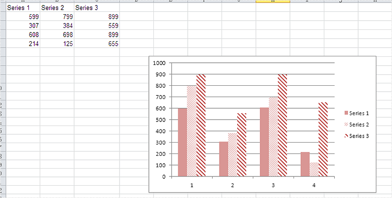
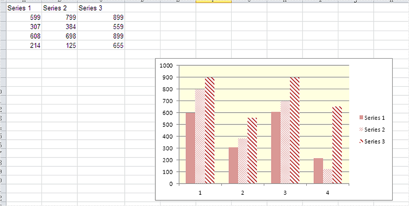
2015-09-14 08:01:45 Written by support iceblueAs a powerful Excel library, Spire.XLS supports to work with many kinds of charts and it also supports to set the performance for the chart. We have already shown you how to fill the excel chart with background image to make the chart more attractive. This article will show you how to fill the excel chart with background color in C#.
Please check the original Excel chart without any background color:
Code Snippet for Inserting Background color:
Step 1: Create a new workbook and load from file.
Workbook workbook = new Workbook();
workbook.LoadFromFile("sample.xlsx");
Step 2: Get the first worksheet from workbook and then get the first chart from the worksheet.
Worksheet ws = workbook.Worksheets[0];
Chart chart = ws.Charts[0];
Step 3: Set the property to ForeGroundColor for PlotArea to fill the background color for the chart.
chart.PlotArea.ForeGroundColor = System.Drawing.Color.LightYellow;
Step 4: Save the document to file.
workbook.SaveToFile("result.xlsx",ExcelVersion.Version2010);
Effective screenshot after fill the background color for Excel chart:
Full codes:
using Spire.Xls;
namespace SetBackgroundColor
{
    class Program
    {

        static void Main(string[] args)
        {
            Workbook workbook = new Workbook();
            workbook.LoadFromFile("sample.xlsx");

            Worksheet ws = workbook.Worksheets[0];
            Chart chart = ws.Charts[0];

            chart.PlotArea.ForeGroundColor = System.Drawing.Color.LightYellow;

            workbook.SaveToFile("result.xlsx", ExcelVersion.Version2010);
        }

    }
}
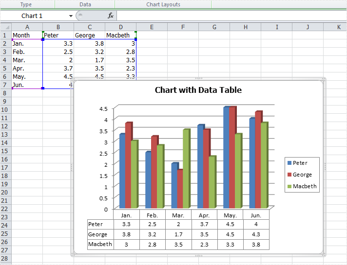
In Excel, we could use charts to visualize and compare data. However, once the charts are created, it becomes much difficult for us to read the data precisely from charts. Adding a data table below the chart is a good solution for which the chart and data are on the same place. This article is going to introduce the method to add a data table to the chart that is based on the data in C# using Spire.XLS.
Note: before start, please download the latest version of Spire.XLS and add the .dll in the bin folder as the reference of Visual studio.
Step 1: Create a new workbook and add an empty sheet.
            Workbook workbook = new Workbook();
            workbook.CreateEmptySheets(1);
            Worksheet sheet = workbook.Worksheets[0];
Step 2: Fill cells with sample data.
            sheet.Name = "Demo";
            sheet.Range["A1"].Value = "Month";
            sheet.Range["A2"].Value = "Jan.";
            sheet.Range["A3"].Value = "Feb.";
            sheet.Range["A4"].Value = "Mar.";
            sheet.Range["A5"].Value = "Apr.";
            sheet.Range["A6"].Value = "May.";
            sheet.Range["A7"].Value = "Jun.";
            sheet.Range["B1"].Value = "Peter";
            sheet.Range["B2"].NumberValue = 3.3;
            sheet.Range["B3"].NumberValue = 2.5;
            sheet.Range["B4"].NumberValue = 2.0;
            sheet.Range["B5"].NumberValue = 3.7;
            sheet.Range["B6"].NumberValue = 4.5;
            sheet.Range["B7"].NumberValue = 4.0;
            sheet.Range["C1"].Value = "George";
            sheet.Range["C2"].NumberValue = 3.8;
            sheet.Range["C3"].NumberValue = 3.2;
            sheet.Range["C4"].NumberValue = 1.7;
            sheet.Range["C5"].NumberValue = 3.5;
            sheet.Range["C6"].NumberValue = 4.5;
            sheet.Range["C7"].NumberValue = 4.3;
            sheet.Range["D1"].Value = "Macbeth";
            sheet.Range["D2"].NumberValue = 3.0;
            sheet.Range["D3"].NumberValue = 2.8;
            sheet.Range["D4"].NumberValue = 3.5;
            sheet.Range["D5"].NumberValue = 2.3;
            sheet.Range["D6"].NumberValue = 3.3;
            sheet.Range["D7"].NumberValue = 3.8;
Step 3: Create a Column3DClustered based on the sample data.
            Chart chart = sheet.Charts.Add(ExcelChartType.Column3DClustered);
            chart.DataRange = sheet.Range["B1:D7"];
            chart.SeriesDataFromRange = false;
            chart.TopRow = 7;
            chart.BottomRow = 28;
            chart.LeftColumn = 3;
            chart.RightColumn =11;
            chart.ChartTitle = "Chart with Data Table";
            chart.ChartTitleArea.IsBold = true;
            chart.ChartTitleArea.Size = 12;
            Spire.Xls.Charts.ChartSerie cs1 = chart.Series[0];
            cs1.CategoryLabels = sheet.Range["A2:A7"];
Step 4: Add a data table to the chart that is based on the data.
chart.HasDataTable = true;
Step 5: Save the document and launch to see effects.
            workbook.SaveToFile("S3.xlsx", ExcelVersion.Version2010);
            System.Diagnostics.Process.Start("S3.xlsx");
Effects:
Full codes:
using System;
using System.Collections.Generic;
using System.Linq;
using System.Text;
using Spire.Xls;
using System.Drawing;

namespace ConsoleApplication2
{
    class Program
    {
        static void Main(string[] args)
        {

            Workbook workbook = new Workbook();
            workbook.CreateEmptySheets(1);
            Worksheet sheet = workbook.Worksheets[0];

            sheet.Name = "Demo";
            sheet.Range["A1"].Value = "Month";
            sheet.Range["A2"].Value = "Jan.";
            sheet.Range["A3"].Value = "Feb.";
            sheet.Range["A4"].Value = "Mar.";
            sheet.Range["A5"].Value = "Apr.";
            sheet.Range["A6"].Value = "May.";
            sheet.Range["A7"].Value = "Jun.";
            sheet.Range["B1"].Value = "Peter";
            sheet.Range["B2"].NumberValue = 3.3;
            sheet.Range["B3"].NumberValue = 2.5;
            sheet.Range["B4"].NumberValue = 2.0;
            sheet.Range["B5"].NumberValue = 3.7;
            sheet.Range["B6"].NumberValue = 4.5;
            sheet.Range["B7"].NumberValue = 4.0;
            sheet.Range["C1"].Value = "George";
            sheet.Range["C2"].NumberValue = 3.8;
            sheet.Range["C3"].NumberValue = 3.2;
            sheet.Range["C4"].NumberValue = 1.7;
            sheet.Range["C5"].NumberValue = 3.5;
            sheet.Range["C6"].NumberValue = 4.5;
            sheet.Range["C7"].NumberValue = 4.3;
            sheet.Range["D1"].Value = "Macbeth";
            sheet.Range["D2"].NumberValue = 3.0;
            sheet.Range["D3"].NumberValue = 2.8;
            sheet.Range["D4"].NumberValue = 3.5;
            sheet.Range["D5"].NumberValue = 2.3;
            sheet.Range["D6"].NumberValue = 3.3;
            sheet.Range["D7"].NumberValue = 3.8;

            Chart chart = sheet.Charts.Add(ExcelChartType.Column3DClustered);
            chart.DataRange = sheet.Range["B1:D7"];
            chart.SeriesDataFromRange = false;
            chart.TopRow = 7;
            chart.BottomRow = 28;
            chart.LeftColumn = 3;
            chart.RightColumn =11;
            chart.ChartTitle = "Chart with Data Table";
            chart.ChartTitleArea.IsBold = true;
            chart.ChartTitleArea.Size = 12;
            Spire.Xls.Charts.ChartSerie cs1 = chart.Series[0];
            cs1.CategoryLabels = sheet.Range["A2:A7"];
            chart.HasDataTable = true;

            workbook.SaveToFile("S3.xlsx", ExcelVersion.Version2010);
            System.Diagnostics.Process.Start("S3.xlsx");
        }
    }
}
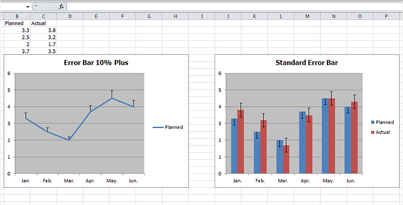
Error bars are a graphical representation of the variability of data and helps us see margins of error and standard deviations immediately in charts with a standard error amount, a percentage, a standard deviation or a custom error amount. Error bars can be used in 2-D area, bar, column, line, scatter, and bubble charts, which are all supported by Spire.XLS. This article is going to introduce the method to add error bars to a chart in C# using Spire.XLS.
Note: before start, please download the latest version of Spire.XLS and add the .dll in the bin folder as the reference of Visual Studio.
Step 1: Create a workbook and fill the sample data in sheet.
            Workbook workbook = new Workbook();
            workbook.CreateEmptySheets(1);
            Worksheet sheet = workbook.Worksheets[0];
            sheet.Name = "Demo";
            sheet.Range["A1"].Value = "Month";
            sheet.Range["A2"].Value = "Jan.";
            sheet.Range["A3"].Value = "Feb.";
            sheet.Range["A4"].Value = "Mar.";
            sheet.Range["A5"].Value = "Apr.";
            sheet.Range["A6"].Value = "May.";
            sheet.Range["A7"].Value = "Jun.";
            sheet.Range["B1"].Value = "Planned";
            sheet.Range["B2"].NumberValue = 3.3;
            sheet.Range["B3"].NumberValue = 2.5;
            sheet.Range["B4"].NumberValue = 2.0;
            sheet.Range["B5"].NumberValue = 3.7;
            sheet.Range["B6"].NumberValue = 4.5;
            sheet.Range["B7"].NumberValue = 4.0;
            sheet.Range["C1"].Value = "Actual";
            sheet.Range["C2"].NumberValue = 3.8;
            sheet.Range["C3"].NumberValue = 3.2;
            sheet.Range["C4"].NumberValue = 1.7;
            sheet.Range["C5"].NumberValue = 3.5;
            sheet.Range["C6"].NumberValue = 4.5;
            sheet.Range["C7"].NumberValue = 4.3;
Step 2: Add a line chart and then add percentage error bar to the chart. The direction of error bars can be set as both, minus and plus and the type of error bars can be set as fixed value, percentage, standard deviation, standard error or custom. After setting the direction and type, we can set the amount.
            Chart chart = sheet.Charts.Add(ExcelChartType.Line);
            chart.DataRange = sheet.Range["B1:B7"];
            chart.SeriesDataFromRange = false;
            chart.TopRow = 6;
            chart.BottomRow = 25;
            chart.LeftColumn = 2;
            chart.RightColumn = 9;
            chart.ChartTitle = "Error Bar 10% Plus";
            chart.ChartTitleArea.IsBold = true;
            chart.ChartTitleArea.Size = 12;
            Spire.Xls.Charts.ChartSerie cs1 = chart.Series[0];
            cs1.CategoryLabels = sheet.Range["A2:A7"];
            cs1.ErrorBar(true, ErrorBarIncludeType.Plus, ErrorBarType.Percentage,10);
Step 3: Add a column chart with standard error bars as comparison.
            Chart chart2 = sheet.Charts.Add(ExcelChartType.ColumnClustered);
            chart2.DataRange = sheet.Range["B1:C7"];
            chart2.SeriesDataFromRange = false;
            chart2.TopRow = 6;
            chart2.BottomRow = 25;
            chart2.LeftColumn = 10;
            chart2.RightColumn = 17;
            chart2.ChartTitle = "Standard Error Bar";
            chart2.ChartTitleArea.IsBold = true;
            chart2.ChartTitleArea.Size = 12;
            Spire.Xls.Charts.ChartSerie cs2 = chart2.Series[0];
            cs2.CategoryLabels = sheet.Range["A2:A7"];
            cs2.ErrorBar(true, ErrorBarIncludeType.Minus, ErrorBarType.StandardError, 0.3);
            Spire.Xls.Charts.ChartSerie cs3 = chart2.Series[1];
            cs3.ErrorBar(true, ErrorBarIncludeType.Both, ErrorBarType.StandardError, 0.5);
Step 4: Save the document and launch to see effects.
            workbook.SaveToFile("S3.xlsx", ExcelVersion.Version2010);
            System.Diagnostics.Process.Start("S3.xlsx");
Effects:
Full Codes:
using System;
using System.Collections.Generic;
using System.Linq;
using System.Text;
using Spire.Xls;
using System.Drawing;

namespace ConsoleApplication2
{
    class Program
    {
        static void Main(string[] args)
        {

            Workbook workbook = new Workbook();
            workbook.CreateEmptySheets(1);
            Worksheet sheet = workbook.Worksheets[0];
            sheet.Name = "Demo";
            sheet.Range["A1"].Value = "Month";
            sheet.Range["A2"].Value = "Jan.";
            sheet.Range["A3"].Value = "Feb.";
            sheet.Range["A4"].Value = "Mar.";
            sheet.Range["A5"].Value = "Apr.";
            sheet.Range["A6"].Value = "May.";
            sheet.Range["A7"].Value = "Jun.";
            sheet.Range["B1"].Value = "Planned";
            sheet.Range["B2"].NumberValue = 3.3;
            sheet.Range["B3"].NumberValue = 2.5;
            sheet.Range["B4"].NumberValue = 2.0;
            sheet.Range["B5"].NumberValue = 3.7;
            sheet.Range["B6"].NumberValue = 4.5;
            sheet.Range["B7"].NumberValue = 4.0;
            sheet.Range["C1"].Value = "Actual";
            sheet.Range["C2"].NumberValue = 3.8;
            sheet.Range["C3"].NumberValue = 3.2;
            sheet.Range["C4"].NumberValue = 1.7;
            sheet.Range["C5"].NumberValue = 3.5;
            sheet.Range["C6"].NumberValue = 4.5;
            sheet.Range["C7"].NumberValue = 4.3;

            Chart chart = sheet.Charts.Add(ExcelChartType.Line);
            chart.DataRange = sheet.Range["B1:B7"];
            chart.SeriesDataFromRange = false;
            chart.TopRow = 6;
            chart.BottomRow = 25;
            chart.LeftColumn = 2;
            chart.RightColumn = 9;
            chart.ChartTitle = "Error Bar 10% Plus";
            chart.ChartTitleArea.IsBold = true;
            chart.ChartTitleArea.Size = 12;
            Spire.Xls.Charts.ChartSerie cs1 = chart.Series[0];
            cs1.CategoryLabels = sheet.Range["A2:A7"];
            cs1.ErrorBar(true, ErrorBarIncludeType.Plus, ErrorBarType.Percentage,10);

            Chart chart2 = sheet.Charts.Add(ExcelChartType.ColumnClustered);
            chart2.DataRange = sheet.Range["B1:C7"];
            chart2.SeriesDataFromRange = false;
            chart2.TopRow = 6;
            chart2.BottomRow = 25;
            chart2.LeftColumn = 10;
            chart2.RightColumn = 17;
            chart2.ChartTitle = "Standard Error Bar";
            chart2.ChartTitleArea.IsBold = true;
            chart2.ChartTitleArea.Size = 12;
            Spire.Xls.Charts.ChartSerie cs2 = chart2.Series[0];
            cs2.CategoryLabels = sheet.Range["A2:A7"];
            cs2.ErrorBar(true, ErrorBarIncludeType.Minus, ErrorBarType.StandardError, 0.3);
            Spire.Xls.Charts.ChartSerie cs3 = chart2.Series[1];
            cs3.ErrorBar(true, ErrorBarIncludeType.Both, ErrorBarType.StandardError, 0.5);

            workbook.SaveToFile("S3.xlsx", ExcelVersion.Version2010);
            System.Diagnostics.Process.Start("S3.xlsx");

        }
    }
}
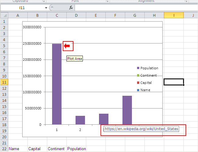
How to add a picture to the chart and then assign a hyperlink to the picture
2015-07-21 01:22:54 Written by support iceblueOne of our users requests a demo of Spire.XLS for how to add a picture to the chart at a specified location and then assign a hyperlink to the picture in C#. To fulfil it, we need to prepare the two things. Firstly, we need to know how to create Excel Charts in C# with the help of Spire.XLS. Secondly, we should have an image that we use to insert to the chart. We will use Excel Column chart for example.
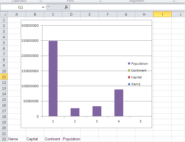
Here comes to the steps. Firstly, please review the sample excel chart that we will add image later.
Step 1: Create a new document and load from file.
Workbook workbook = new Workbook();
workbook.LoadFromFile("sample.xlsx");
Step 2: Get the first worksheet and the first chart in it.
Worksheet workSheet = workbook.Worksheets[0];
Chart chart = workSheet.Charts[0];
Step 3: Add the desired image into the chart and set the image's position and size.
IPictureShape ps = chart.Shapes.AddPicture("1.png");
ps.Top = 180;
ps.Left = 280;
ps.Width = 60;
ps.Height = 80;
Step 4: Assign a hyperlink to the image.
(ps as XlsBitmapShape).SetHyperLink("https://en.wikipedia.org/wiki/United_States", true);
Step 5: Save the document to file.
workbook.SaveToFile("result.xlsx", ExcelVersion.Version2010);
Effective screenshot of adding an image to the chart and assign a hyperlink to the image:
Full codes:
using Spire.Xls;
using Spire.Xls.Core;
using Spire.Xls.Core.Spreadsheet.Shapes;
namespace AddPicturetoChart
{
    class Program
    {

        static void Main(string[] args)
        {
            Workbook workbook = new Workbook();
            workbook.LoadFromFile("sample.xlsx");

            Worksheet workSheet = workbook.Worksheets[0];
            Chart chart = workSheet.Charts[0];

            IPictureShape ps = chart.Shapes.AddPicture("1.png");
            ps.Top = 180;
            ps.Left = 280;
            ps.Width = 60;
            ps.Height = 80;
            (ps as XlsBitmapShape).SetHyperLink("https://en.wikipedia.org/wiki/United_States", true);

            workbook.SaveToFile("result.xlsx", ExcelVersion.Version2010);
        }
    }
}
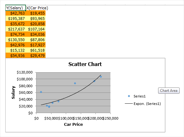
Charts are used to display series of numeric data in a graphical format to make it easier to understand large quantities of data and the relationship between different series of data. This article talks about how to create scatter chart via Spire.XLS.
To create a Scatter Chart, execute the following steps.
Step 1: Create a new Excel document and get the first sheet.
Workbook workbook = new Workbook();
workbook.CreateEmptySheets(1);
Worksheet sheet = workbook.Worksheets[0];
Step 2: Rename the first sheet and set the grid lines invisible.
sheet.Name = "Scatter Chart";
sheet.GridLinesVisible = false;
Step 3: Create a scatter chart and set data region for it.
Chart chart = sheet.Charts.Add(ExcelChartType.ScatterMarkers);
chart.DataRange = sheet.Range["B2:B10"];
chart.SeriesDataFromRange = false;
Step 4: Set position and title for the chart.
chart.LeftColumn = 1;
chart.TopRow = 6;
chart.RightColumn = 9;
chart.BottomRow = 25;

chart.ChartTitle = "Scatter Chart";
chart.ChartTitleArea.IsBold = true;
chart.ChartTitleArea.Size = 12;
Step 5: Add data to the excel range.
sheet.Range["A1"].Value = "Y(Salary)";
sheet.Range["A2"].Value = "42763";
sheet.Range["A3"].Value = "195387";
sheet.Range["A4"].Value = "35672";
sheet.Range["A5"].Value = "217637";
sheet.Range["A6"].Value = "74734";
sheet.Range["A7"].Value = "130550";
sheet.Range["A8"].Value = "42976";
sheet.Range["A9"].Value = "15132";
sheet.Range["A10"].Value = "54936";

sheet.Range["B1"].Value = "X(Car Price)";
sheet.Range["B2"].Value = "19455";
sheet.Range["B3"].Value = "93965";
sheet.Range["B4"].Value = "20858";
sheet.Range["B5"].Value = "107164";
sheet.Range["B6"].Value = "34036";
sheet.Range["B7"].Value = "87806";
sheet.Range["B8"].Value = "17927";
sheet.Range["B9"].Value = "61518";
sheet.Range["B10"].Value = "29479";
Step 6: Set style color for the range.
sheet.Range["A2:B2"].Style.KnownColor = ExcelColors.LightOrange;
sheet.Range["A3:B3"].Style.KnownColor = ExcelColors.LightYellow;
sheet.Range["A4:B4"].Style.KnownColor = ExcelColors.LightOrange;
sheet.Range["A5:B5"].Style.KnownColor = ExcelColors.LightYellow;
sheet.Range["A6:B6"].Style.KnownColor = ExcelColors.LightOrange;
sheet.Range["A7:B7"].Style.KnownColor = ExcelColors.LightYellow;
sheet.Range["A8:B8"].Style.KnownColor = ExcelColors.LightOrange;
sheet.Range["A9:B9"].Style.KnownColor = ExcelColors.LightYellow;
sheet.Range["A10:B10"].Style.KnownColor = ExcelColors.LightOrange;
Step 7: Set number format for cell ranges.
sheet.Range["A2:B10"].Style.NumberFormat = "\"$\"#,##0";
Step 8: Set data for axis x y.
chart.Series[0].CategoryLabels = sheet.Range["A2:A10"];
chart.Series[0].Values = sheet.Range["B2:B10"];
Step 9: Add a trend line.
chart.Series[0].TrendLines.Add(TrendLineType.Exponential);
Step 10: Add axis title.
chart.PrimaryValueAxis.Title = "Salary";
chart.PrimaryCategoryAxis.Title = "Car Price";
Step 11: Save and review.
workbook.SaveToFile("XYChart.xlsx", FileFormat.Version2013);
System.Diagnostics.Process.Start("XYChart.xlsx");
Screenshot:
Full code:
using Spire.Xls;
namespace CreateExcelScatterChart
{
    class Program
    {

        static void Main(string[] args)
        {
            Workbook workbook = new Workbook();
            workbook.CreateEmptySheets(1);
            Worksheet sheet = workbook.Worksheets[0];

            sheet.Name = "Scatter Chart";
            sheet.GridLinesVisible = false;

            Chart chart = sheet.Charts.Add(ExcelChartType.ScatterMarkers);
            chart.DataRange = sheet.Range["B2:B10"];
            chart.SeriesDataFromRange = false;

            chart.LeftColumn = 1;
            chart.TopRow = 6;
            chart.RightColumn = 9;
            chart.BottomRow = 25;

            chart.ChartTitle = "Scatter Chart";
            chart.ChartTitleArea.IsBold = true;
            chart.ChartTitleArea.Size = 12;

            sheet.Range["A1"].Value = "Y(Salary)";
            sheet.Range["A2"].Value = "42763";
            sheet.Range["A3"].Value = "195387";
            sheet.Range["A4"].Value = "35672";
            sheet.Range["A5"].Value = "217637";
            sheet.Range["A6"].Value = "74734";
            sheet.Range["A7"].Value = "130550";
            sheet.Range["A8"].Value = "42976";
            sheet.Range["A9"].Value = "15132";
            sheet.Range["A10"].Value = "54936";

            sheet.Range["B1"].Value = "X(Car Price)";
            sheet.Range["B2"].Value = "19455";
            sheet.Range["B3"].Value = "93965";
            sheet.Range["B4"].Value = "20858";
            sheet.Range["B5"].Value = "107164";
            sheet.Range["B6"].Value = "34036";
            sheet.Range["B7"].Value = "87806";
            sheet.Range["B8"].Value = "17927";
            sheet.Range["B9"].Value = "61518";
            sheet.Range["B10"].Value = "29479";

            sheet.Range["A2:B2"].Style.KnownColor = ExcelColors.LightOrange;
            sheet.Range["A3:B3"].Style.KnownColor = ExcelColors.LightYellow;
            sheet.Range["A4:B4"].Style.KnownColor = ExcelColors.LightOrange;
            sheet.Range["A5:B5"].Style.KnownColor = ExcelColors.LightYellow;
            sheet.Range["A6:B6"].Style.KnownColor = ExcelColors.LightOrange;
            sheet.Range["A7:B7"].Style.KnownColor = ExcelColors.LightYellow;
            sheet.Range["A8:B8"].Style.KnownColor = ExcelColors.LightOrange;
            sheet.Range["A9:B9"].Style.KnownColor = ExcelColors.LightYellow;
            sheet.Range["A10:B10"].Style.KnownColor = ExcelColors.LightOrange;

            sheet.Range["A2:B10"].Style.NumberFormat = "\"$\"#,##0";

            chart.Series[0].CategoryLabels = sheet.Range["A2:A10"];
            chart.Series[0].Values = sheet.Range["B2:B10"];

            chart.Series[0].TrendLines.Add(TrendLineType.Exponential);

            chart.PrimaryValueAxis.Title = "Salary";
            chart.PrimaryCategoryAxis.Title = "Car Price";

            workbook.SaveToFile("XYChart.xlsx", FileFormat.Version2013);
            System.Diagnostics.Process.Start("XYChart.xlsx");
        }
    }
}
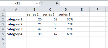
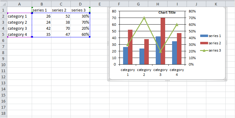
How to Create a Combination Chart in Excel in C#, VB.NET
2015-06-04 02:23:38 Written by support iceblueA combination chart that combines two or more chart types in a single chart is often used to emphasize different types of information in that chart. As is shown in the below Excel sheet, we have different type of data in series 3. To clearly display data of different types, it can be helpful to plot varying data sets either with different chart types or on different axes.
In this article, we will introduce how to combine different chart types in one chart and how to add a secondary axis to a chart using Spire.XLS in C#, VB.NET.
Code Snippet:
Step 1: Create a new instance of Workbook class and the load the sample Excel file.
Workbook workbook = new Workbook();
workbook.LoadFromFile("data.xlsx");
Step 2: Get the first worksheet from workbook.
Worksheet sheet=workbook.Worksheets[0];
Step 3: Add a chart to worksheet based on the data from A1 to D5.
Chart chart = sheet.Charts.Add();
chart.DataRange = sheet.Range["A1:D5"];
chart.SeriesDataFromRange = false;
Step 4: Set position of chart.
chart.LeftColumn = 6;
chart.TopRow = 1;
chart.RightColumn = 12;
chart.BottomRow = 13;
Step 5: Apply Column chart type to series 1 and series 2, apply Line chart type to series 3.
var cs1 = (ChartSerie)chart.Series[0];
cs1.SerieType = ExcelChartType.ColumnClustered;

var cs2 = (ChartSerie)chart.Series[1];
cs2.SerieType = ExcelChartType.ColumnClustered;

var cs3 = (ChartSerie)chart.Series[2];
cs3.SerieType = ExcelChartType.LineMarkers;
Step 6: Add a secondary axis to the chart, plot data of series 3 on the secondary axis.
chart.SecondaryCategoryAxis.IsMaxCross = true;
cs3.UsePrimaryAxis = false;
Step 7: Save and launch the file
workbook.SaveToFile("result.xlsx",ExcelVersion.Version2010);
System.Diagnostics.Process.Start("result.xlsx");
Result:
Full Code:
using Spire.Xls;
using Spire.Xls.Charts;
namespace CreateCombinationExcel
{
    class Program
    {

        static void Main(string[] args)
        {
            Workbook workbook = new Workbook();
            workbook.LoadFromFile("data.xlsx");
            Worksheet sheet = workbook.Worksheets[0];

            //add a chart based on the data from A1 to D5
            Chart chart = sheet.Charts.Add();
            chart.DataRange = sheet.Range["A1:D5"];
            chart.SeriesDataFromRange = false;

            //set position of chart
            chart.LeftColumn = 6;
            chart.TopRow = 1;
            chart.RightColumn = 12;
            chart.BottomRow = 13;

            //apply different chart type to different series
            var cs1 = (ChartSerie)chart.Series[0];
            cs1.SerieType = ExcelChartType.ColumnClustered;
            var cs2 = (ChartSerie)chart.Series[1];
            cs2.SerieType = ExcelChartType.ColumnClustered;
            var cs3 = (ChartSerie)chart.Series[2];
            cs3.SerieType = ExcelChartType.LineMarkers;

            //add a secondary axis to chart
            chart.SecondaryCategoryAxis.IsMaxCross = true;
            cs3.UsePrimaryAxis = false;

            //save and launch the file
            workbook.SaveToFile("result.xlsx", ExcelVersion.Version2010);
            System.Diagnostics.Process.Start("result.xlsx");
        }
    }
}
Imports Spire.Xls
Imports Spire.Xls.Charts
Namespace CreateCombinationExcel
	Class Program

		Private Shared Sub Main(args As String())
			Dim workbook As New Workbook()
			workbook.LoadFromFile("data.xlsx")
			Dim sheet As Worksheet = workbook.Worksheets(0)

			'add a chart based on the data from A1 to D5
			Dim chart As Chart = sheet.Charts.Add()
			chart.DataRange = sheet.Range("A1:D5")
			chart.SeriesDataFromRange = False

			'set position of chart
			chart.LeftColumn = 6
			chart.TopRow = 1
			chart.RightColumn = 12
			chart.BottomRow = 13

			'apply different chart type to different series
			Dim cs1 = DirectCast(chart.Series(0), ChartSerie)
			cs1.SerieType = ExcelChartType.ColumnClustered
			Dim cs2 = DirectCast(chart.Series(1), ChartSerie)
			cs2.SerieType = ExcelChartType.ColumnClustered
			Dim cs3 = DirectCast(chart.Series(2), ChartSerie)
			cs3.SerieType = ExcelChartType.LineMarkers

			'add a secondary axis to chart
			chart.SecondaryCategoryAxis.IsMaxCross = True
			cs3.UsePrimaryAxis = False

			'save and launch the file
			workbook.SaveToFile("result.xlsx", ExcelVersion.Version2010)
			System.Diagnostics.Process.Start("result.xlsx")
		End Sub
	End Class
End Namespace
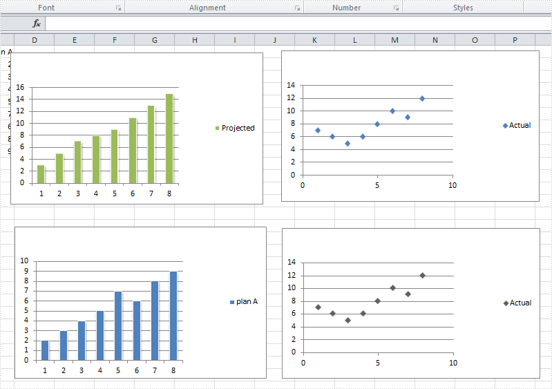
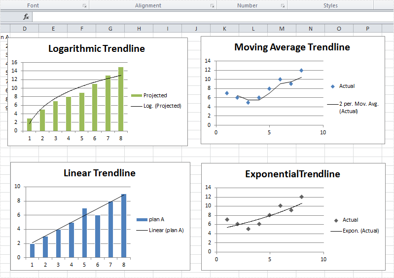
A trendline is used to show the trend of data series and predict future tendency. Totally, there are six different types: linear trendline, logarithmic trendline, polynomial trendline, power trendline, exponential trendline, and moving average trendline. We may choose different trendline based on the data type we have for different trendline has different advantages to show trend.
For example, a linear trendline works well to show the increase or decrease of data at a steady rate while a logarithmic trendline is often used to show the rate of change in the data increases or decreases quickly and then levels out.
Spire.XLS supports to add all of those six trendlines in charts. This article is going to show how to add trendlines in visual studio.
Before adding trendlines
After adding trendlines
Step 1: Load the workbook and create a sheet
Workbook workbook = new Workbook();
workbook.LoadFromFile("S2.xlsx");
Worksheet sheet = workbook.Worksheets[0];
Step 2: Select targeted chart, add trendline and set its type
//select chart and set logarithmic trendline
Chart chart = sheet.Charts[0];
chart.Series[0].TrendLines.Add(TrendLineType.Logarithmic);
//select chart and set moving_average trendline
Chart chart1 = sheet.Charts[1];
chart1.Series[0].TrendLines.Add(TrendLineType.Moving_Average);
//select chart and set linear trendline
Chart chart2 = sheet.Charts[2];
chart2.Series[0].TrendLines.Add(TrendLineType.Linear);
//select chart and set exponential trendline
Chart chart3 = sheet.Charts[3];
chart3.Series[0].TrendLines.Add(TrendLineType.Exponential);
Step 3: Save and launch the document
workbook.SaveToFile("S3.xlsx", ExcelVersion.Version2010);
System.Diagnostics.Process.Start("S3.xlsx");
Full code:
using System;
using System.Collections.Generic;
using System.Linq;
using System.Text;
using Spire.Xls;

namespace TradeLine
{
    class Program
    {
        static void Main(string[] args)
        {
            Workbook workbook = new Workbook();
            workbook.LoadFromFile("S2.xlsx");
            Worksheet sheet = workbook.Worksheets[0];


            Chart chart = sheet.Charts[0];
            chart.Series[0].TrendLines.Add(TrendLineType.Logarithmic);

            Chart chart1 = sheet.Charts[1];
            chart1.Series[0].TrendLines.Add(TrendLineType.Moving_Average);

            Chart chart2 = sheet.Charts[2];
            chart2.Series[0].TrendLines.Add(TrendLineType.Linear);

            Chart chart3 = sheet.Charts[3];
            chart3.Series[0].TrendLines.Add(TrendLineType.Exponential);

            workbook.SaveToFile("S3.xlsx", ExcelVersion.Version2010);
            System.Diagnostics.Process.Start("S3.xlsx");

        }
    }
}
Please note that we cannot add a trendline to data series in a stacked, 3-D, radar, pie, surface, or doughnut chart because those types of chart don't support trendline.
How to Fill Chart Elements with Pictures in C#, VB.NET
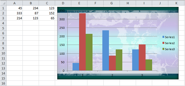
2015-01-28 03:29:45 Written by support iceblueA chart filled with an image of company logo or propaganda is more impressive than a plain chart; adding a proper image into a chart as background will dramatically draw attention from your readers. As is similar to MS Excel, Spire.XLS enables users to insert pictures to specific chart elements such as chart area, bar area and plot area. In this article, I'll introduce how to enhance your chart by inserting image in chart area and plot area in C#, VB.NET.
Test File:
Code Snippet for Inserting Background Image:
Step 1: Create a new workbook and load the test file
Workbook workbook = new Workbook();
workbook.LoadFromFile("test.xlsx");
Step 2: Get the first worksheet from workbook, get the first chart from worksheet.
Worksheet ws = workbook.Worksheets[0];
Chart chart = ws.Charts[0];
Step 3:
A) Insert chart area with a custom picture and set the transparency of plot area as 0.9. If you don't make plot area transparent, it will cover up the background image filled in chart area. Anyway, it all depends on your own needs.
chart.ChartArea.Fill.CustomPicture(Image.FromFile("05.jpg"), "None");
chart.PlotArea.Fill.Transparency = 0.9;
B) Insert plot area with a custom picture
chart.PlotArea.Fill.CustomPicture(Image.FromFile("01.jpg"), "None");
Step 4: Save the file
workbook.SaveToFile("Sample.xlsx",ExcelVersion.Version2010);
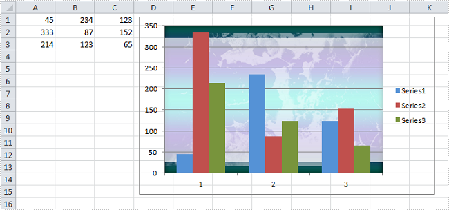
Result:
A) Fill chart area with image
B) Fill plot area with image
Full Code:
using Spire.Xls;
using System.Drawing;
namespace FillChartElement
{
    class Program
    {

        static void Main(string[] args)
        {

            Workbook workbook = new Workbook();
            workbook.LoadFromFile("test.xlsx");

            Worksheet ws = workbook.Worksheets[0];
            Chart chart = ws.Charts[0];

            // A. Fill chart area with image
            chart.ChartArea.Fill.CustomPicture(Image.FromFile("05.jpg"), "None");
            chart.PlotArea.Fill.Transparency = 0.9;

            //// B.Fill plot area with image
            //chart.PlotArea.Fill.CustomPicture(Image.FromFile("05.jpg"), "None");

            workbook.SaveToFile("Sample.xlsx", ExcelVersion.Version2010);
        }
    }
}
Imports Spire.Xls
Imports System.Drawing
Namespace FillChartElement
	Class Program

		Private Shared Sub Main(args As String())

			Dim workbook As New Workbook()
			workbook.LoadFromFile("test.xlsx")

			Dim ws As Worksheet = workbook.Worksheets(0)
			Dim chart As Chart = ws.Charts(0)

			' A. Fill chart area with image
			chart.ChartArea.Fill.CustomPicture(Image.FromFile("05.jpg"), "None")
			chart.PlotArea.Fill.Transparency = 0.9

			'''/ B.Fill plot area with image
			'chart.PlotArea.Fill.CustomPicture(Image.FromFile("05.jpg"), "None");

			workbook.SaveToFile("Sample.xlsx", ExcelVersion.Version2010)
		End Sub
	End Class
End Namespace
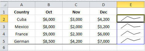
Sparkline is a tiny chart that can be inserted in cells to represent the trends in a series of values. Spire.XLS enables programmers to select a data cell range and display sparkline in another cell, usually next to data range. This article gives an example in C# and VB.NET to show how this purpose is achieved with a few lines of code.
Code Snippet:
Step 1: Create a new Workbook and load the sample file.
Workbook wb = new Workbook();
wb.LoadFromFile("sample.xlsx");
Step 2: Get the Worksheet from Workbook.
Worksheet ws = wb.Worksheets[0];
Step 3: Set SparklineType as line and apply line sparkline to SparklineCollection.
SparklineGroup sparklineGroup = ws.SparklineGroups.AddGroup(SparklineType.Line);
SparklineCollection sparklines = sparklineGroup.Add();
Step 4: Call SparklineCollection.Add(DateRange, ReferenceRange) mothed get data from a range of cells and display sparkline chart inside another cell, e.g., a sparkline in E2 shows the trend of values from A2 to D2.
sparklines.Add(ws["A2:D2"], ws["E2"]);
sparklines.Add(ws["A3:D3"], ws["E3"]);
sparklines.Add(ws["A4:D4"], ws["E4"]);
sparklines.Add(ws["A5:D5"], ws["E5"]);
Step 5: Save the file.
wb.SaveToFile("output.xlsx",ExcelVersion.Version2010);
Output:
Full Code:
using Spire.Xls;
namespace InsertSparkline
{
    class Program
    {

        static void Main(string[] args)
        {

            Workbook wb = new Workbook();
            wb.LoadFromFile("sample.xlsx");
            Worksheet ws = wb.Worksheets[0];

            SparklineGroup sparklineGroup = ws.SparklineGroups.AddGroup(SparklineType.Line);
            SparklineCollection sparklines = sparklineGroup.Add();
            sparklines.Add(ws["A2:D2"], ws["E2"]);
            sparklines.Add(ws["A3:D3"], ws["E3"]);
            sparklines.Add(ws["A4:D4"], ws["E4"]);
            sparklines.Add(ws["A5:D5"], ws["E5"]);

            wb.SaveToFile("output.xlsx", ExcelVersion.Version2010);

        }
    }
}
Imports Spire.Xls
Namespace InsertSparkline
	Class Program

		Private Shared Sub Main(args As String())

			Dim wb As New Workbook()
			wb.LoadFromFile("sample.xlsx")
			Dim ws As Worksheet = wb.Worksheets(0)

			Dim sparklineGroup As SparklineGroup = ws.SparklineGroups.AddGroup(SparklineType.Line)
			Dim sparklines As SparklineCollection = sparklineGroup.Add()
			sparklines.Add(ws("A2:D2"), ws("E2"))
			sparklines.Add(ws("A3:D3"), ws("E3"))
			sparklines.Add(ws("A4:D4"), ws("E4"))
			sparklines.Add(ws("A5:D5"), ws("E5"))

			wb.SaveToFile("output.xlsx", ExcelVersion.Version2010)

		End Sub
	End Class
End Namespace