A Scatter (X Y) Chart has two value axes – X value axis and Y value axis. It combines X and Y values into single data points and shows them in irregular intervals, or clusters. This article will show you how to create scatter chart in PowerPoint using Spire.Presentation with C#.
Step 1: Create a Presentation object.
Presentation presentation = new Presentation();
Step 2: Add a "Scatter with Smooth Lines and Markers" chart to the first slide, and set the chart title.
IChart chart = presentation.Slides[0].Shapes.AppendChart(ChartType.ScatterSmoothLinesAndMarkers, new RectangleF(40, 80, 550, 320), false);
chart.ChartTitle.TextProperties.Text = "Scatter Chart";
chart.ChartTitle.TextProperties.IsCentered = true;
chart.ChartTitle.Height = 20;
chart.HasTitle = true;
Step 3: Write data to the chart data.
Double[] xdata = new Double[] { 1.0, 2.4, 5.0, 8.9 };
Double[] ydata = new Double[] { 5.3, 15.2, 6.7, 8 };
chart.ChartData[0, 0].Text = "X-Values";
chart.ChartData[0, 1].Text = "Y-Values";
for (Int32 i = 0; i < xdata.Length; ++i)
{
    chart.ChartData[i + 1, 0].Value = xdata[i];
    chart.ChartData[i + 1, 1].Value = ydata[i];
}
Step 4: Set up the data source of the X values, the Y values, and the series label.
chart.Series.SeriesLabel = chart.ChartData["B1", "B1"];
chart.Series[0].XValues= chart.ChartData["A2", "A5"];
chart.Series[0].YValues = chart.ChartData["B2", "B5"];
Step 5: Add and display the data labels in the chart.
for (int i = 0; i < 4; i++)
{
    ChartDataLabel dataLabel = chart.Series[0].DataLabels.Add();
    dataLabel.LabelValueVisible = true;
}
Step 6: Set the axis titles.
chart.PrimaryValueAxis.HasTitle = true;
chart.PrimaryValueAxis.Title.TextProperties.Text = "X-Axis Title";
chart.SecondaryValueAxis.HasTitle = true;
chart.SecondaryValueAxis.Title.TextProperties.Text = "Y-Axis Title";
Step 7: Format the gridlines.
chart.SecondaryValueAxis.MajorGridTextLines.FillType = FillFormatType.Solid;
chart.SecondaryValueAxis.MajorGridTextLines.Style = TextLineStyle.ThinThin;
chart.SecondaryValueAxis.MajorGridTextLines.SolidFillColor.Color = Color.Gray;
chart.PrimaryValueAxis.MajorGridTextLines.FillType = FillFormatType.None;
Step 8: Format the outline.
chart.Series[0].Line.FillType = FillFormatType.Solid;
chart.Series[0].Line.Width = 0.1f;
chart.Series[0].Line.SolidFillColor.Color = Color.RoyalBlue;
Step 9: Save the file.
presentation.SaveToFile("ScatterChart.pptx", FileFormat.Pptx2010);
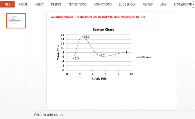
Output:
Full Code:
using Spire.Presentation;
using Spire.Presentation.Charts;
using Spire.Presentation.Drawing;
using System;
using System.Drawing;

namespace CreateScatterChart
{
    class Program
    {
        static void Main(string[] args)
        {
            Presentation presentation = new Presentation();
            IChart chart = presentation.Slides[0].Shapes.AppendChart(ChartType.ScatterSmoothLinesAndMarkers, new RectangleF(40, 80, 550, 320), false);
            chart.ChartTitle.TextProperties.Text = "Scatter Chart";
            chart.ChartTitle.TextProperties.IsCentered = true;
            chart.ChartTitle.Height = 20;
            chart.HasTitle = true;

            Double[] xdata = new Double[] { 1.0, 2.4, 5.0, 8.9 };
            Double[] ydata = new Double[] { 5.3, 15.2, 6.7, 8 };
            chart.ChartData[0, 0].Text = "X-Values";
            chart.ChartData[0, 1].Text = "Y-Values";
            for (Int32 i = 0; i < xdata.Length; ++i)
            {
                chart.ChartData[i + 1, 0].Value = xdata[i];
                chart.ChartData[i + 1, 1].Value = ydata[i];
            }

            chart.Series.SeriesLabel = chart.ChartData["B1", "B1"];
            chart.Series[0].XValues = chart.ChartData["A2", "A5"];
            chart.Series[0].YValues = chart.ChartData["B2", "B5"];

            for (int i = 0; i < 4; i++)
            {
                ChartDataLabel dataLabel = chart.Series[0].DataLabels.Add();
                dataLabel.LabelValueVisible = true;
            }

            chart.PrimaryValueAxis.HasTitle = true;
            chart.PrimaryValueAxis.Title.TextProperties.Text = "X-Axis Title";
            chart.SecondaryValueAxis.HasTitle = true;
            chart.SecondaryValueAxis.Title.TextProperties.Text = "Y-Axis Title";

            chart.SecondaryValueAxis.MajorGridTextLines.FillType = FillFormatType.Solid;
            chart.SecondaryValueAxis.MajorGridTextLines.Style = TextLineStyle.ThinThin;
            chart.SecondaryValueAxis.MajorGridTextLines.SolidFillColor.Color = Color.Gray;
            chart.PrimaryValueAxis.MajorGridTextLines.FillType = FillFormatType.None;

            chart.Series[0].Line.FillType = FillFormatType.Solid;
            chart.Series[0].Line.Width = 0.1f;
            chart.Series[0].Line.SolidFillColor.Color = Color.RoyalBlue;

            presentation.SaveToFile("ScatterChart.pptx", FileFormat.Pptx2010);
        }
    }
}