
Waterfall charts are one of the most powerful tools in Excel for visualizing how a starting value is affected by a series of positive and negative changes. Whether you're tracking a budget, analyzing profit and loss, or explaining sales performance, a waterfall chart (also known as a bridge chart) turns a sea of numbers into a clear, compelling story.
In this guide, you'll learn exactly how to create a waterfall chart in Excel and customize it for maximum impact. We'll also cover a programming method for developers who need to automate chart creation.
- What Is a Waterfall Chart?
- Create a Waterfall Chart in Excel
- Create a Waterfall Chart Programmatically with C#
- Professional Tips to Customize Waterfall Chart
- Frequently Asked Questions (FAQs)
What Is a Waterfall Chart?
A waterfall chart shows a running total as values are added or subtracted. The "floating" columns appear to bridge the gap between a start and end point, showing you exactly how you got from one to the other.
Waterfall charts are ideal for:
| Use Case | Example |
|---|---|
| Financial Statements | Breaking down profit & loss from revenue to net income |
| Budget Tracking | Showing how expenses and funding affect your budget |
| Inventory Analysis | Tracking stock changes from new stock, sales, and returns |
| Sales Performance | Showing how product lines or regions contributed to targets |
| Cash Flow Analysis | Visualizing money in and money out |
If you need to explain the journey from Point A to Point B, a waterfall chart is one of the most effective tools in your data visualization toolkit.
Create a Waterfall Chart in Excel
Modern Excel versions (2016, 2019, and Microsoft 365) include a native waterfall chart feature that lets you build a fully functional chart quickly. This is the fastest, most reliable method for most users.
Step 1: Prepare Your Data
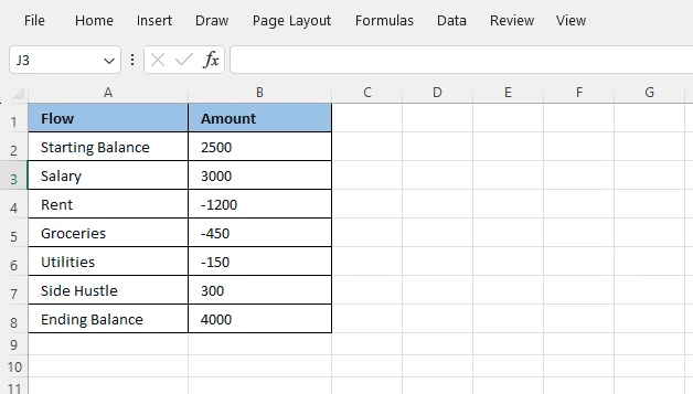
The secret to a great Excel chart is a well-structured data table. For a waterfall chart, you'll need at least two columns: one for labels and one for values.
Key points:
- Use positive numbers for increases
- Use negative numbers (with minus sign) for decreases
- First and last rows are typically your totals (not contributing changes)
Here's a simple monthly budget example:
Step 2: Insert the Waterfall Chart
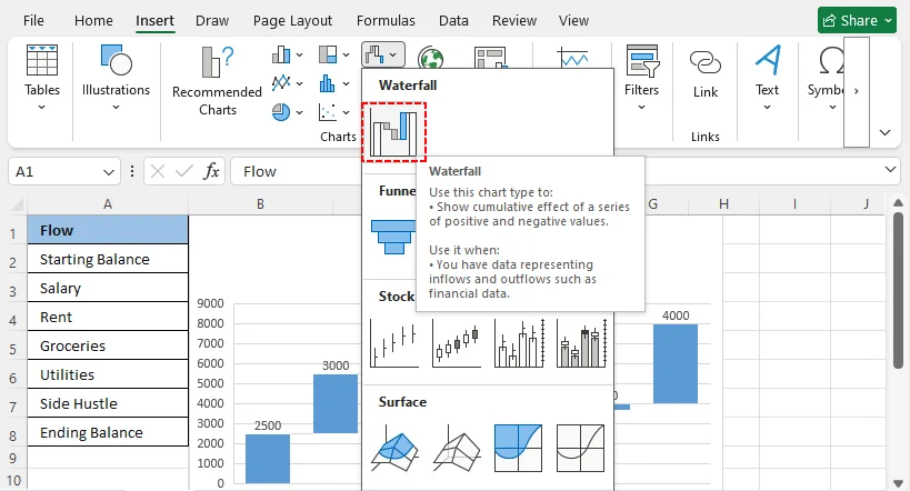
- Select your data range, including both columns and headers.
- Go to the “Insert” tab on Excel's ribbon.
- In the “Charts” group, click the "Insert Waterfall, Funnel, Stock, Surface, or Radar Chart" icon.
- Select Waterfall from the drop-down menu.
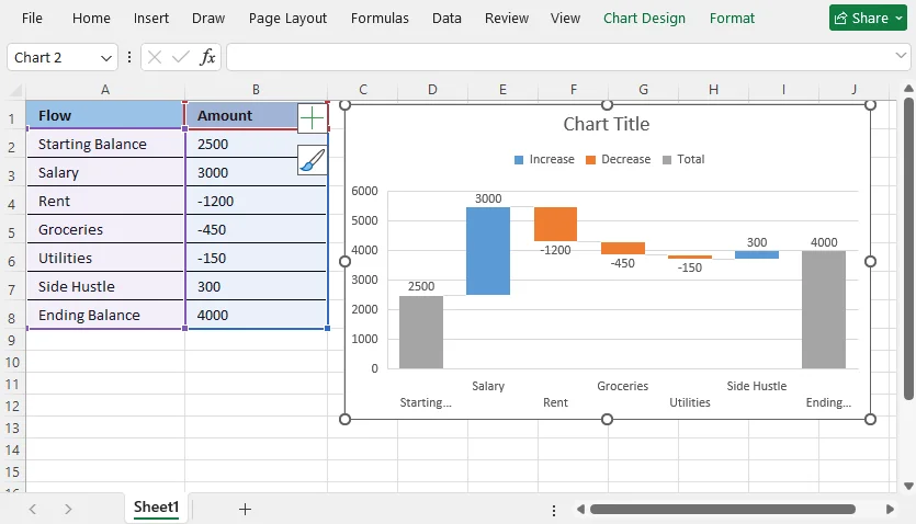
Excel will instantly generate a basic waterfall chart. However, it won't look quite right yet because it treats every value as a step. The starting and ending values need to be set as totals—this is the most critical editing step.
Step 3: Set Total Columns (Critical)
By default, Excel doesn't know which bars are supposed to be totals and which are contributing steps.
To set a starting or ending total:
- Double-click the bar you want to set as a total.
- In the “Format Data Point” pane on the right, check the box for “Set as total”.
- Repeat this process for your ending balance bar.
These columns will now anchor to the horizontal axis, creating the classic waterfall chart structure.
If you need to visualize proportions instead of a running total, you can also create a pie chart in Excel to show how each category contributes to the whole.
Create a Waterfall Chart Programmatically with C#
For developers and advanced users who need to build waterfall chart in Excel automatically, you can create the chart entirely with code using the Free Spire.XLS for .NET library. This approach is fast, repeatable, and gives you full programmatic control over totals, labels, and styling.
When to Use the Programming Method
Use Free Spire.XLS or a similar Excel automation library when you need to:
- Generate the same waterfall chart across dozens of workbooks
- Pull data from a database and build reports automatically
- Schedule monthly or weekly financial dashboards
- Avoid manual chart formatting errors
Full C# Code Example
using Spire.Xls;

namespace WaterfallChart
{
    class Program
    {
        static void Main(string[] args)
        {
            //Create a Workbook instance
            Workbook workbook = new Workbook();

            //Load a sample Excel document
            workbook.LoadFromFile("Income.xlsx");

            //Get the first worksheet
            Worksheet sheet = workbook.Worksheets[0];

            //Add a waterfall chart to the worksheet
            Chart chart = sheet.Charts.Add(ExcelChartType.WaterFall);

            //Set data range for the chart
            chart.DataRange = sheet["A2:B11"];

            //Set position of the chart
            chart.LeftColumn = 4;
            chart.TopRow = 2;
            chart.RightColumn = 15;
            chart.BottomRow = 23;

            //Set the chart title
            chart.ChartTitle = "Income Statement";

            //Set specific data points in the chart as totals or subtotals
            chart.Series[0].DataPoints[2].SetAsTotal = true;
            chart.Series[0].DataPoints[7].SetAsTotal = true;
            chart.Series[0].DataPoints[9].SetAsTotal = true;

            //Show the connector lines between data points
            chart.Series[0].Format.ShowConnectorLines = true;

            //Show data labels for data points
            chart.Series[0].DataPoints.DefaultDataPoint.DataLabels.HasValue = true;
            chart.Series[0].DataPoints.DefaultDataPoint.DataLabels.Size = 8;

            //Set the legend position of the chart
            chart.Legend.Position = LegendPositionType.Top;

            //Save the result document
            workbook.SaveToFile("WaterfallChart.xlsx");
            workbook.Dispose();
        }
    }
}
Core Code:
-
ExcelChartType.WaterFall: Specifies the chart type as a waterfall chart. -
chart.DataRange: Defines the source data (labels and values). -
chart.Series[].DataPoints[].SetAsTotal: Marks specific data points as totals. (Note: indices are zero-based). -
ShowConnectorLines: Enables the connector lines between floating bars. -
DataLabels.HasValue: Turns on data labels so viewers can read the exact values.
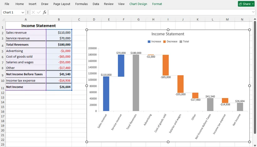
Result:
Pro Tip: Free Spire.XLS also supports other chart types. For simple comparisons, you can create a bar chart. For trends over time, you can use a line chart.
Professional Tips to Customize Waterfall Chart
A basic waterfall chart works for quick analysis, but customizing it will make your reports look polished and professional.
1. Adjust Chart Colors
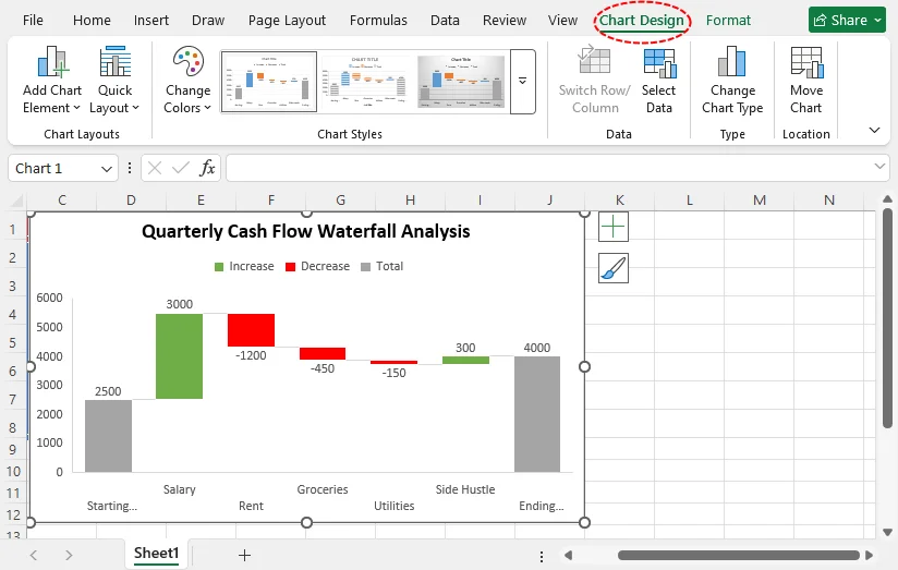
Click any chart column to open the Chart Design tab. Use pre-built color schemes or manually set unique colors for positive values, negative values, and total columns.
- Convention: Green for increases and red for decreases is a common standard that makes the chart instantly readable.
2. Add Data Labels
Click the (+) sign next to the chart and check Data Labels. This positions labels above positive columns and below negative columns to avoid overlap and improve readability.
3. Clean Up Chart Elements
Remove unnecessary gridlines, edit the chart title to be descriptive (e.g., "Quarterly Cash Flow Waterfall Analysis"), and adjust axis scales to eliminate wasted white space.
4. Update Chart Fonts & Sizing
Use consistent, professional fonts and resize the chart to fit your Excel dashboard, presentation, or report layout without cutting off labels.
Final Thoughts
Knowing how to create a waterfall chart in Excel helps you turn a static list of numbers into a dynamic narrative of cause and effect. The native Excel feature (available in 2016 and later) makes the process surprisingly accessible: prepare your data, insert the chart, and set your totals. For those who need automation, C# with Free Spire.XLS gives you a reliable way to create waterfall graph in Excel programmatically.
Whether you build it manually or through code, a well-designed waterfall chart empowers you to communicate complex financial insights clearly and confidently.
Frequently Asked Questions (FAQs)
Q: Can I create a waterfall chart for monthly sales data?
A: Absolutely! Waterfall charts are ideal for tracking monthly sales growth, monthly expenses, and incremental business performance changes over time.
Q: Does older Excel (2013 / 2010) support native waterfall charts?
A: No. Native waterfall chart functionality was introduced in Excel 2016. If you use an older version, you will need to build a manual workaround using stacked column charts. Upgrading your Excel version is recommended for native, low‑maintenance waterfall visuals.
Q: Can I export a waterfall chart as a picture?
A: Yes. Right-click the chart area and select Save as Picture. You can save it as PNG, JPEG, or GIF for use in presentations or reports. For a programming solution with Free Spire.XLS, refer to this guide: Convert Charts in Excel to Images in C#.
Q: Can I create a waterfall chart with multiple data series?
A: No. Excel’s native waterfall chart supports only one data series. If you need to show multiple series (e.g., comparing two years side by side), you must use a stacked column chart workaround with a hidden base series, or create two separate waterfall charts.