A radar chart, also known as a spider chart, is a graphical method of displaying multivariate data in two dimensions. Each spoke on the chart represents a different variable, and data points are plotted along these spokes. Radar charts are particularly useful for comparing the performance of different entities across several criteria. This article will demonstrate how to create a radar chart in Excel in Python using Spire.XLS for Python.
Install Spire.XLS for Python
This scenario requires Spire.XLS for Python and plum-dispatch v1.7.4. They can be easily installed in your Windows through the following pip command.
pip install Spire.XLS
If you are unsure how to install, please refer to this tutorial: How to Install Spire.XLS for Python on Windows
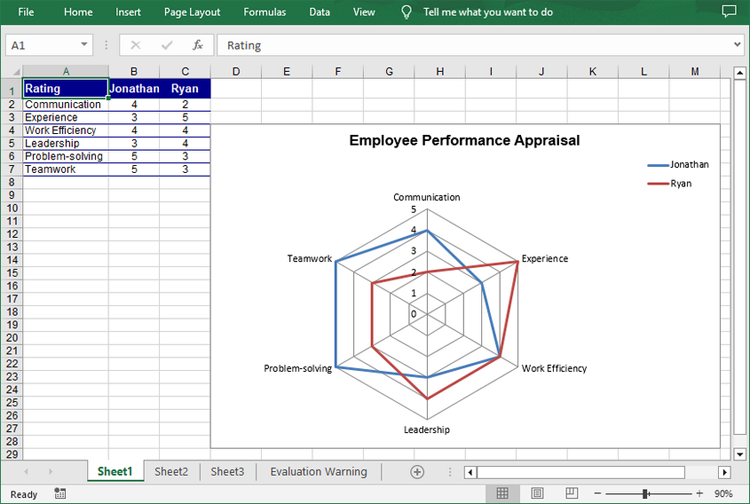
Create a Simple Radar Chart in Excel in Python
Spire.XLS for Python provides the Worksheet.Charts.Add(ExcelChartType.Radar) method to add a standard radar chart to an Excel worksheet. The following are the detailed steps:
- Create a Workbook instance.
- Get a specified worksheet using Workbook.Worksheets[] property.
- Add the chart data to specified cells and set the cell styles.
- Add a simple radar chart to the worksheet using Worksheet.Charts.Add(ExcelChartType.Radar) method.
- Set data range for the chart using Chart.DataRange property.
- Set the position, legend and title of the chart.
- Save the result file using Workbook.SaveToFile() method.
- Python
*from spire.xls import *
from spire.xls.common import *

# Create a Workbook instance
workbook = Workbook()

# Get the first worksheet
sheet = workbook.Worksheets[0]

# Add chart data to specified cells
sheet.Range["A1"].Value = "Rating"
sheet.Range["A2"].Value = "Communication"
sheet.Range["A3"].Value = "Experience"
sheet.Range["A4"].Value = "Work Efficiency"
sheet.Range["A5"].Value = "Leadership"
sheet.Range["A6"].Value = "Problem-solving"
sheet.Range["A7"].Value = "Teamwork"

sheet.Range["B1"].Value = "Jonathan"
sheet.Range["B2"].NumberValue = 4
sheet.Range["B3"].NumberValue = 3
sheet.Range["B4"].NumberValue = 4
sheet.Range["B5"].NumberValue = 3
sheet.Range["B6"].NumberValue = 5
sheet.Range["B7"].NumberValue = 5

sheet.Range["C1"].Value = "Ryan"
sheet.Range["C2"].NumberValue = 2
sheet.Range["C3"].NumberValue = 5
sheet.Range["C4"].NumberValue = 4
sheet.Range["C5"].NumberValue = 4
sheet.Range["C6"].NumberValue = 3
sheet.Range["C7"].NumberValue = 3

# Set font styles
sheet.Range["A1:C1"].Style.Font.IsBold = True
sheet.Range["A1:C1"].Style.Font.Size = 11
sheet.Range["A1:C1"].Style.Font.Color = Color.get_White()

# Set row height and column width
sheet.Rows[0].RowHeight = 20
sheet.Range["A1:C7"].Columns[0].ColumnWidth = 15

# Set cell styles
sheet.Range["A1:C1"].Style.Color = Color.get_DarkBlue()
sheet.Range["A2:C7"].Borders[BordersLineType.EdgeBottom].LineStyle = LineStyleType.Thin
sheet.Range["A2:C7"].Style.Borders[BordersLineType.EdgeBottom].Color = Color.get_DarkBlue()
sheet.Range["B1:C7"].HorizontalAlignment = HorizontalAlignType.Center
sheet.Range["A1:C7"].VerticalAlignment = VerticalAlignType.Center

# Add a radar chart to the worksheet
chart = sheet.Charts.Add(ExcelChartType.Radar)

# Set position of chart
chart.LeftColumn = 4
chart.TopRow = 4
chart.RightColumn = 14
chart.BottomRow = 29

# Set data range for the chart
chart.DataRange = sheet.Range["A1:C7"]
chart.SeriesDataFromRange = False

# Set and format chart title
chart.ChartTitle = "Employee Performance Appraisal"
chart.ChartTitleArea.IsBold = True
chart.ChartTitleArea.Size = 14
chart.PlotArea.Fill.Visible = False
chart.Legend.Position = LegendPositionType.Corner

# Save the result file
workbook.SaveToFile("CreateRadarChart.xlsx", ExcelVersion.Version2016)
workbook.Dispose()
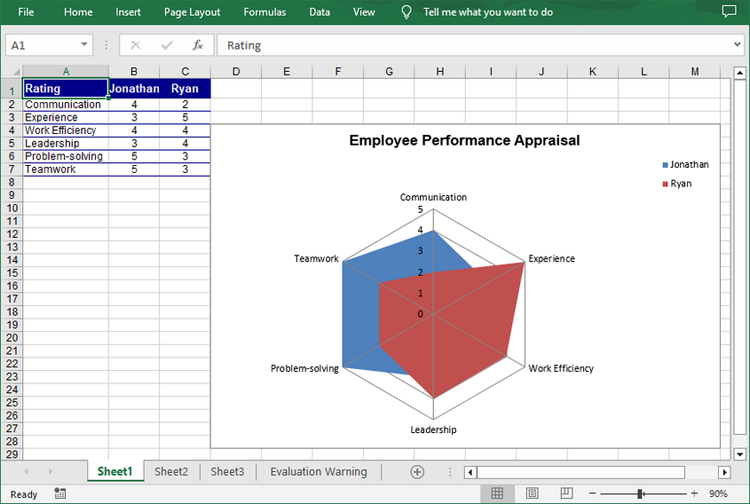
Create a Filled Radar Chart in Excel in Python
A filled radar chart is a variation of a standard radar chart, with the difference that the area between each data point is filled with color. The following are the steps to create a filled radar chart using Python:
- Create a Workbook instance.
- Get a specified worksheet using Workbook.Worksheets[] property.
- Add the chart data to specified cells and set the cell styles.
- Add a filled radar chart to the worksheet using Worksheet.Charts.Add(ExcelChartType.RadarFilled) method.
- Set data range for the chart using Chart.DataRange property.
- Set the position, legend and title of the chart.
- Save the result file using Workbook.SaveToFile() method.
- Python
from spire.xls import *
from spire.xls.common import *

# Create a Workbook instance
workbook = Workbook()

# Get the first worksheet
sheet = workbook.Worksheets[0]

# Add chart data to specified cells
sheet.Range["A1"].Value = "Rating"
sheet.Range["A2"].Value = "Communication"
sheet.Range["A3"].Value = "Experience"
sheet.Range["A4"].Value = "Work Efficiency"
sheet.Range["A5"].Value = "Leadership"
sheet.Range["A6"].Value = "Problem-solving"
sheet.Range["A7"].Value = "Teamwork"

sheet.Range["B1"].Value = "Jonathan"
sheet.Range["B2"].NumberValue = 4
sheet.Range["B3"].NumberValue = 3
sheet.Range["B4"].NumberValue = 4
sheet.Range["B5"].NumberValue = 3
sheet.Range["B6"].NumberValue = 5
sheet.Range["B7"].NumberValue = 5

sheet.Range["C1"].Value = "Ryan"
sheet.Range["C2"].NumberValue = 2
sheet.Range["C3"].NumberValue = 5
sheet.Range["C4"].NumberValue = 4
sheet.Range["C5"].NumberValue = 4
sheet.Range["C6"].NumberValue = 3
sheet.Range["C7"].NumberValue = 3

# Set font styles
sheet.Range["A1:C1"].Style.Font.IsBold = True
sheet.Range["A1:C1"].Style.Font.Size = 11
sheet.Range["A1:C1"].Style.Font.Color = Color.get_White()

# Set row height and column width
sheet.Rows[0].RowHeight = 20
sheet.Range["A1:C7"].Columns[0].ColumnWidth = 15

# Set cell styles
sheet.Range["A1:C1"].Style.Color = Color.get_DarkBlue()
sheet.Range["A2:C7"].Borders[BordersLineType.EdgeBottom].LineStyle = LineStyleType.Thin
sheet.Range["A2:C7"].Style.Borders[BordersLineType.EdgeBottom].Color = Color.get_DarkBlue()
sheet.Range["B1:C7"].HorizontalAlignment = HorizontalAlignType.Center
sheet.Range["A1:C7"].VerticalAlignment = VerticalAlignType.Center

# Add a filled radar chart to the worksheet
chart = sheet.Charts.Add(ExcelChartType.RadarFilled)

# Set position of chart
chart.LeftColumn = 4
chart.TopRow = 4
chart.RightColumn = 14
chart.BottomRow = 29

# Set data range for the chart
chart.DataRange = sheet.Range["A1:C7"]
chart.SeriesDataFromRange = False

# Set and format chart title
chart.ChartTitle = "Employee Performance Appraisal"
chart.ChartTitleArea.IsBold = True
chart.ChartTitleArea.Size = 14
chart.PlotArea.Fill.Visible = False
chart.Legend.Position = LegendPositionType.Corner

# Save the result file
workbook.SaveToFile("FilledRadarChart.xlsx", ExcelVersion.Version2016)
workbook.Dispose()
Apply for a Temporary License
If you'd like to remove the evaluation message from the generated documents, or to get rid of the function limitations, please request a 30-day trial license for yourself.