Insert Pictures and Text Boxes in a Chart in React with JavaScript
A chart makes the data clear; it says nothing about whose brand it belongs to, or what the one-line conclusion is. The usual fix in a report is a logo in one corner of the chart plus a note such as "Online: 1,208K USD in total" in the empty space — putting the conclusion where the reader's eye already is instead of starting another paragraph of prose. In Excel these elements belong to the chart's own shape layer, positioned against the chart rather than against the cells, and that is where code that adds them most often goes wrong. The plot area's default white background is a separate matter again: it can be swapped for a light texture so that the chart and the rest of the report look like one piece. Spire.XLS for JavaScript does all of this in the browser on top of WebAssembly, managing input and output files through a virtual file system (VFS), with no backend service required.
This article covers three key features:
For installation and project setup, see Integrating Spire.XLS for JavaScript in a React Project. The examples below assume Spire.XLS is installed and the WebAssembly module has been initialised.
Insert a picture into a chart
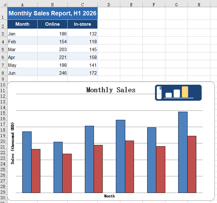
Charts in a report often need to carry a brand mark or a product shot. Once a picture is inside the chart it becomes part of it: move or resize the chart and the picture comes along, and copying the chart into another document or exporting it as an image keeps the picture too. A picture floating above the cells, by contrast, is out of alignment the moment the chart moves. The steps are:
- Load the font, the test data file and the picture into the VFS.
- Load the workbook with
workbook.LoadFromFileand take the first chart on the first worksheet. - Add the picture to the chart with
chart.Shapes.AddPicture; the value it returns is that shape. - Set the shape's
Left,Top,WidthandHeight. A shape inside a chart is measured against the chart itself: each of the four is in units of 1/4000 of the chart's width (Left,Width) or height (Top,Height). - Save the workbook with
workbook.SaveToFile.
The complete code example below shows how to insert a picture into a chart in React:
function App() {
  const addPictureInChart = async () => {
    // get the Spire.XLS WASM module
    const xlsModule = window.wasmModule?.spirexls;

    // check that the module is ready
    if (!xlsModule) {
      alert('Spire.Xls is not ready yet');
      return;
    }

    // load the font, the test data file and the picture into the VFS
    await window.spire.FetchFileToVFS('ARIAL.TTF', '/Library/Fonts/', `${process.env.PUBLIC_URL}/font/`);
    const inputFileName = 'ChartReport.xlsx';
    await window.spire.FetchFileToVFS(inputFileName, '', `${process.env.PUBLIC_URL}data/`);
    await window.spire.FetchFileToVFS('logo.png', '', `${process.env.PUBLIC_URL}static/image/`);

    // load the workbook
    const workbook = new xlsModule.Workbook();
    workbook.LoadFromFile({ fileName: inputFileName });

    // take the first worksheet and the chart on it
    const sheet = workbook.Worksheets.get(0);
    const chart = sheet.Charts.get(0);

    // insert the picture into the chart; the object returned is that picture
    const picture = chart.Shapes.AddPicture('logo.png');

    // place it in the top-right corner and scale it down. Left unset, the picture is laid out at
    // its natural pixel size and usually covers most of the chart
    picture.Left = 2850;   // 2850/4000 from the left edge of the chart
    picture.Top = 110;     // 110/4000 from the top edge of the chart
    picture.Width = 900;   // width 900/4000
    picture.Height = 532;  // height 532/4000, matching the 320x120 of the source picture

    // save the workbook
    const outputFileName = 'AddPictureInChart.xlsx';
    workbook.SaveToFile({ fileName: outputFileName });

    // dispose of the workbook to free resources
    workbook.Dispose();

    // read the result file from the VFS and start the download
    const fileArray = window.dotnetRuntime.Module.FS.readFile(outputFileName);
    const blob = new Blob([fileArray], { type: 'application/vnd.openxmlformats-officedocument.spreadsheetml.sheet' });
    const url = URL.createObjectURL(blob);
    const a = document.createElement('a');
    a.href = url;
    a.download = outputFileName;
    a.click();
    URL.revokeObjectURL(url);
  };

  return (
    <div style={{ textAlign: 'center', height: '300px' }}>
      <h1>Insert a Picture and a Text Box in a Chart</h1>
      <button id="add-picture-in-chart" onClick={addPictureInChart}>Add a picture to the chart</button>
    </div>
  );
}

export default App;
After running, inserting a picture into a chart:
Insert a text box into a chart
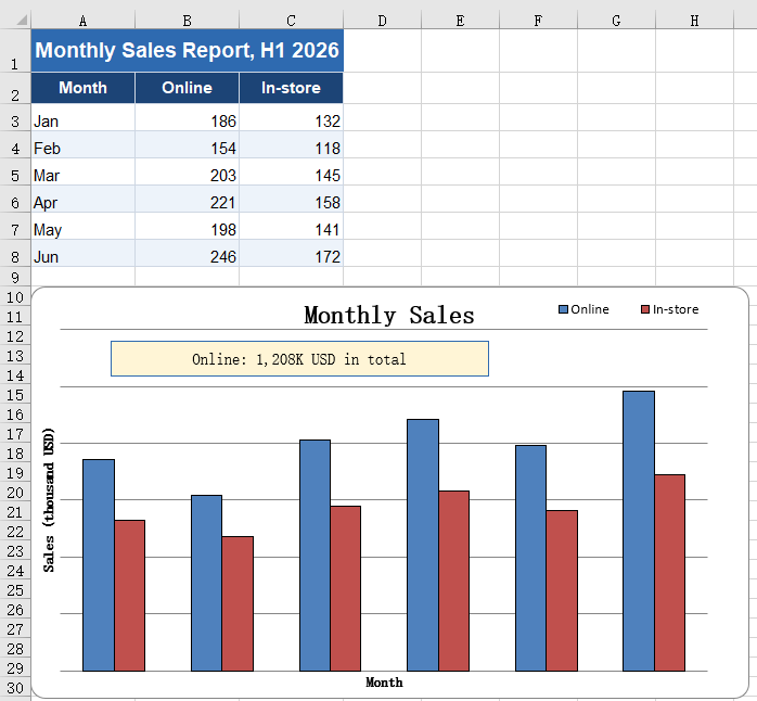
A chart shows a trend but cannot state a conclusion. A total for one series, a year-on-year remark or a callout on an outlier can all be written straight onto the chart with a text box, sparing the reader a second trip to the body text for the number. A text box is a shape inside the chart like the picture, measured on the same scale; the difference is that its size has to be sized to the length of the text. Leave it too narrow and the text wraps, and the wrapped line is clipped by the box height — it looks as though half the words went missing. The steps are:
- Load the font and the test data file into the VFS.
- Load the workbook with
workbook.LoadFromFileand take the first chart on the first worksheet. - Create the text box inside the chart with
chart.Shapes.AddTextBox. - Set
Left,Top,WidthandHeightaccording to the length of the text so that the content fits on one line. - Write the text into the
Textproperty. - Centre the text with
HAlignmentandVAlignment, taking the values fromxlsModule.CommentHAlignTypeandxlsModule.CommentVAlignType. - Set the fill, the border colour and the border width with
Fill.ForeColor,Line.ForeColorandLine.Weight, so that the box stands out on the chart. - Save the workbook with
workbook.SaveToFile.
The complete code example below shows how to insert a text box into a chart in React:
function App() {
  const addTextBoxInChart = async () => {
    // get the Spire.XLS WASM module
    const xlsModule = window.wasmModule?.spirexls;

    // check that the module is ready
    if (!xlsModule) {
      alert('Spire.Xls is not ready yet');
      return;
    }

    // load the font and the test data file into the VFS
    await window.spire.FetchFileToVFS('ARIAL.TTF', '/Library/Fonts/', `${process.env.PUBLIC_URL}/font/`);
    const inputFileName = 'ChartReport.xlsx';
    await window.spire.FetchFileToVFS(inputFileName, '', `${process.env.PUBLIC_URL}data/`);

    // load the workbook
    const workbook = new xlsModule.Workbook();
    workbook.LoadFromFile({ fileName: inputFileName });

    // take the first worksheet and the chart on it
    const sheet = workbook.Worksheets.get(0);
    const chart = sheet.Charts.get(0);

    // Add a text box to the chart
    const textBox = chart.Shapes.AddTextBox();

    // set the position and size of the text box, again in 1/4000 of the chart
    textBox.Left = 450;
    textBox.Top = 530;
    textBox.Width = 2100;
    textBox.Height = 340;

    // write the text
    textBox.Text = 'Online: 1,208K USD in total';

    // centre the text and give the box a pale yellow fill and a blue border so that it stands
    // out on the chart
    textBox.HAlignment = xlsModule.CommentHAlignType.Center;
    textBox.VAlignment = xlsModule.CommentVAlignType.Center;
    textBox.Fill.ForeColor = xlsModule.Color.FromArgb(255, 255, 245, 214);
    textBox.Line.ForeColor = xlsModule.Color.FromArgb(255, 46, 106, 176);
    textBox.Line.Weight = 1;

    // save the workbook
    const outputFileName = 'AddTextBoxInChart.xlsx';
    workbook.SaveToFile({ fileName: outputFileName });

    // dispose of the workbook to free resources
    workbook.Dispose();

    // read the result file from the VFS and start the download
    const fileArray = window.dotnetRuntime.Module.FS.readFile(outputFileName);
    const blob = new Blob([fileArray], { type: 'application/vnd.openxmlformats-officedocument.spreadsheetml.sheet' });
    const url = URL.createObjectURL(blob);
    const a = document.createElement('a');
    a.href = url;
    a.download = outputFileName;
    a.click();
    URL.revokeObjectURL(url);
  };

  return (
    <div style={{ textAlign: 'center', height: '300px' }}>
      <h1>Insert a Picture and a Text Box in a Chart</h1>
      <button id="add-textbox-in-chart" onClick={addTextBoxInChart}>Add a text box to the chart</button>
    </div>
  );
}

export default App;
After running, inserting a text box into a chart:
Fill the plot area with a picture
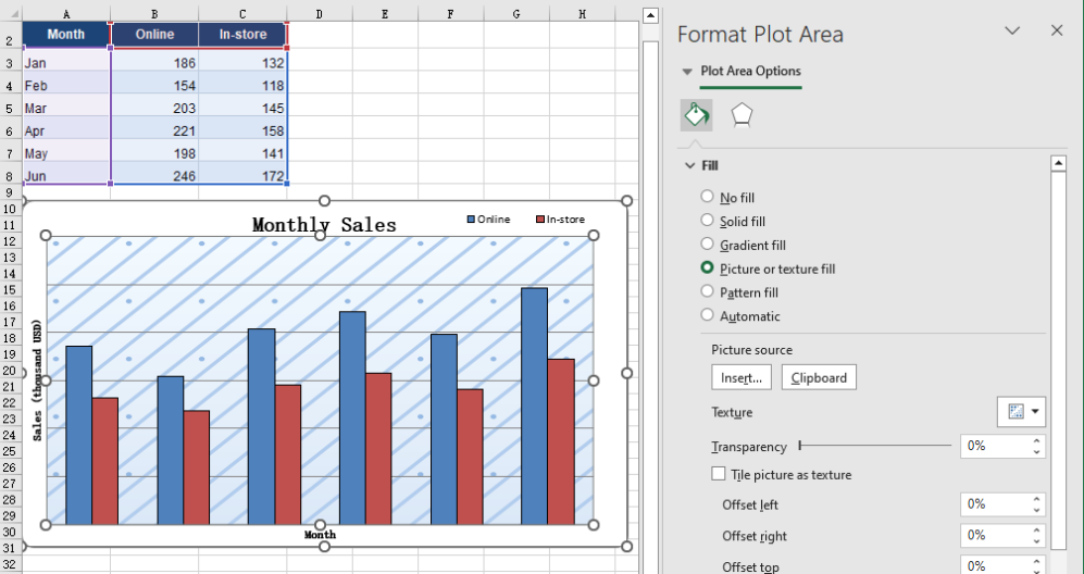
The white background of the plot area is the chart's default, and a report that has been around for a while starts to look the same everywhere. Replacing it with a light texture keeps the columns, the gridlines and the axis labels perfectly legible while giving the background some depth, and pulls the chart into the same visual language as the rest of the report. The fill and the picture shapes placed on the chart do not interfere with each other; the two can be used together. The steps are:
- Load the font, the test data file and the background picture into the VFS.
- Load the workbook with
workbook.LoadFromFileand take the first chart on the first worksheet. - Build an
xlsModule.Streamin memory from the background picture. - Hand it to
chart.PlotArea.Fill.CustomPicture; the second parameter,name, names an existing texture in the workbook, and'None'is passed when there is none. - Save the workbook with
workbook.SaveToFile.
The complete code example below shows how to fill the plot area with a picture in React:
function App() {
  const fillPlotAreaWithPicture = async () => {
    // get the Spire.XLS WASM module
    const xlsModule = window.wasmModule?.spirexls;

    // check that the module is ready
    if (!xlsModule) {
      alert('Spire.Xls is not ready yet');
      return;
    }

    // load the font, the test data file and the background picture into the VFS
    await window.spire.FetchFileToVFS('ARIAL.TTF', '/Library/Fonts/', `${process.env.PUBLIC_URL}/font/`);
    const inputFileName = 'ChartReport.xlsx';
    await window.spire.FetchFileToVFS(inputFileName, '', `${process.env.PUBLIC_URL}data/`);
    await window.spire.FetchFileToVFS('background.png', '', `${process.env.PUBLIC_URL}static/image/`);

    // load the workbook
    const workbook = new xlsModule.Workbook();
    workbook.LoadFromFile({ fileName: inputFileName });

    // take the first worksheet and the chart on it
    const sheet = workbook.Worksheets.get(0);
    const chart = sheet.Charts.get(0);

    // read the background picture into a memory stream and use it to fill the plot area
    const background = new xlsModule.Stream('background.png');
    chart.PlotArea.Fill.CustomPicture({ im: background, name: 'None' });

    // save the workbook
    const outputFileName = 'FillPlotAreaWithPicture.xlsx';
    workbook.SaveToFile({ fileName: outputFileName });

    // dispose of the workbook to free resources
    workbook.Dispose();

    // read the result file from the VFS and start the download
    const fileArray = window.dotnetRuntime.Module.FS.readFile(outputFileName);
    const blob = new Blob([fileArray], { type: 'application/vnd.openxmlformats-officedocument.spreadsheetml.sheet' });
    const url = URL.createObjectURL(blob);
    const a = document.createElement('a');
    a.href = url;
    a.download = outputFileName;
    a.click();
    URL.revokeObjectURL(url);
  };

  return (
    <div style={{ textAlign: 'center', height: '300px' }}>
      <h1>Insert a Picture and a Text Box in a Chart</h1>
      <button id="fill-plot-area" onClick={fillPlotAreaWithPicture}>Fill the plot area with a picture</button>
    </div>
  );
}

export default App;
After running, filling the plot area with a picture:
FAQ
Can I add an arrow or a callout line to a chart?
Solution: An arrow or a callout line that points at something has no API of its own, but a text box can stand in for one: stretch it into a thin strip, drop the fill and keep only the border, and place it where the callout should point.
When filling with a picture, is it the plot area or the whole chart that gets filled?
Cause: PlotArea.Fill and ChartArea.Fill are two different objects. The first covers only the region enclosed by the axes, leaving the chart title, the legend and the axis labels outside the picture. The second covers the entire chart, so the title and the legend end up on top of the picture as well.
Solution: Pick whichever one you need. After the fill, read Fill.FillType; it returns ShapeFillType.Picture on success:
// fill only the plot area: the title, the legend and the axis labels stay as they were
const background = new xlsModule.Stream('background.png');
chart.PlotArea.Fill.CustomPicture({ im: background, name: 'None' });

// fill the whole chart: the picture runs under the title and the legend
chart.ChartArea.Fill.CustomPicture({ im: new xlsModule.Stream('background.png'), name: 'None' });
Get a Free License
Spire.XLS for JavaScript offers a 30-day full-featured free trial license with no functional limitations. Apply here to evaluate before purchasing.
Create Excel Charts from Discontinuous or No Data in React
Worksheet data is rarely a tidy rectangle. Detail rows are interrupted by subtotal lines, group headings and notes, and the chart is meant to draw the detail alone; other numbers never reach a cell at all, because they come back from an API, are computed in code, or are simply a set of targets for this one report. Both cases defeat the usual routine of selecting a block and inserting a chart. Spire.XLS for JavaScript does this in the browser on top of WebAssembly, managing input and output files through a virtual file system (VFS), with no backend service required.
This article covers two key features:
For installation and project setup, see Integrating Spire.XLS for JavaScript in a React Project. The examples below assume Spire.XLS is installed and the WebAssembly module has been initialised.
Create a chart from a discontinuous data source
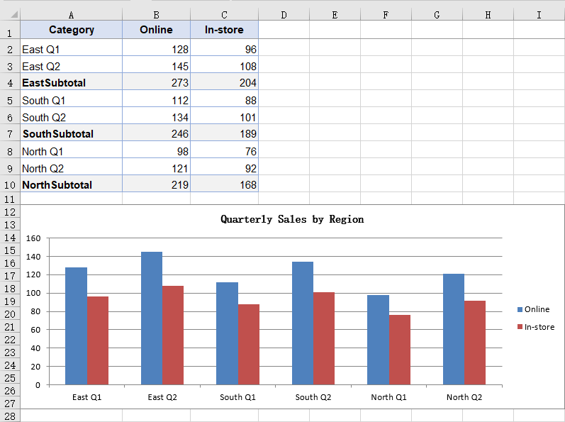
Subtotal rows, group headings and notes all cut a table of details into several blocks. Selecting the whole column and inserting a chart makes no distinction between them and the detail rows, so they are drawn as columns too: in the sample data a subtotal follows every two quarters, and reading the whole column turns six columns into nine and roughly doubles the height of every region. A series can be given its data as several non-adjacent blocks joined into a single reference, so the chart takes only the rows inside those blocks and skips over the rest. The table then needs no rearranging for the sake of the chart, and the subtotal rows can stay where they are. The steps are:
- Load the font and the test data file into the VFS.
- Load the workbook with
workbook.LoadFromFileand get the first worksheet withworkbook.Worksheets.get(0). - Add a column chart with
sheet.Charts.Addand setchart.SeriesDataFromRangetofalse, declaring that the series data is supplied block by block in code rather than taken fromchart.DataRange. - Add a series with
chart.Series.Addand setserie.Nameto theValueof the header cell. - Take each region's quarter rows with
Range.getand join them withAddCombinedRange, producing one reference for the category labels and one for the values. - Repeat the same joins for the second series so both share the same category labels, then save the workbook.
The complete code example below shows how to create a chart from a discontinuous data source in React:
function App() {
  const chartFromDiscontinuousData = async () => {
    // Get the Spire.XLS WASM module
    const xlsModule = window.wasmModule?.spirexls;

    // Check that the module is ready
    if (!xlsModule) {
      alert('Spire.Xls is not ready yet');
      return;
    }

    // Load the font and the sample workbook into the VFS
    await window.spire.FetchFileToVFS('ARIAL.TTF', '/Library/Fonts/', `${process.env.PUBLIC_URL}/font/`);
    const inputFileName = 'ChartSourceData.xlsx';
    await window.spire.FetchFileToVFS(inputFileName, '', `${process.env.PUBLIC_URL}data/`);

    // Load the workbook and get the first worksheet
    const workbook = new xlsModule.Workbook();
    workbook.LoadFromFile({ fileName: inputFileName });
    const sheet = workbook.Worksheets.get(0);

    // Add a column chart; the series data is given block by block in code, not as one range
    const chart = sheet.Charts.Add({ chartType: xlsModule.ExcelChartType.ColumnClustered });
    chart.ChartTitle = "Quarterly Sales by Region";
    chart.ChartTitleArea.Size = 12;
    chart.SeriesDataFromRange = false;

    // Place the chart on the worksheet
    chart.TopRow = 12;
    chart.BottomRow = 28;
    chart.LeftColumn = 1;
    chart.RightColumn = 10;

    // Join the three regions' quarter rows into one reference, skipping the subtotal rows
    const categoryLabels = sheet.Range.get("A2:A3")
      .AddCombinedRange(sheet.Range.get("A5:A6"))
      .AddCombinedRange(sheet.Range.get("A8:A9"));

    // Online series: the name comes from the header, the values are joined the same way
    const onlineSerie = chart.Series.Add();
    onlineSerie.Name = sheet.Range.get("B1").Value;
    onlineSerie.CategoryLabels = categoryLabels;
    onlineSerie.Values = sheet.Range.get("B2:B3")
      .AddCombinedRange(sheet.Range.get("B5:B6"))
      .AddCombinedRange(sheet.Range.get("B8:B9"));

    // In-store series: it shares the same category labels
    const storeSerie = chart.Series.Add();
    storeSerie.Name = sheet.Range.get("C1").Value;
    storeSerie.CategoryLabels = categoryLabels;
    storeSerie.Values = sheet.Range.get("C2:C3")
      .AddCombinedRange(sheet.Range.get("C5:C6"))
      .AddCombinedRange(sheet.Range.get("C8:C9"));

    // Save the workbook
    const outputFileName = "DiscontinuousData.xlsx";
    workbook.SaveToFile({ fileName: outputFileName });

    // Dispose of the workbook object to free resources
    workbook.Dispose();

    // Read the result file from the VFS and trigger the download
    const fileArray = window.dotnetRuntime.Module.FS.readFile(outputFileName);
    const blob = new Blob([fileArray], { type: 'application/vnd.openxmlformats-officedocument.spreadsheetml.sheet' });
    const url = URL.createObjectURL(blob);
    const a = document.createElement('a');
    a.href = url;
    a.download = outputFileName;
    a.click();
    URL.revokeObjectURL(url);
  };

  return (
    <div style={{ textAlign: 'center', height: '300px' }}>
      <h1>Discontinuous Data Chart</h1>
      <button id="discontinuous-data" onClick={chartFromDiscontinuousData}>Create a chart from a discontinuous source</button>
    </div>
  );
}

export default App;
After running, the chart created from a discontinuous data source:
Create a chart without a data source
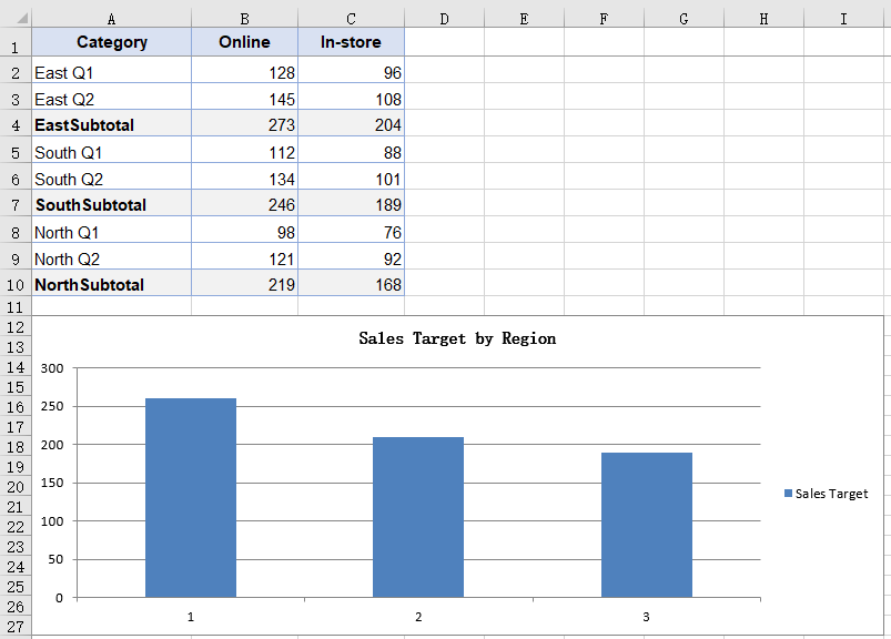
A chart normally takes its data from cells, but not always: a target may live in a configuration file, a summary figure may come back from an API, or the numbers may just be a set of constants for a demonstration. None of them has landed in the worksheet, so there is no range for the chart to point at. A series can carry its values inside itself instead, which lets the chart stand without any worksheet data behind it; the numbers follow the code and are regenerated with it, so no copy has to be maintained in the sheet for the sake of the chart. Because the values come from nowhere on the sheet, the chart carries no text categories either, and the horizontal axis is numbered 1, 2, 3. The steps are:
- Load the font and the test data file into the VFS.
- Load the workbook with
workbook.LoadFromFileand get the first worksheet withworkbook.Worksheets.get(0); the new chart still has to hang on an existing worksheet. - Add a column chart with
sheet.Charts.Add, and set the chart title and position. - Add a series with
chart.Series.Addand setserie.Nameto the series name. - Box each number with
xlsModule.Int32.Create, put them in order intoserie.EnteredDirectlyValues, and save the workbook.
The complete code example below shows how to create a chart without a data source in React:
function App() {
  const chartWithoutSourceData = async () => {
    // Get the Spire.XLS WASM module
    const xlsModule = window.wasmModule?.spirexls;

    // Check that the module is ready
    if (!xlsModule) {
      alert('Spire.Xls is not ready yet');
      return;
    }

    // Load the font and the sample workbook into the VFS
    await window.spire.FetchFileToVFS('ARIAL.TTF', '/Library/Fonts/', `${process.env.PUBLIC_URL}/font/`);
    const inputFileName = 'ChartSourceData.xlsx';
    await window.spire.FetchFileToVFS(inputFileName, '', `${process.env.PUBLIC_URL}data/`);

    // Load the workbook and get the first worksheet
    const workbook = new xlsModule.Workbook();
    workbook.LoadFromFile({ fileName: inputFileName });
    const sheet = workbook.Worksheets.get(0);

    // Add a column chart; this time the numbers come from no cell at all
    const chart = sheet.Charts.Add({ chartType: xlsModule.ExcelChartType.ColumnClustered });
    chart.ChartTitle = "Sales Target by Region";
    chart.ChartTitleArea.Size = 12;

    // Place the chart on the worksheet
    chart.TopRow = 12;
    chart.BottomRow = 28;
    chart.LeftColumn = 1;
    chart.RightColumn = 10;

    // Add a series and write the numbers into EnteredDirectlyValues one by one
    // No category labels are given, so the chart numbers them 1, 2, 3
    const targetSerie = chart.Series.Add();
    targetSerie.Name = "Sales Target";
    targetSerie.EnteredDirectlyValues = [
      xlsModule.Int32.Create(260),
      xlsModule.Int32.Create(210),
      xlsModule.Int32.Create(190),
    ];

    // Save the workbook
    const outputFileName = "NoSourceData.xlsx";
    workbook.SaveToFile({ fileName: outputFileName });

    // Dispose of the workbook object to free resources
    workbook.Dispose();

    // Read the result file from the VFS and trigger the download
    const fileArray = window.dotnetRuntime.Module.FS.readFile(outputFileName);
    const blob = new Blob([fileArray], { type: 'application/vnd.openxmlformats-officedocument.spreadsheetml.sheet' });
    const url = URL.createObjectURL(blob);
    const a = document.createElement('a');
    a.href = url;
    a.download = outputFileName;
    a.click();
    URL.revokeObjectURL(url);
  };

  return (
    <div style={{ textAlign: 'center', height: '300px' }}>
      <h1>Chart Without a Data Source</h1>
      <button id="no-source-data" onClick={chartWithoutSourceData}>Create a chart without a data source</button>
    </div>
  );
}

export default App;
After running, the chart created without a data source:
FAQ
Does the series name have to point at a cell?
Cause: serie.Name takes a plain string. Whatever you assign becomes the series name and is what the legend shows; after saving it sits in the series itself rather than in a reference to a cell. Reading the Value of a header cell is just another way to get there, not a requirement. The values and the category labels still have to come from a range — only the name can stand free of one.
Solution: assign the text straight to serie.Name:
const serie = chart.Series.Add();
serie.Name = "Sales Target";
serie.CategoryLabels = sheet.Range.get("A2:A3").AddCombinedRange(sheet.Range.get("A5:A6")).AddCombinedRange(sheet.Range.get("A8:A9"));
serie.Values = sheet.Range.get("B2:B3").AddCombinedRange(sheet.Range.get("B5:B6")).AddCombinedRange(sheet.Range.get("B8:B9"));
Do both series need their own category labels?
Cause: CategoryLabels belongs to the series itself. When a second series is added it does not pick up the setting from the one before it, so it has to be assigned again.
Solution: join the blocks once, keep the result in a variable and point each series at it, instead of writing AddCombinedRange out twice:
const labels = sheet.Range.get("A2:A3")
  .AddCombinedRange(sheet.Range.get("A5:A6"))
  .AddCombinedRange(sheet.Range.get("A8:A9"));

onlineSerie.CategoryLabels = labels;
storeSerie.CategoryLabels = labels;
Get a Free License
Spire.XLS for JavaScript offers a 30-day full-featured free trial license with no functional limitations. Apply here to evaluate before purchasing.
Format Excel Chart Axes in React with JavaScript
When a chart is inserted, Excel determines a scale automatically: the lower and upper bounds of the value axis and its intervals are all derived from the data range. These defaults are adequate in most cases, but they fall short in two situations. First, when the data is concentrated in a narrow band that sits well away from zero, the automatic scale lifts the bottom of the axis to just below the data, so a modest fluctuation is drawn as a near full-height swing and the differences between the columns bear no proportion to the differences between the values. Second, because the tick labels follow the formatting of the source cells, values carrying decimals fill the value axis with fractional digits, which are both harder to read and wider on the page. Axis formatting addresses both: setting the scale and the units keeps the axis from shifting with the data, holds the column heights in proportion to the values, and places every chart on the same measure, choosing the tick marks and the label position controls where the readings fall, rewriting the number format makes the labels easier to compare, and adding titles to both axes tells the reader what each direction represents. Spire.XLS for JavaScript does all of this in the browser on top of WebAssembly, managing input and output files through a virtual file system (VFS), with no backend service required.
This article covers two key features:
For installation and project setup, see Integrating Spire.XLS for JavaScript in a React Project. The examples below assume Spire.XLS is installed and the WebAssembly module has been initialised.
Format the value axis scale
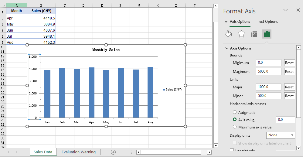
An automatic scale is derived by Excel from the data range, and it is chosen to make the chart look even rather than to make the readings easy to compare. When the data is concentrated in a narrow band that sits well away from zero, that derivation lifts the bottom of the axis to just below the data: with the axis no longer starting at 0, the columns only show their differences from one another, and a modest fluctuation is drawn as a near full-height swing, out of proportion to the values behind it. The tick labels, too, follow the display format of the source cells by default, so data carrying decimals produces a run of fractional values along the value axis, which is both harder to read and wider on the page. Setting the value axis scale by hand addresses both at once: once the scale and the intervals are given by the code, the bottom and top of the axis no longer shift with the data, the column heights stay in proportion to the values, and a set of charts can be measured against the same ruler; once the label format is independent of the source cells, the readings are more even as well. The steps are:
- Load the font and the test data file into the VFS.
- Load the workbook with
workbook.LoadFromFileand get the first worksheet withworkbook.Worksheets.get(0). - Add a column chart with
sheet.Charts.Add, pointchart.DataRangeat the sales column, and assign the month column toserie.CategoryLabels. - On
chart.PrimaryValueAxis, set the scale withMinValueandMaxValue, and the steps of the major and minor divisions withMajorUnitandMinorUnit. - Set the types of the major and minor tick marks with
MajorTickMarkandMinorTickMark, and the position of the tick labels withTickLabelPosition. - Set
NumberFormatto#,##0for the label number format, setIsSourceLinkedtofalseto unlink the format from the source cells, and save the workbook.
The complete code example below shows how to format the value axis scale in React:
function App() {
  const formatValueAxis = async () => {
    // Get the Spire.XLS WASM module
    const xlsModule = window.wasmModule?.spirexls;

    // Check that the module is ready
    if (!xlsModule) {
      alert('Spire.Xls is not ready yet');
      return;
    }

    // Load the font and the sample workbook into the VFS
    await window.spire.FetchFileToVFS('ARIAL.TTF', '/Library/Fonts/', `${process.env.PUBLIC_URL}/font/`);
    const inputFileName = 'ChartAxisData.xlsx';
    await window.spire.FetchFileToVFS(inputFileName, '', `${process.env.PUBLIC_URL}data/`);

    // Load the workbook and get the first worksheet
    const workbook = new xlsModule.Workbook();
    workbook.LoadFromFile({ fileName: inputFileName });
    const sheet = workbook.Worksheets.get(0);

    // Add a column chart whose data range is the sales column
    const chart = sheet.Charts.Add({ chartType: xlsModule.ExcelChartType.ColumnClustered });
    chart.ChartTitle = "Monthly Sales";
    chart.ChartTitleArea.IsBold = true;
    chart.ChartTitleArea.Size = 12;
    chart.DataRange = sheet.Range.get("B1:B9");
    chart.SeriesDataFromRange = false;
    chart.PlotArea.Visible = false;

    // Place the chart on the worksheet
    chart.TopRow = 10;
    chart.BottomRow = 28;
    chart.LeftColumn = 2;
    chart.RightColumn = 10;

    // Take the series and use the month column as its category labels
    const serie = chart.Series.get(0);
    serie.CategoryLabels = sheet.Range.get("A2:A9");

    // Set the value axis bounds: 0 at the bottom, 5000 at the top
    const valueAxis = chart.PrimaryValueAxis;
    valueAxis.MinValue = 0;
    valueAxis.MaxValue = 5000;

    // Set the major unit to 1000 and the minor unit to 500
    valueAxis.MajorUnit = 1000;
    valueAxis.MinorUnit = 500;

    // Major tick marks outside the axis, minor tick marks inside
    valueAxis.MajorTickMark = xlsModule.TickMarkType.TickMarkOutside;
    valueAxis.MinorTickMark = xlsModule.TickMarkType.TickMarkInside;

    // Tick labels sit next to the axis, which the category axis crosses at 0
    valueAxis.TickLabelPosition = xlsModule.TickLabelPositionType.TickLabelPositionNextToAxis;
    valueAxis.CrossesAt = 0;

    // Give the tick labels a thousands separator and drop the decimals
    valueAxis.NumberFormat = "#,##0";

    // Unlink the source format so the tick labels follow NumberFormat
    valueAxis.IsSourceLinked = false;

    // Save the workbook
    const outputFileName = "AxisFormat.xlsx";
    workbook.SaveToFile({ fileName: outputFileName });

    // Dispose of the workbook object to free resources
    workbook.Dispose();

    // Read the result file from the VFS and trigger the download
    const fileArray = window.dotnetRuntime.Module.FS.readFile(outputFileName);
    const blob = new Blob([fileArray], { type: 'application/vnd.openxmlformats-officedocument.spreadsheetml.sheet' });
    const url = URL.createObjectURL(blob);
    const a = document.createElement('a');
    a.href = url;
    a.download = outputFileName;
    a.click();
    URL.revokeObjectURL(url);
  };

  return (
    <div style={{ textAlign: 'center', height: '300px' }}>
      <h1>Value Axis Scale</h1>
      <button onClick={formatValueAxis}>Start</button>
    </div>
  );
}

export default App;
After running, the effect of formatting the value axis scale:
Add axis titles
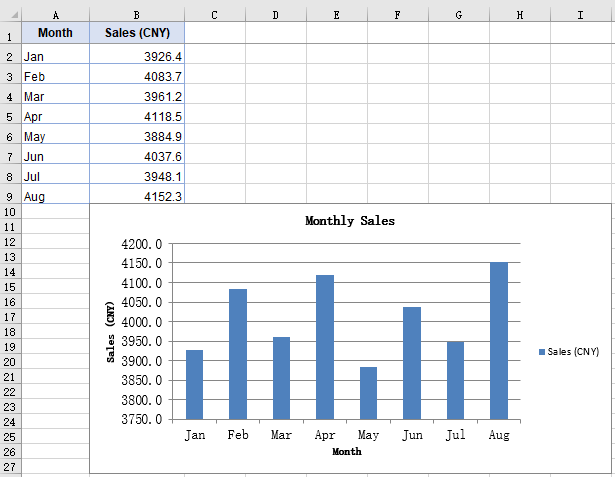
The axes carry only their own divisions and categories, so the chart itself does not state what each data point represents or what unit the numbers are in; opening the file again after some time, a reader often has to check the chart title first to confirm the subject. Axis titles supply precisely that context: the category axis title states what each data point represents, the value axis title states the unit of the numbers, and together with the chart title they complete the chart so that it can be read without its surrounding context. The size of an axis title can also be adjusted separately, which keeps it distinct from the chart title. The steps are:
- Load the font and the test data file into the VFS.
- Load the workbook with
workbook.LoadFromFileand get the first worksheet withworkbook.Worksheets.get(0). - Add a column chart with
sheet.Charts.Add, pointchart.DataRangeat the sales column, and assign the month column toserie.CategoryLabels. - Assign the title text to
chart.PrimaryCategoryAxis.Titleandchart.PrimaryValueAxis.Titlerespectively. - Set both titles to size 12 through the
Font.Sizeof the two axis objects, and save the workbook.
The complete code example below shows how to add titles to the axes in React:
function App() {
  const setAxisTitle = async () => {
    // Get the Spire.XLS WASM module
    const xlsModule = window.wasmModule?.spirexls;

    // Check that the module is ready
    if (!xlsModule) {
      alert('Spire.Xls is not ready yet');
      return;
    }

    // Load the font and the sample workbook into the VFS
    await window.spire.FetchFileToVFS('ARIAL.TTF', '/Library/Fonts/', `${process.env.PUBLIC_URL}/font/`);
    const inputFileName = 'ChartAxisData.xlsx';
    await window.spire.FetchFileToVFS(inputFileName, '', `${process.env.PUBLIC_URL}data/`);

    // Load the workbook and get the first worksheet
    const workbook = new xlsModule.Workbook();
    workbook.LoadFromFile({ fileName: inputFileName });
    const sheet = workbook.Worksheets.get(0);

    // Add a column chart whose data range is the sales column
    const chart = sheet.Charts.Add({ chartType: xlsModule.ExcelChartType.ColumnClustered });
    chart.ChartTitle = "Monthly Sales";
    chart.ChartTitleArea.IsBold = true;
    chart.ChartTitleArea.Size = 12;
    chart.DataRange = sheet.Range.get("B1:B9");
    chart.SeriesDataFromRange = false;
    chart.PlotArea.Visible = false;

    // Place the chart on the worksheet
    chart.TopRow = 10;
    chart.BottomRow = 28;
    chart.LeftColumn = 2;
    chart.RightColumn = 10;

    // Take the series and use the month column as its category labels
    const serie = chart.Series.get(0);
    serie.CategoryLabels = sheet.Range.get("A2:A9");

    // Give the category axis and the value axis their titles
    chart.PrimaryCategoryAxis.Title = "Month";
    chart.PrimaryValueAxis.Title = "Sales (CNY)";

    // Set both axis titles to size 12
    chart.PrimaryCategoryAxis.Font.Size = 12;
    chart.PrimaryValueAxis.Font.Size = 12;

    // Save the workbook
    const outputFileName = "AxisTitle.xlsx";
    workbook.SaveToFile({ fileName: outputFileName });

    // Dispose of the workbook object to free resources
    workbook.Dispose();

    // Read the result file from the VFS and trigger the download
    const fileArray = window.dotnetRuntime.Module.FS.readFile(outputFileName);
    const blob = new Blob([fileArray], { type: 'application/vnd.openxmlformats-officedocument.spreadsheetml.sheet' });
    const url = URL.createObjectURL(blob);
    const a = document.createElement('a');
    a.href = url;
    a.download = outputFileName;
    a.click();
    URL.revokeObjectURL(url);
  };

  return (
    <div style={{ textAlign: 'center', height: '300px' }}>
      <h1>Axis Titles</h1>
      <button onClick={setAxisTitle}>Start</button>
    </div>
  );
}

export default App;
After running, the effect of adding axis titles:
FAQ
MinorUnit is set but no minor tick marks show up
Cause: MinorUnit determines only the interval of the minor divisions — how many steps each major division is split into. Whether those steps are drawn as short strokes is decided by a separate property. MinorTickMark defaults to TickMarkNone, and in that state the interval is in effect but no strokes are drawn.
Fix: Set MinorTickMark at the same time, taking its value from TickMarkType:
const valueAxis = chart.PrimaryValueAxis;
valueAxis.MinorUnit = 500;
valueAxis.MinorTickMark = xlsModule.TickMarkType.TickMarkInside;
CrossesAt is set but the category axis does not move
Cause: CrossesAt determines where the category axis meets the value axis, and the move becomes visible only when it is set to a position on the scale other than the one the category axis already occupies. With the value axis starting at 0, the category axis already sits at the bottom of the axis line, so setting CrossesAt to 0 leaves it in place.
Fix: Set CrossesAt to another position on the value axis scale, 3000 for example, and the category axis moves up to that level:
const valueAxis = chart.PrimaryValueAxis;
valueAxis.MinValue = 0;
valueAxis.MaxValue = 5000;
valueAxis.CrossesAt = 3000;
Get a Free License
Spire.XLS for JavaScript offers a 30-day full-featured free trial license with no functional limitations. Apply here to evaluate before purchasing.
Add Sparklines in Excel in React with JavaScript
A chart makes the trend behind one set of numbers visible, but it is far less good at showing the trends behind dozens of sets at once. Sparklines are built for exactly that: each one compresses a trend into a single cell, with no axes and no legend, so a whole column of trends can be taken in at a glance. Give every region's quarterly sales figures their own sparkline and you can see which row is climbing and which one turned back long before you could read it out of a column of numbers. Spire.XLS for JavaScript performs this directly in the browser through WebAssembly, managing input and output files with a virtual file system (VFS) and requiring no backend service.
This article covers three feature points:
- Add line sparklines
- Add column sparklines and highlight the high and low points
- Clear sparklines from a worksheet
For installation and project setup, see Integrating Spire.XLS for JavaScript in a React Project. The examples below assume Spire.XLS is installed and the WebAssembly module has been initialized.
Add Line Sparklines
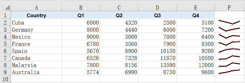
A line sparkline joins a row of values in order into a single thin line, making the rise and fall of the trend immediately readable. It occupies no cell of its own and hides none of the numbers underneath, so a single narrow column can carry the trends of dozens of rows at once, and which one is climbing and which one turned back is there at a glance. A sparkline cannot exist outside a sparkline group, and the group decides the type, colors and marker settings shared by the whole batch. The steps are:
- Load the font and the sample data file into the VFS.
- Load the workbook and get the first worksheet.
- Create a line sparkline group with
SparklineGroups.AddGroup()and set the line weight and marker color. - Get the group's sparkline collection with
Add()and add one sparkline per data row in column F. - Save the workbook.
The following is the complete code example, showing how to add line sparklines to Excel data in React:
function App() {
  const addLineSparkline = async () => {
    // Get the Spire.XLS WASM module
    const xlsModule = window.wasmModule?.spirexls;

    // Check if the module is ready
    if (!xlsModule) {
      alert('Spire.Xls is not ready yet');
      return;
    }

    // Load the font and the sample data file into the VFS
    await window.spire.FetchFileToVFS('ARIAL.TTF', '/Library/Fonts/', `${process.env.PUBLIC_URL}/font/`);
    const inputFileName = 'SparklineData.xlsx';
    await window.spire.FetchFileToVFS(inputFileName, '', `${process.env.PUBLIC_URL}data/`);

    // Load the workbook and get the first worksheet
    const workbook = new xlsModule.Workbook();
    workbook.LoadFromFile({ fileName: inputFileName });
    const sheet = workbook.Worksheets.get(0);

    // Create a line sparkline group on the worksheet
    const sparklineGroup = sheet.SparklineGroups.AddGroup({ sparklineType: xlsModule.SparklineType.Line });

    // Style the line: thicker stroke and visible data point markers
    sparklineGroup.LineWeight = 1.5;
    sparklineGroup.ShowMarkers = true;
    sparklineGroup.MarkersColor = xlsModule.Color.get_Red();

    // Get the sparkline collection of the group
    const sparklines = sparklineGroup.Add();

    // Add one sparkline per data row in column F
    for (let row = 2; row <= 9; row++) {
      sparklines.Add({
        dataRange: sheet.Range.get(`B${row}:E${row}`),
        referenceRange: sheet.Range.get(`F${row}`),
      });
    }

    // Save the workbook
    const outputFileName = 'AddLineSparkline.xlsx';
    workbook.SaveToFile({ fileName: outputFileName });

    // Dispose of the workbook object to free resources
    workbook.Dispose();

    // Read the result file from the VFS and trigger the download
    const fileArray = window.dotnetRuntime.Module.FS.readFile(outputFileName);
    const blob = new Blob([fileArray], { type: 'application/vnd.openxmlformats-officedocument.spreadsheetml.sheet' });
    const url = URL.createObjectURL(blob);
    const a = document.createElement('a');
    a.href = url;
    a.download = outputFileName;
    a.click();
    URL.revokeObjectURL(url);
  };

  return (
    <div style={{ textAlign: 'center', height: '300px' }}>
      <h1>Line Sparkline</h1>
      <button onClick={addLineSparkline}>Start</button>
    </div>
  );
}

export default App;
After running, the effect of adding line sparklines:
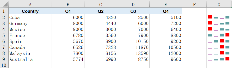
Add Column Sparklines and Highlight the High and Low Points
A column sparkline represents values as a row of thin bars, which reads more directly than a line when you are comparing several numbers within the same row. It works the same way as the line sparkline, except that the color lands on each bar itself rather than on a connecting stroke.
What really makes column sparklines useful is the high and low point markers: the strongest and the weakest quarter in each row are picked out and colored on their own, so you no longer have to compare the numbers by eye to see where a row peaked and where it fell away. The steps are:
- Load the font and the sample data file into the VFS.
- Load the workbook and get the first worksheet.
- Create a column sparkline group with
SparklineGroups.AddGroup()(passingSparklineType.Column) and set the series color withSparklineColor. - Turn on
ShowHighPointandShowLowPoint, and give each its own color withHighPointColorandLowPointColor. - Get the group's sparkline collection with
Add(), add one sparkline per data row in column G and save the workbook.
The following is the complete code example, showing how to add column sparklines to Excel data and highlight the high and low points in React:
function App() {
  const addColumnSparkline = async () => {
    // Get the Spire.XLS WASM module
    const xlsModule = window.wasmModule?.spirexls;

    // Check if the module is ready
    if (!xlsModule) {
      alert('Spire.Xls is not ready yet');
      return;
    }

    // Load the font and the sample data file into the VFS
    await window.spire.FetchFileToVFS('ARIAL.TTF', '/Library/Fonts/', `${process.env.PUBLIC_URL}/font/`);
    const inputFileName = 'SparklineData.xlsx';
    await window.spire.FetchFileToVFS(inputFileName, '', `${process.env.PUBLIC_URL}data/`);

    // Load the workbook and get the first worksheet
    const workbook = new xlsModule.Workbook();
    workbook.LoadFromFile({ fileName: inputFileName });
    const sheet = workbook.Worksheets.get(0);

    // Create a column sparkline group
    const sparklineGroup = sheet.SparklineGroups.AddGroup({ sparklineType: xlsModule.SparklineType.Column });

    // Set the color of the sparkline itself
    sparklineGroup.SparklineColor = xlsModule.Color.get_CadetBlue();

    // Turn on the high and low point markers and give each its own color
    sparklineGroup.ShowHighPoint = true;
    sparklineGroup.HighPointColor = xlsModule.Color.get_Red();
    sparklineGroup.ShowLowPoint = true;
    sparklineGroup.LowPointColor = xlsModule.Color.get_Purple();

    const sparklines = sparklineGroup.Add();

    // Add one sparkline per data row in column G
    for (let row = 2; row <= 9; row++) {
      sparklines.Add({
        dataRange: sheet.Range.get(`B${row}:E${row}`),
        referenceRange: sheet.Range.get(`G${row}`),
      });
    }

    // Save the workbook
    const outputFileName = 'AddColumnSparkline.xlsx';
    workbook.SaveToFile({ fileName: outputFileName });

    // Dispose of the workbook object to free resources
    workbook.Dispose();

    // Read the result file from the VFS and trigger the download
    const fileArray = window.dotnetRuntime.Module.FS.readFile(outputFileName);
    const blob = new Blob([fileArray], { type: 'application/vnd.openxmlformats-officedocument.spreadsheetml.sheet' });
    const url = URL.createObjectURL(blob);
    const a = document.createElement('a');
    a.href = url;
    a.download = outputFileName;
    a.click();
    URL.revokeObjectURL(url);
  };

  return (
    <div style={{ textAlign: 'center', height: '300px' }}>
      <h1>Column Sparkline</h1>
      <button onClick={addColumnSparkline}>Start</button>
    </div>
  );
}

export default App;
After running, the effect of adding column sparklines and highlighting the high and low points:
Clear Sparklines from a Worksheet
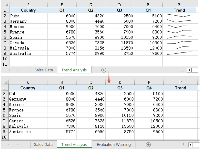
When a report is revised or the figures are restated, the sparklines drawn beside the old numbers may no longer apply and need to be removed and drawn again. Sparkline groups are held by the worksheet, and once they are gone the cells return to their ordinary state, with their data and other formatting untouched. The steps are:
- Load the font and the sample data file into the VFS.
- Load the workbook and get the second worksheet, which already carries a line sparkline group.
- Clear all sparkline groups on that worksheet with
SparklineGroups.Clear(). - Save the workbook.
The following is the complete code example, showing how to clear sparklines from a worksheet in React:
function App() {
  const clearSparklines = async () => {
    // Get the Spire.XLS WASM module
    const xlsModule = window.wasmModule?.spirexls;

    // Check if the module is ready
    if (!xlsModule) {
      alert('Spire.Xls is not ready yet');
      return;
    }

    // Load the font and the sample data file into the VFS
    await window.spire.FetchFileToVFS('ARIAL.TTF', '/Library/Fonts/', `${process.env.PUBLIC_URL}/font/`);
    const inputFileName = 'SparklineData.xlsx';
    await window.spire.FetchFileToVFS(inputFileName, '', `${process.env.PUBLIC_URL}data/`);

    // Load the workbook and get the second worksheet
    const workbook = new xlsModule.Workbook();
    workbook.LoadFromFile({ fileName: inputFileName });
    const sheet = workbook.Worksheets.get(1);

    // Clear all sparkline groups on that worksheet
    sheet.SparklineGroups.Clear();

    // Save the workbook
    const outputFileName = 'ClearSparklines.xlsx';
    workbook.SaveToFile({ fileName: outputFileName });

    // Dispose of the workbook object to free resources
    workbook.Dispose();

    // Read the result file from the VFS and trigger the download
    const fileArray = window.dotnetRuntime.Module.FS.readFile(outputFileName);
    const blob = new Blob([fileArray], { type: 'application/vnd.openxmlformats-officedocument.spreadsheetml.sheet' });
    const url = URL.createObjectURL(blob);
    const a = document.createElement('a');
    a.href = url;
    a.download = outputFileName;
    a.click();
    URL.revokeObjectURL(url);
  };

  return (
    <div style={{ textAlign: 'center', height: '300px' }}>
      <h1>Clear Sparklines</h1>
      <button onClick={clearSparklines}>Start</button>
    </div>
  );
}

export default App;
After running, the effect of clearing sparklines from a worksheet:
FAQ
Reading the cells back does not show the sparklines
Cause: A sparkline is not cell content. It belongs to a sparkline group on the worksheet and is drawn over its anchor cell, while its data and settings are written into the worksheet's extension block, so walking the cells returns an empty value for the anchor column and no cell-level call can tell you whether a sparkline is there.
Solution: Read it from the worksheet-level SparklineGroups instead. get_Item(0) returns the first group, and its SparklineType tells you whether the batch is a line or a column one; the color settings are read from the same place:
const group = sheet.SparklineGroups.get_Item(0);
console.log(group.SparklineType);   // SparklineType.Line or SparklineType.Column
Setting the line weight and markers on a column sparkline has no effect
Cause: LineWeight and ShowMarkers apply to line sparklines only. A column sparkline represents values as bars, so it has neither a connecting stroke nor data point markers, and although the assignment succeeds, neither property is written to the result file.
Solution: If you need a stroke and markers, create the sparkline group as a line type and set them there:
const sparklineGroup = sheet.SparklineGroups.AddGroup({ sparklineType: xlsModule.SparklineType.Line });
sparklineGroup.LineWeight = 1.5;
sparklineGroup.ShowMarkers = true;
sparklineGroup.MarkersColor = xlsModule.Color.get_Red();
Get a Free License
Spire.XLS for JavaScript offers a 30-day full-featured free trial license with no functional limitations. Apply here to evaluate before purchasing.
Add Error Bars to Excel Charts in React with JavaScript
A chart plots averages, and an average says nothing about how steady the underlying readings were. The same rising line can sit on top of six near-identical measurements or six wildly scattered ones -- the curve alone will not tell you which. Error bars supply that missing layer: a short segment drawn at each data point marks the spread or uncertainty around it, so the reader can see how much confidence each turn of the line deserves. Percentage error bars derive their range from a fixed proportion of the value, while standard error bars derive theirs from the data itself, and the two suit different situations. Spire.XLS for JavaScript performs both directly in the browser through WebAssembly, managing input and output files with a virtual file system (VFS) and requiring no backend service.
This article covers two key features:
For installation and project setup, see Integrating Spire.XLS for JavaScript in a React Project. The examples below assume Spire.XLS is installed and the WebAssembly module has been initialised.
Add percentage error bars to a line chart
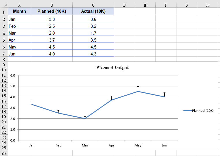
A percentage error bar takes the value of each data point as its base and works out the range from the given percentage. Set it to 10, and a point valued at 4.0 gets an error amount of 0.4; which side of the data point that length is drawn on is decided by a separate parameter. This kind of error bar expresses a tolerance -- a production target allowed to drift by a tenth, or an instrument reading with a fixed relative precision. Error bars belong to a series, so the series object has to be fetched first and its ErrorBar method called on it. The steps are:
- Load the font and the test data file into the VFS.
- Load the workbook and get the first worksheet.
- Add a line chart whose data range is the planned output column.
- Use the month column as the category labels.
- Add a percentage error bar to the series, setting its direction and amount, then save the workbook.
The complete code example below shows how to add percentage error bars to a line chart in React:
function App() {
  const addPercentageErrorBar = async () => {
    // Get the Spire.XLS WASM module
    const xlsModule = window.wasmModule?.spirexls;

    // Check if the module is ready
    if (!xlsModule) {
      alert('Spire.Xls is not ready yet');
      return;
    }

    // Load the font and the test data file into the VFS
    await window.spire.FetchFileToVFS('ARIAL.TTF', '/Library/Fonts/', `${process.env.PUBLIC_URL}/font/`);
    const inputFileName = 'ErrorBarChartData.xlsx';
    await window.spire.FetchFileToVFS(inputFileName, '', `${process.env.PUBLIC_URL}data/`);

    // Load the workbook and get the first worksheet
    const workbook = new xlsModule.Workbook();
    workbook.LoadFromFile({ fileName: inputFileName });
    const sheet = workbook.Worksheets.get(0);

    // Add a line chart whose data range is the planned output column
    const chart = sheet.Charts.Add({ chartType: xlsModule.ExcelChartType.Line });
    chart.ChartTitle = "Planned Output";
    chart.ChartTitleArea.IsBold = true;
    chart.ChartTitleArea.Size = 12;
    chart.DataRange = sheet.Range.get("B1:B7");
    chart.SeriesDataFromRange = false;

    // Set the chart position on the worksheet
    chart.TopRow = 9;
    chart.BottomRow = 26;
    chart.LeftColumn = 1;
    chart.RightColumn = 9;

    // Get the series and use the month column as its category labels
    const serie = chart.Series.get(0);
    serie.CategoryLabels = sheet.Range.get("A2:A7");

    // Add a percentage error bar to the series: plus direction, 10% of the value
    serie.ErrorBar({
      bIsY: true,
      include: xlsModule.ErrorBarIncludeType.Plus,
      type: xlsModule.ErrorBarType.Percentage,
      numberValue: 10.0,
    });

    // Save the workbook
    const outputFileName = "PercentageErrorBar.xlsx";
    workbook.SaveToFile({ fileName: outputFileName });

    // Dispose of the workbook object to free resources
    workbook.Dispose();

    // Read the result file from the VFS and trigger the download
    const fileArray = window.dotnetRuntime.Module.FS.readFile(outputFileName);
    const blob = new Blob([fileArray], { type: 'application/vnd.openxmlformats-officedocument.spreadsheetml.sheet' });
    const url = URL.createObjectURL(blob);
    const a = document.createElement('a');
    a.href = url;
    a.download = outputFileName;
    a.click();
    URL.revokeObjectURL(url);
  };

  return (
    <div style={{ textAlign: 'center', height: '300px' }}>
      <h1>Percentage Error Bars</h1>
      <button onClick={addPercentageErrorBar}>Start</button>
    </div>
  );
}

export default App;
After running, the effect of adding percentage error bars to a line chart:
Add standard error bars to a column chart
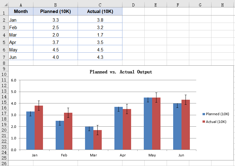
A standard error bar takes no percentage from you; it computes the standard error of the series itself, so a series with scattered values automatically gets longer error bars. That is the division of labour between the two kinds: the standard error bar describes how steady the data is, the percentage one describes how far you are willing to let it drift. Column charts are usually there to compare several groups side by side, and hanging a standard error bar on each group shows at a glance which one's readings cluster more tightly. The steps are:
- Load the font and the test data file into the VFS.
- Load the workbook and get the first worksheet.
- Add a column chart covering both the planned and the actual output columns.
- Add a standard error bar to each of the two series.
- Save the workbook.
The complete code example below shows how to add standard error bars to a column chart in React:
function App() {
  const addStandardErrorBar = async () => {
    // Get the Spire.XLS WASM module
    const xlsModule = window.wasmModule?.spirexls;

    // Check if the module is ready
    if (!xlsModule) {
      alert('Spire.Xls is not ready yet');
      return;
    }

    // Load the font and the test data file into the VFS
    await window.spire.FetchFileToVFS('ARIAL.TTF', '/Library/Fonts/', `${process.env.PUBLIC_URL}/font/`);
    const inputFileName = 'ErrorBarChartData.xlsx';
    await window.spire.FetchFileToVFS(inputFileName, '', `${process.env.PUBLIC_URL}data/`);

    // Load the workbook and get the first worksheet
    const workbook = new xlsModule.Workbook();
    workbook.LoadFromFile({ fileName: inputFileName });
    const sheet = workbook.Worksheets.get(0);

    // Add a column chart covering both the planned and the actual output columns
    const chart = sheet.Charts.Add({ chartType: xlsModule.ExcelChartType.ColumnClustered });
    chart.ChartTitle = "Planned vs. Actual Output";
    chart.ChartTitleArea.IsBold = true;
    chart.ChartTitleArea.Size = 12;
    chart.DataRange = sheet.Range.get("B1:C7");
    chart.SeriesDataFromRange = false;

    // Set the chart position on the worksheet
    chart.TopRow = 9;
    chart.BottomRow = 26;
    chart.LeftColumn = 1;
    chart.RightColumn = 9;

    // Get the first series and use the month column as its category labels
    const serie = chart.Series.get(0);
    serie.CategoryLabels = sheet.Range.get("A2:A7");

    // Draw a standard error bar on the first series, minus direction
    serie.ErrorBar({
      bIsY: true,
      include: xlsModule.ErrorBarIncludeType.Minus,
      type: xlsModule.ErrorBarType.StandardError,
      numberValue: 0.3,
    });

    // Draw a standard error bar on the second series as well, both directions
    const serie2 = chart.Series.get(1);
    serie2.ErrorBar({
      bIsY: true,
      include: xlsModule.ErrorBarIncludeType.Both,
      type: xlsModule.ErrorBarType.StandardError,
      numberValue: 0.5,
    });

    // Save the workbook
    const outputFileName = "StandardErrorBar.xlsx";
    workbook.SaveToFile({ fileName: outputFileName });

    // Dispose of the workbook object to free resources
    workbook.Dispose();

    // Read the result file from the VFS and trigger the download
    const fileArray = window.dotnetRuntime.Module.FS.readFile(outputFileName);
    const blob = new Blob([fileArray], { type: 'application/vnd.openxmlformats-officedocument.spreadsheetml.sheet' });
    const url = URL.createObjectURL(blob);
    const a = document.createElement('a');
    a.href = url;
    a.download = outputFileName;
    a.click();
    URL.revokeObjectURL(url);
  };

  return (
    <div style={{ textAlign: 'center', height: '300px' }}>
      <h1>Standard Error Bars</h1>
      <button onClick={addStandardErrorBar}>Start</button>
    </div>
  );
}

export default App;
After running, the effect of adding standard error bars to a column chart:
FAQ
Which directions do error bars support?
The direction comes from the include parameter of ErrorBar, which takes three values from ErrorBarIncludeType:
| Value | Effect |
|---|---|
Both |
Both directions, a segment drawn above and below the data point |
Minus |
Negative only, drawn below the data point |
Plus |
Positive only, drawn above the data point |
// Draw it in both directions
serie.ErrorBar({
  bIsY: true,
  include: xlsModule.ErrorBarIncludeType.Both,
  type: xlsModule.ErrorBarType.Percentage,
  numberValue: 10.0,
});
Direction only decides which side of the data point the error bar is drawn on, and does not change its length. The same parameters give the same error amount in all three directions.
Which error amount types are supported?
The error amount type comes from the type parameter of ErrorBar, which takes five values from ErrorBarType:
| Type | Description |
|---|---|
Fixed |
A fixed value, given by numberValue |
Percentage |
A percentage of each data point's value |
StandardDeviation |
A standard deviation, given by numberValue |
StandardError |
A standard error, computed from the series data; numberValue plays no part |
Custom |
Custom ranges,needs a different overload |
The first four take their amount in numberValue:
serie.ErrorBar({
  bIsY: true,
  include: xlsModule.ErrorBarIncludeType.Both,
  type: xlsModule.ErrorBarType.StandardDeviation,
  numberValue: 2,
});
Get a Free License
Spire.XLS for JavaScript offers a 30-day full-featured free trial license with no functional limitations. Apply here to evaluate before purchasing.
Multi-Level Labels with a Secondary Axis in React with JavaScript
When the categories in a chart are themselves layered -- a region that contains months, or a year that contains quarters -- squeezing both columns into a single row of labels leaves the reader guessing which region or which month a data point belongs to. Layered data brings a second problem with it: sales run into the millions while a growth rate sits in the low teens, and on one shared value axis the growth rate flattens into a line pinned to the baseline. Multi-level category labels and the secondary axis solve these two problems respectively. Spire.XLS for JavaScript performs both directly in the browser through WebAssembly, managing input and output files with a virtual file system (VFS) and requiring no backend service.
This article covers two key features:
For installation and project setup, see Integrating Spire.XLS for JavaScript in a React Project. The examples below assume Spire.XLS is installed and the WebAssembly module has been initialised.
Create a Chart with Multi-Level Category Labels
Multi-level category labels are drawn by the category axis, and how many levels that axis has depends on how many columns the series' category labels point at. In the test data the outer labels are already merged by region, so the code only has to make the category labels span both the outer and the inner column. The steps are:
- Load the font and the test data file into the VFS.
- Load the workbook and get the worksheet.
- Add a column chart and add a named sales series.
- Point the category labels at both the region and the month column.
- Turn on multi-level labels for the category axis and save the workbook.
The complete code example below creates a chart with multi-level category labels in React:
function App() {
  const createMultiLevelChart = async () => {
    // Get the Spire.XLS WASM module
    const xlsModule = window.wasmModule?.spirexls;

    // Check if the module is ready
    if (!xlsModule) {
      alert('Spire.Xls is not ready yet');
      return;
    }

    // Load the font and the test data file into the VFS
    await window.spire.FetchFileToVFS('ARIAL.TTF', '/Library/Fonts/', `${process.env.PUBLIC_URL}/font/`);
    const inputFileName = 'MultiLevelChartData.xlsx';
    await window.spire.FetchFileToVFS(inputFileName, '', `${process.env.PUBLIC_URL}data/`);

    // Load the workbook and get the first worksheet
    const workbook = new xlsModule.Workbook();
    workbook.LoadFromFile({ fileName: inputFileName });
    const sheet = workbook.Worksheets.get(0);

    // Add a column chart
    const chart = sheet.Charts.Add({ chartType: xlsModule.ExcelChartType.ColumnClustered });
    chart.ChartTitle = "Sales";
    chart.Legend.Delete();

    // Add the sales series and give it a name
    const serie = chart.Series.Add({ name: "Sales", serieType: xlsModule.ExcelChartType.ColumnClustered });
    serie.Values = sheet.Range.get("C2:C7");

    // Point the category labels at both the region and the month column
    serie.CategoryLabels = sheet.Range.get("A2:B7");

    // Turn on multi-level category labels so each level gets its own row
    chart.PrimaryCategoryAxis.MultiLevelLable = true;

    // Place the chart on the worksheet
    chart.LeftColumn = 5;
    chart.TopRow = 1;
    chart.RightColumn = 14;

    // Save the workbook
    const outputFileName = "MultiLevelLabels.xlsx";
    workbook.SaveToFile({ fileName: outputFileName });

    // Dispose of the workbook object to free resources
    workbook.Dispose();

    // Read the result file from the VFS and trigger the download
    const fileArray = window.dotnetRuntime.Module.FS.readFile(outputFileName);
    const blob = new Blob([fileArray], { type: 'application/vnd.openxmlformats-officedocument.spreadsheetml.sheet' });
    const url = URL.createObjectURL(blob);
    const a = document.createElement('a');
    a.href = url;
    a.download = outputFileName;
    a.click();
    URL.revokeObjectURL(url);
  };

  return (
    <div style={{ textAlign: 'center', height: '300px' }}>
      <h1>Multi-Level Labels</h1>
      <button onClick={createMultiLevelChart}>Start</button>
    </div>
  );
}

export default App;
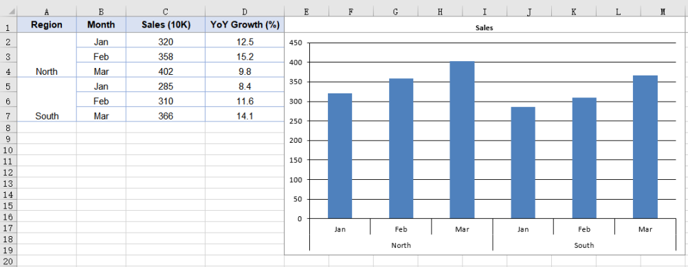
How many levels the category axis has is decided by how many columns CategoryLabels points at, so binding a single-column range still yields a single level of labels; MultiLevelLable controls whether those levels are laid out as multiple rows.
After running, the effect of creating a chart with multi-level category labels:
Add a Secondary Axis to the Chart
When two series in the same chart differ sharply in magnitude, sharing one value axis squashes the smaller of the two into a line pinned to the baseline, and its movement can no longer be read. A secondary axis is meant for exactly that case: it gives the series a value axis of its own, so each scale spreads across its own range without interfering with the other. The way to do it is to move the series off the primary axis and draw it as a line -- a line takes up no bar width, so it reads clearly against the column series sharing the same categories. The steps are:
- Load the font and the test data file into the VFS.
- Load the workbook and get the worksheet.
- Add a column chart and add a named sales series.
- Add the growth series as a line.
- Move the growth series to the secondary axis and save the workbook.
The complete code example below adds a secondary axis to the chart in React:
function App() {
  const addSecondaryAxis = async () => {
    // Get the Spire.XLS WASM module
    const xlsModule = window.wasmModule?.spirexls;

    // Check if the module is ready
    if (!xlsModule) {
      alert('Spire.Xls is not ready yet');
      return;
    }

    // Load the font and the test data file into the VFS
    await window.spire.FetchFileToVFS('ARIAL.TTF', '/Library/Fonts/', `${process.env.PUBLIC_URL}/font/`);
    const inputFileName = 'MultiLevelChartData.xlsx';
    await window.spire.FetchFileToVFS(inputFileName, '', `${process.env.PUBLIC_URL}data/`);

    // Load the workbook and get the first worksheet
    const workbook = new xlsModule.Workbook();
    workbook.LoadFromFile({ fileName: inputFileName });
    const sheet = workbook.Worksheets.get(0);

    // Add a column chart
    const chart = sheet.Charts.Add({ chartType: xlsModule.ExcelChartType.ColumnClustered });
    chart.ChartTitle = "Sales and YoY Growth";

    // Add the sales series, which stays on the primary axis
    const salesSerie = chart.Series.Add({ name: "Sales", serieType: xlsModule.ExcelChartType.ColumnClustered });
    salesSerie.Values = sheet.Range.get("C2:C7");

    // Point the category labels at both the region and the month column
    salesSerie.CategoryLabels = sheet.Range.get("A2:B7");

    // Add the growth series as a line
    const growthSerie = chart.Series.Add({ name: "YoY Growth", serieType: xlsModule.ExcelChartType.Line });
    growthSerie.Values = sheet.Range.get("D2:D7");

    // Move the growth series to the secondary axis so it plots on its own percentage scale
    growthSerie.UsePrimaryAxis = false;

    // Turn on multi-level category labels
    chart.PrimaryCategoryAxis.MultiLevelLable = true;

    // Place the chart on the worksheet
    chart.LeftColumn = 5;
    chart.TopRow = 1;
    chart.RightColumn = 14;

    // Save the workbook
    const outputFileName = "SecondaryAxis.xlsx";
    workbook.SaveToFile({ fileName: outputFileName });

    // Dispose of the workbook object to free resources
    workbook.Dispose();

    // Read the result file from the VFS and trigger the download
    const fileArray = window.dotnetRuntime.Module.FS.readFile(outputFileName);
    const blob = new Blob([fileArray], { type: 'application/vnd.openxmlformats-officedocument.spreadsheetml.sheet' });
    const url = URL.createObjectURL(blob);
    const a = document.createElement('a');
    a.href = url;
    a.download = outputFileName;
    a.click();
    URL.revokeObjectURL(url);
  };

  return (
    <div style={{ textAlign: 'center', height: '300px' }}>
      <h1>Secondary Axis</h1>
      <button onClick={addSecondaryAxis}>Start</button>
    </div>
  );
}

export default App;
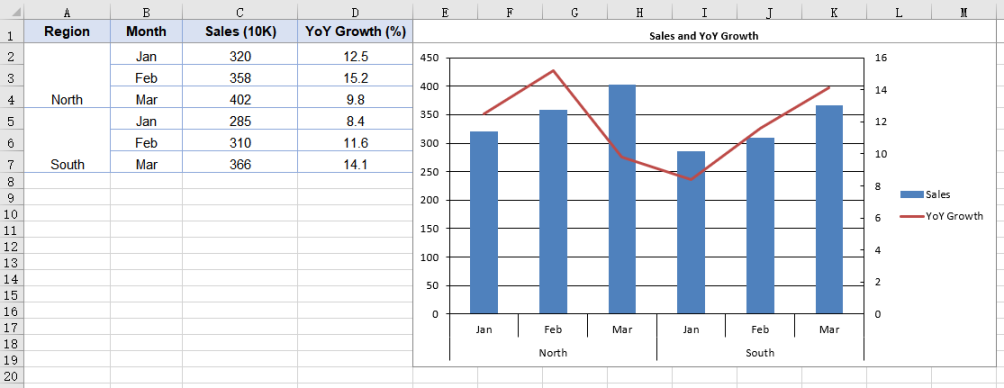
UsePrimaryAxis = false affects only the series it is set on; the other series stay on the primary axis. The chart gains a second pair of value and category axes as a result, giving it two separate scale ranges. Series.Add takes the series name at the same time, so the legend shows the name passed in rather than an auto-generated "Series 1".
After running, the effect of adding a secondary axis to the chart:
Frequently Asked Questions
Why does the category axis show only one level of labels?
Cause: How many levels the category axis has is decided by the range CategoryLabels points at. If that is a single-column range such as B2:B7, the range holds only one level of category information, and setting PrimaryCategoryAxis.MultiLevelLable to true will still give you one level of labels -- the property controls whether multiple levels are expanded, not whether a level of data is created.
Solution: Point CategoryLabels at a multi-column range that includes the outer labels; the cells the outer labels occupy then need to be merged in the data:
// Cover both columns with the category labels; the outer label cells need merging in the data
serie.CategoryLabels = sheet.Range.get("A2:B7");
Why do the two value axes have different scales?
Cause: The primary and secondary value axes work out their scales independently of each other, and MinValue, MaxValue and MajorUnit on PrimaryValueAxis apply to the primary axis only -- changing them leaves the secondary axis untouched. When the two series differ sharply in magnitude, the range the secondary axis picks for itself is often not a good fit.
Solution: Give the secondary axis its own scale through chart.SecondaryValueAxis:
// Give the secondary axis a 0-20 scale with a major unit of 5
chart.SecondaryValueAxis.MinValue = 0;
chart.SecondaryValueAxis.MaxValue = 20;
chart.SecondaryValueAxis.MajorUnit = 5;
Set the scale after the series has been moved to the secondary axis: while no series uses the secondary axis, the assignment is accepted but never written to the file.
Get a Free License
Spire.XLS for JavaScript offers a 30-day full-featured free trial license with no functional limitations. Apply here to evaluate before purchasing.
Create a Radar Chart with JavaScript in React
When you need to compare several metrics across multiple dimensions at the same time, a radar chart is a very intuitive way to present them — each dimension is placed on an axis radiating out from the center, and the values on those axes are joined into a polygon, so the shape immediately shows where the strengths and weaknesses are. Spire.XLS for JavaScript provides a complete charting API that supports creating radar charts directly in the browser via WebAssembly, without requiring a backend service.
This article covers two core features:
For installation and project configuration, please refer to Integrating Spire.XLS for JavaScript in a React Project. The following examples assume Spire.XLS is already installed and the WebAssembly module has been initialized.
Create a Radar Chart
You can add a radar chart to a worksheet with the sheet.Charts.Add() method. The steps are as follows:
- Load the Excel file that contains the data and get the first worksheet.
- Add a radar chart with
Charts.Add({ chartType: ExcelChartType.Radar }). - Set the
DataRangeproperty to specify the chart data range: the first row holds the series names, the first column holds the category names for each axis, and the remaining cells hold the values. - Set
SeriesDataFromRange = falseso that the data is not taken from a row/column layout. - Set the chart title, position, and legend position.
- Save the workbook with the
Workbook.SaveToFile()method.
Below is a complete code example that shows how to create a radar chart in React:
function App() {
  const createRadarChart = async () => {
    // Get the Spire.XLS WASM module
    const xlsModule = window.wasmModule?.spirexls;

    // Check if the module is ready
    if (!xlsModule) {
      alert('Spire.Xls is not ready yet');
      return;
    }

    // Load the Excel file into VFS
    const inputFileName = 'RadarChartData.xlsx';
    await window.spire.FetchFileToVFS(inputFileName, '', `${process.env.PUBLIC_URL}/static/data/`);

    // Load the workbook
    const workbook = new xlsModule.Workbook();
    workbook.LoadFromFile(inputFileName);

    // Get the first worksheet
    let sheet = workbook.Worksheets.get(0);

    // Add a radar chart
    let chart = sheet.Charts.Add({ chartType: xlsModule.ExcelChartType.Radar });

    // Set the chart data range
    chart.DataRange = sheet.Range.get("A1:C5");
    chart.SeriesDataFromRange = false;

    // Set the chart position
    chart.LeftColumn = 7;
    chart.TopRow = 6;
    chart.RightColumn = 16;
    chart.BottomRow = 29;

    // Set the chart title
    chart.ChartTitle = "Product Sales by Region";
    chart.ChartTitleArea.IsBold = true;
    chart.ChartTitleArea.Size = 12;

    // Set the legend position
    chart.Legend.Position = xlsModule.LegendPositionType.Corner;

    // Save the workbook
    const outputFileName = 'CreateRadarChart.xlsx';
    workbook.SaveToFile(outputFileName);

    // Release resources
    workbook.Dispose();

    // Read the converted file from VFS and trigger download
    const fileArray = window.dotnetRuntime.Module.FS.readFile(outputFileName);
    const blob = new Blob([fileArray], { type: "application/vnd.openxmlformats-officedocument.spreadsheetml.sheet" });
    const url = URL.createObjectURL(blob);
    const a = document.createElement('a');
    a.href = url;
    a.download = outputFileName;
    a.click();
    URL.revokeObjectURL(url);
  };

  return (
    <div style={{ textAlign: 'center', height: '300px' }}>
      <h1>Create a Radar Chart</h1>
      <button onClick={createRadarChart}>Start</button>
    </div>
  );
}

export default App;
After running, the effect of creating a radar chart:

Style the Radar Chart
After creating the radar chart, you can further improve its appearance by setting the chart area, plot area, and series line colors. The steps are as follows:
- Get the radar chart object that has been created.
- Set the
ChartArea.Fill.ForeColorproperty to set the chart background color. - Set the
PlotArea.Fill.ForeColorproperty to set the plot area background color. - Set the
Series[i].Format.LineProperties.Colorproperty to specify the line color of each series;Series.get(0)andSeries.get(1)correspond to the two series in the data range. - Save the workbook.
Below is a complete code example that shows how to style the radar chart:
function App() {
  const styleRadarChart = async () => {
    // Get the Spire.XLS WASM module
    const xlsModule = window.wasmModule?.spirexls;

    // Check if the module is ready
    if (!xlsModule) {
      alert('Spire.Xls is not ready yet');
      return;
    }

    // Load the Excel file into VFS
    const inputFileName = 'RadarChartData.xlsx';
    await window.spire.FetchFileToVFS(inputFileName, '', `${process.env.PUBLIC_URL}/static/data/`);

    // Load the workbook
    const workbook = new xlsModule.Workbook();
    workbook.LoadFromFile(inputFileName);

    // Get the first worksheet
    let sheet = workbook.Worksheets.get(0);

    // Add a radar chart
    let chart = sheet.Charts.Add({ chartType: xlsModule.ExcelChartType.Radar });

    // Set the chart data range
    chart.DataRange = sheet.Range.get("A1:C5");
    chart.SeriesDataFromRange = false;

    // Set the chart position
    chart.LeftColumn = 7;
    chart.TopRow = 6;
    chart.RightColumn = 16;
    chart.BottomRow = 29;

    // Set the chart title
    chart.ChartTitle = "Product Sales by Region";
    chart.ChartTitleArea.IsBold = true;
    chart.ChartTitleArea.Size = 12;

    // Style the radar chart
    // Set the chart area background color
    chart.ChartArea.Fill.ForeColor = xlsModule.Color.get_LightCyan();
    // Set the plot area background color
    chart.PlotArea.Fill.ForeColor = xlsModule.Color.get_LightYellow();
    // Set the color of the first series line
    chart.Series.get(0).Format.LineProperties.Color = xlsModule.Color.get_Orange();
    // Set the color of the second series line
    chart.Series.get(1).Format.LineProperties.Color = xlsModule.Color.get_CornflowerBlue();

    // Save the workbook
    const outputFileName = 'StyledRadarChart.xlsx';
    workbook.SaveToFile(outputFileName);

    // Release resources
    workbook.Dispose();

    // Read the converted file from VFS and trigger download
    const fileArray = window.dotnetRuntime.Module.FS.readFile(outputFileName);
    const blob = new Blob([fileArray], { type: "application/vnd.openxmlformats-officedocument.spreadsheetml.sheet" });
    const url = URL.createObjectURL(blob);
    const a = document.createElement('a');
    a.href = url;
    a.download = outputFileName;
    a.click();
    URL.revokeObjectURL(url);
  };

  return (
    <div style={{ textAlign: 'center', height: '300px' }}>
      <h1>Style the Radar Chart</h1>
      <button onClick={styleRadarChart}>Start</button>
    </div>
  );
}

export default App;
After running, the effect of styling the radar chart:

Frequently Asked Questions
The radar chart does not change after setting a series color
Reason: A radar chart draws each series as a line, so setting a fill color with Series.get(i).Format.Fill has no effect.
Solution: Set the line color through Series.get(i).Format.LineProperties.Color, for example:
chart.Series.get(0).Format.LineProperties.Color = xlsModule.Color.get_Orange();
How do I adjust the legend position of a radar chart?
Reason: The legend is docked to the right of the chart by default, where it competes with the plot area for width — especially noticeable on a radar chart, which already takes up a lot of horizontal space.
Solution: Set the legend position with the chart.Legend.Position property. The available values are LegendPositionType.Bottom, Corner, Top, Right, Left, and NotDocked. For example, to move the legend to the top-right corner:
chart.Legend.Position = xlsModule.LegendPositionType.Corner;
Get a Free License
Spire.XLS for JavaScript offers a 30-day full-featured free trial license with no functional limitations. Apply here to evaluate before purchasing.
Create a Bubble Chart with JavaScript in React
In data analysis scenarios, bubble charts help intuitively display multi-dimensional data relationships. Each data point in a bubble chart is defined by three values: X-axis value, Y-axis value, and bubble size. Spire.XLS for JavaScript provides rich charting APIs that support creating bubble charts directly in the browser via WebAssembly, without requiring a backend service.
This article covers two core features:
For installation and project configuration, please refer to Integrating Spire.XLS for JavaScript in a React Project. The following examples assume Spire.XLS is already installed and the WebAssembly module has been initialized.
Create a Bubble Chart
A bubble chart can be added to a worksheet using the sheet.Charts.Add() method. The specific steps are as follows:
- Create a
Workbookobject and get the first worksheet. - Add a bubble chart via
Charts.Add(ExcelChartType.Bubble). - Set the
DataRangeproperty to specify the chart data area. - Set
SeriesDataFromRange = falseto indicate that data is not obtained from row/column layout. - Set
Series[0].Bubblesto specify the bubble size data range. - Set the chart title, position, and dimensions.
- Save the workbook via
Workbook.SaveToFile().
The following is a complete code example that demonstrates creating a bubble chart in React:
function App() {
  const createBubbleChart = async () => {
    // Get the Spire.XLS WASM module
    const xlsModule = window.wasmModule?.spirexls;

    // Check if the module is ready
    if (!xlsModule) {
      alert('Spire.Xls is not ready yet');
      return;
    }

    // Load the Excel file into VFS
    const inputFileName = 'CreateBubbleChart.xlsx';
    await window.spire.FetchFileToVFS(inputFileName, '', `${process.env.PUBLIC_URL}/static/data/`);

    // Load the workbook
    const workbook = new xlsModule.Workbook();
    workbook.LoadFromFile(inputFileName);

    // Get the first worksheet
    let sheet = workbook.Worksheets.get(0);

    // Add a bubble chart
    let chart = sheet.Charts.Add({ chartType: xlsModule.ExcelChartType.Bubble });

    // Set the chart data range
    chart.DataRange = sheet.Range.get("A1:C5");
    chart.SeriesDataFromRange = false;

    // Set the bubble sizes
    chart.Series.get(0).Bubbles = sheet.Range.get("C2:C5");

    // Set the chart position
    chart.LeftColumn = 7;
    chart.TopRow = 6;
    chart.RightColumn = 16;
    chart.BottomRow = 29;

    // Set the chart title
    chart.ChartTitle = "Bubble Chart";
    chart.ChartTitleArea.IsBold = true;
    chart.ChartTitleArea.Size = 12;

    // Save the workbook
    const outputFileName = 'CreateBubbleChart.xlsx';
    workbook.SaveToFile(outputFileName);

    // Dispose resources
    workbook.Dispose();

    // Read the converted file from VFS and trigger download
    const fileArray = window.dotnetRuntime.Module.FS.readFile(outputFileName);
    const blob = new Blob([fileArray], { type: "application/vnd.openxmlformats-officedocument.spreadsheetml.sheet" });
    const url = URL.createObjectURL(blob);
    const a = document.createElement('a');
    a.href = url;
    a.download = outputFileName;
    a.click();
    URL.revokeObjectURL(url);
  };

  return (
    <div style={{ textAlign: 'center', height: '300px' }}>
      <h1>Create Bubble Chart</h1>
      <button onClick={createBubbleChart}>Start</button>
    </div>
  );
}

export default App;
After running the code, the effect of creating a bubble chart is as follows:

Style the Bubble Chart
After creating a bubble chart, you can enhance its appearance by setting the chart area, plot area, and series colors. The specific steps are as follows:
- Get the created bubble chart object.
- Set the
ChartArea.Fill.ForeColorproperty to set the chart background color. - Set the
PlotArea.Fill.ForeColorproperty to set the plot area background color. - Set the
Series[0].Format.Fill.ForeColorproperty to set the series color. - Set the
Series[0].HasDataLabelsproperty to enable data labels, and specify the label content throughDataPoints.DefaultDataPoint.DataLabels. - Save the workbook.
The following is a complete code example that demonstrates how to style a bubble chart:
function App() {
  const styleBubbleChart = async () => {
    // Get the Spire.XLS WASM module
    const xlsModule = window.wasmModule?.spirexls;

    // Check if the module is ready
    if (!xlsModule) {
      alert('Spire.Xls is not ready yet');
      return;
    }

    // Load the Excel file into VFS
    const inputFileName = 'CreateBubbleChart.xlsx';
    await window.spire.FetchFileToVFS(inputFileName, '', `${process.env.PUBLIC_URL}/static/data/`);

    // Load the workbook
    const workbook = new xlsModule.Workbook();
    workbook.LoadFromFile(inputFileName);

    // Get the first worksheet
    let sheet = workbook.Worksheets.get(0);

    // Add a bubble chart
    let chart = sheet.Charts.Add({ chartType: xlsModule.ExcelChartType.Bubble });

    // Set the chart data range
    chart.DataRange = sheet.Range.get("A1:C5");
    chart.SeriesDataFromRange = false;

    // Set the bubble sizes
    chart.Series.get(0).Bubbles = sheet.Range.get("C2:C5");

    // Set the chart position
    chart.LeftColumn = 7;
    chart.TopRow = 6;
    chart.RightColumn = 16;
    chart.BottomRow = 29;

    // Set the chart title
    chart.ChartTitle = "Bubble Chart";
    chart.ChartTitleArea.IsBold = true;
    chart.ChartTitleArea.Size = 12;

    // Style the bubble chart
    // Set chart area background color
    chart.ChartArea.Fill.ForeColor = xlsModule.Color.get_LightCyan();
    // Set plot area background color
    chart.PlotArea.Fill.ForeColor = xlsModule.Color.get_LightYellow();
    // Set series color
    chart.Series.get(0).Format.Fill.FillType = xlsModule.ShapeFillType.SolidColor;
    chart.Series.get(0).Format.Fill.ForeColor = xlsModule.Color.get_Orange();
    // Enable and set data labels
    chart.Series.get(0).HasDataLabels = true;
    chart.Series.get(0).DataPoints.DefaultDataPoint.DataLabels.HasCategoryName = true;
    chart.Series.get(0).DataPoints.DefaultDataPoint.DataLabels.HasValue = true;

    // Save the workbook
    const outputFileName = 'StyledBubbleChart.xlsx';
    workbook.SaveToFile(outputFileName);

    // Dispose resources
    workbook.Dispose();

    // Read the converted file from VFS and trigger download
    const fileArray = window.dotnetRuntime.Module.FS.readFile(outputFileName);
    const blob = new Blob([fileArray], { type: "application/vnd.openxmlformats-officedocument.spreadsheetml.sheet" });
    const url = URL.createObjectURL(blob);
    const a = document.createElement('a');
    a.href = url;
    a.download = outputFileName;
    a.click();
    URL.revokeObjectURL(url);
  };

  return (
    <div style={{ textAlign: 'center', height: '300px' }}>
      <h1>Style Bubble Chart</h1>
      <button onClick={styleBubbleChart}>Start</button>
    </div>
  );
}

export default App;
After running the code, the effect of styling the bubble chart is as follows:

Frequently Asked Questions
What do columns A, B, and C in DataRange represent?
Reason: Each data point in a bubble chart needs three values — an X-axis value, a Y-axis value, and a bubble size — and the three columns specified by DataRange correspond to them exactly.
Solution: Taking chart.DataRange = sheet.Range.get("A1:C5") as an example, column A serves as the category (X axis), column B as the Y-axis value, and column C is set as the bubble size through chart.Series.get(0).Bubbles = sheet.Range.get("C2:C5"). The order of these three columns cannot be swapped, or both the point positions and the bubble sizes will be wrong.
Why does the data range start at A1 instead of A2?
Reason: The first row of the data range is used as the series name.
Solution: Include the header row in DataRange. In the example, the "Sales" shown in the legend comes from cell B1, so the data range is written as A1:C5 rather than A2:C5.
Get a Free License
Spire.XLS for JavaScript offers a 30-day full-featured free trial license with no functional limitations. Apply here to evaluate before purchasing.
Add Trendline to Excel Charts in React with JavaScript
In data analysis scenarios, trendlines help you visually identify data trends and predict directions from Excel charts. Spire.XLS for JavaScript provides rich trendline APIs that allow you to add various types of trendlines to chart series directly in the browser via WebAssembly, without requiring a backend service.
This article covers two core features:
For installation and project configuration, please refer to Integrating Spire.XLS for JavaScript in a React Project. The following examples assume Spire.XLS is installed and the WebAssembly module has been initialized.
Add Trendline to Chart
You can add trendlines to any series in a chart through the chart.Series.get(i).TrendLines.Add() method. Spire.XLS for JavaScript supports 4 types of trendlines defined in the TrendLineType enumeration:
Linear— Linear trendline, suitable for data showing steady increase or decreaseExponential— Exponential trendline, suitable for scenarios where the growth or decline rate acceleratesLogarithmic— Logarithmic trendline, suitable for data that changes rapidly then stabilizesMoving_Average— Moving average trendline, suitable for smoothing data fluctuations
Specific steps:
- Create a
Workbookobject and get the first worksheet. - Get the chart that needs a trendline through
Worksheet.Charts.get(i). - Call
chart.Series.get(0).TrendLines.Add()with thetypeparameter specifying the trendline type. - Save the workbook through
Workbook.SaveToFile().
Below is a complete code example showing how to add four different types of trendlines to an Excel chart in React:
function App() {
  const addTrendline = async () => {
    // Get the Spire.XLS WASM module
    const xlsModule = window.wasmModule?.spirexls;

    // Check if the module is ready
    if (!xlsModule) {
      alert('Spire.Xls is not ready yet');
      return;
    }

    // Load the Excel file into VFS
    const inputFileName = 'ChartTrendline_en.xlsx';
    await window.spire.FetchFileToVFS(inputFileName, '', `${process.env.PUBLIC_URL}data/`);

    // Load the workbook
    const workbook = new xlsModule.Workbook();
    workbook.LoadFromFile({ fileName: inputFileName });

    // Get the first chart from the first worksheet
    let chart = workbook.Worksheets.get(0).Charts.get(0);

    // Add linear trendline
    chart.ChartTitle = "Linear Trendline";
    chart.Series.get(0).TrendLines.Add({ type: xlsModule.TrendLineType.Linear });

    // Add exponential trendline
    chart = workbook.Worksheets.get(0).Charts.get(0);
    chart.ChartTitle = "Exponential Trendline";
    chart.Series.get(0).TrendLines.Add({ type: xlsModule.TrendLineType.Exponential });

    // Add logarithmic trendline
    chart.ChartTitle = "Logarithmic Trendline";
    chart.Series.get(0).TrendLines.Add({ type: xlsModule.TrendLineType.Logarithmic });

    // Add moving average trendline
    chart.ChartTitle = "Moving Average Trendline";
    chart.Series.get(0).TrendLines.Add({ type: xlsModule.TrendLineType.Moving_Average });

    // Save the document
    const outputFileName = 'AddTrendline.xlsx';
    workbook.SaveToFile({ fileName: outputFileName, version: xlsModule.ExcelVersion.Version2010 });

    // Release resources
    workbook.Dispose();

    // Read the converted file from VFS and trigger download
    const fileArray = window.dotnetRuntime.Module.FS.readFile(outputFileName);
    const blob = new Blob([fileArray], { type: 'application/vnd.openxmlformats-officedocument.spreadsheetml.sheet' });
    const url = URL.createObjectURL(blob);
    const a = document.createElement('a');
    a.href = url;
    a.download = outputFileName;
    a.click();
    URL.revokeObjectURL(url);
  };

  return (
    <div style={{ textAlign: 'center', height: '300px' }}>
      <h1>Add Trendline to Chart</h1>
      <button onClick={addTrendline}>Start</button>
    </div>
  );
}

export default App;
After running the code, you get the effect of adding four different types of trendlines to a chart:

Extract Trendline Formula
You can obtain the mathematical formula of a trendline through the trendLine.Formula property, making it easy to display the trendline's analytical expression in reports.
Specific steps:
- Load the
AddTrendline.xlsxfile generated in Step 1, which contains four charts. - Use
Worksheet.Charts.get(i)to iterate through all four charts. - Read the
trendLine.Formulaproperty from each chart to obtain the formula string, then save all formulas to a text file.
Below is a complete code example showing how to extract trendline formulas in React:
function App() {
  const extractTrendlineFormula = async () => {
    // Get the Spire.XLS WASM module
    const xlsModule = window.wasmModule?.spirexls;

    // Check if the module is ready
    if (!xlsModule) {
      alert('Spire.Xls is not ready yet');
      return;
    }

    // Load the AddTrendline.xlsx file generated in Step 1 into VFS
    const inputFileName = 'AddTrendline.xlsx';
    await window.spire.FetchFileToVFS(inputFileName, '', `${process.env.PUBLIC_URL}data/`);

    // Load the workbook
    const workbook = new xlsModule.Workbook();
    workbook.LoadFromFile({ fileName: inputFileName });

    // Get the first worksheet
    let sheet = workbook.Worksheets.get(0);
    let result = "Extracted trendline formulas from four charts:\n\n";

    // Iterate through all four charts and extract trendline formulas
    for (let i = 0; i < 4; i++) {
      let chart = sheet.Charts.get(i);
      let trendLine = chart.Series.get(0).TrendLines.get(0);
      // Moving average trendline has no mathematical formula
      if (trendLine.Type === xlsModule.TrendLineType.Moving_Average) {
        result += `Chart ${i + 1} (${chart.ChartTitle}): N/A (Moving Average)\n`;
      } else {
        let formula = trendLine.Formula;
        result += `Chart ${i + 1} (${chart.ChartTitle}): ${formula}\n`;
      }
    }

    // Release resources
    workbook.Dispose();

    // Save the formulas to a text file and trigger download
    const outputFileName = 'ExtractTrendline.txt';
    const blob = new Blob([result], { type: "text/plain;charset=utf-8" });
    const url = URL.createObjectURL(blob);
    const a = document.createElement('a');
    a.href = url;
    a.download = outputFileName;
    a.click();
    URL.revokeObjectURL(url);
  };

  return (
    <div style={{ textAlign: 'center', height: '300px' }}>
      <h1>Extract Trendline Formula</h1>
      <button onClick={extractTrendlineFormula}>Start</button>
    </div>
  );
}

export default App;
After running the code, you get the effect of extracting trendline formulas:

FAQ
How to delete an added trendline from a chart?
Cause: A trendline has already been added to the chart, but it needs to be removed or replaced.
Solution: Use the TrendLines.RemoveAt(index) method to remove a trendline at a specific index. Indexing starts from 0. For example, chart.Series.get(0).TrendLines.RemoveAt(0) removes the first trendline from the first series.
How to set forward/backward prediction periods for a trendline?
Cause: A trendline can not only fit existing data, but also predict future or past values based on the trend.
Solution: Use the trendLine.Forward and trendLine.Backward properties to set the number of prediction periods forward and backward respectively. For example, trendLine.Forward = 2 predicts two periods beyond the current data, while trendLine.Backward = 1 extrapolates one period before the data.
Get Free License
Spire.XLS for JavaScript offers a 30-day full-featured free trial license with no functional limitations. Apply here to evaluate before purchasing.
Create Exploded Pie and Doughnut Charts in Excel with JavaScript in React
Pie charts and doughnut charts are the most intuitive chart types for showing the proportion of each data item. An exploded pie chart or exploded doughnut chart pulls all the slices apart, which makes every part stand out more clearly. Spire.XLS for JavaScript completes this directly in the browser based on WebAssembly, managing input/output files through a virtual file system (VFS), with no backend service required.
This article introduces two core features:
For installation and project configuration, refer to Integrating Spire.XLS for JavaScript in a React Project. The examples below assume Spire.XLS is installed and the WebAssembly module is initialized.
Create an Exploded Pie Chart
The slices of an exploded pie chart are separated from each other, which is suitable for highlighting the proportion of each data item. To create an exploded pie chart, follow these steps:
- Create a
Workbookobject and use theLoadFromFile()method to load the Excel file that contains the data. - Use the
Workbook.Worksheets.get()method to get the worksheet that contains the data. - Call the
Charts.Add()method to add a chart and set theChartTypetoExcelChartType.PieExploded. - Use the
Series.CategoryLabelsandSeries.Valuesproperties to specify the categories and values of the chart. - Set properties such as the chart title, position and data labels.
- Use the
Workbook.SaveToFile()method to save the workbook.
Here is a complete code example showing how to create an exploded pie chart from the product sales data in a worksheet in React:
function App() {
  const createExplodedPieChart = async () => {
    // Get the Spire.XLS WASM module
    const xlsModule = window.wasmModule?.spirexls;

    // Check whether the module is ready
    if (!xlsModule) {
      alert('Spire.Xls is not ready yet');
      return;
    }

    // Load the font and Excel file into the VFS
    await window.spire.FetchFileToVFS('ARIAL.TTF', '/Library/Fonts/', `${process.env.PUBLIC_URL}/font/`);
    const inputFileName = 'SalesData.xlsx';
    await window.spire.FetchFileToVFS(inputFileName, '', `${process.env.PUBLIC_URL}data/`);

    // Load the workbook and get the worksheet that contains the data
    const workbook = new xlsModule.Workbook();
    workbook.LoadFromFile({ fileName: inputFileName });
    const sheet = workbook.Worksheets.get(0);

    // Add a chart and set its chart type to an exploded pie chart
    const chart = sheet.Charts.Add();
    chart.ChartType = xlsModule.ExcelChartType.PieExploded;

    // Set the data range and the title of the chart
    chart.DataRange = sheet.Range.get("B2:B7");
    chart.SeriesDataFromRange = false;
    chart.ChartTitle = "Product Sales Share";
    chart.ChartTitleArea.IsBold = true;
    chart.ChartTitleArea.Size = 12;

    // Set the category labels and the values of the chart, and show the value labels
    const cs = chart.Series.get(0);
    cs.CategoryLabels = sheet.Range.get("A2:A7");
    cs.Values = sheet.Range.get("B2:B7");
    cs.DataPoints.DefaultDataPoint.DataLabels.HasValue = true;

    // Set the position of the chart
    chart.LeftColumn = 4;
    chart.TopRow = 1;
    chart.RightColumn = 15;
    chart.BottomRow = 25;

    // Hide the background of the plot area and set the position of the legend
    chart.PlotArea.Fill.Visible = false;
    chart.Legend.Position = xlsModule.LegendPositionType.Right;

    // Save the document
    const outputFileName = 'ExplodedPieChart_output.xlsx';
    workbook.SaveToFile({ fileName: outputFileName });

    // Release resources
    workbook.Dispose();

    // Read the converted file from the VFS and trigger a download
    const fileArray = window.dotnetRuntime.Module.FS.readFile(outputFileName);
    const blob = new Blob([fileArray], { type: 'application/vnd.openxmlformats-officedocument.spreadsheetml.sheet' });
    const url = URL.createObjectURL(blob);
    const a = document.createElement('a');
    a.href = url;
    a.download = outputFileName;
    a.click();
    URL.revokeObjectURL(url);
  };

  return (
    <div style={{ textAlign: 'center', height: '300px' }}>
      <h1>Create Exploded Pie Chart</h1>
      <button onClick={createExplodedPieChart}>
        Start
      </button>
    </div>
  );
}

export default App;
After running the code, you can see the effect of the exploded pie chart:
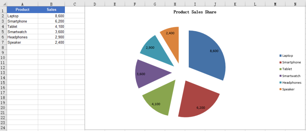
Create an Exploded Doughnut Chart
A doughnut chart is similar to a pie chart, but it has a hole in the center and can also show the proportion of each part in the whole. An exploded doughnut chart further pulls the slices apart. To create an exploded doughnut chart, follow these steps:
- Create a
Workbookobject and use theLoadFromFile()method to load the Excel file that contains the data. - Use the
Workbook.Worksheets.get()method to get the worksheet that contains the data. - Call the
Charts.Add()method to add a chart and set theChartTypetoExcelChartType.DoughnutExploded. - Use the
Series.CategoryLabelsandSeries.Valuesproperties to specify the categories and values of the chart. - Set properties such as the chart title, position and data labels.
- Use the
Workbook.SaveToFile()method to save the workbook.
Here is a complete code example showing how to create an exploded doughnut chart from the product sales data in a worksheet in React:
function App() {
  const createExplodedDoughnutChart = async () => {
    // Get the Spire.XLS WASM module
    const xlsModule = window.wasmModule?.spirexls;

    // Check whether the module is ready
    if (!xlsModule) {
      alert('Spire.Xls is not ready yet');
      return;
    }

    // Load the font and Excel file into the VFS
    await window.spire.FetchFileToVFS('ARIAL.TTF', '/Library/Fonts/', `${process.env.PUBLIC_URL}/font/`);
    const inputFileName = 'SalesData.xlsx';
    await window.spire.FetchFileToVFS(inputFileName, '', `${process.env.PUBLIC_URL}data/`);

    // Load the workbook and get the worksheet that contains the data
    const workbook = new xlsModule.Workbook();
    workbook.LoadFromFile({ fileName: inputFileName });
    const sheet = workbook.Worksheets.get(0);

    // Add a chart and set its chart type to an exploded doughnut chart
    const chart = sheet.Charts.Add();
    chart.ChartType = xlsModule.ExcelChartType.DoughnutExploded;

    // Set the data range and the title of the chart
    chart.DataRange = sheet.Range.get("B2:B7");
    chart.SeriesDataFromRange = false;
    chart.ChartTitle = "Sales Share by Product";
    chart.ChartTitleArea.IsBold = true;
    chart.ChartTitleArea.Size = 12;

    // Set the category labels and the values of the chart, and show the value labels
    const cs = chart.Series.get(0);
    cs.CategoryLabels = sheet.Range.get("A2:A7");
    cs.Values = sheet.Range.get("B2:B7");
    cs.DataPoints.DefaultDataPoint.DataLabels.HasValue = true;

    // Set the position of the chart
    chart.LeftColumn = 4;
    chart.TopRow = 1;
    chart.RightColumn = 15;
    chart.BottomRow = 25;

    // Hide the background of the plot area and set the position of the legend
    chart.PlotArea.Fill.Visible = false;
    chart.Legend.Position = xlsModule.LegendPositionType.Right;

    // Save the document
    const outputFileName = 'ExplodedDoughnutChart_output.xlsx';
    workbook.SaveToFile({ fileName: outputFileName });

    // Release resources
    workbook.Dispose();

    // Read the converted file from the VFS and trigger a download
    const fileArray = window.dotnetRuntime.Module.FS.readFile(outputFileName);
    const blob = new Blob([fileArray], { type: 'application/vnd.openxmlformats-officedocument.spreadsheetml.sheet' });
    const url = URL.createObjectURL(blob);
    const a = document.createElement('a');
    a.href = url;
    a.download = outputFileName;
    a.click();
    URL.revokeObjectURL(url);
  };

  return (
    <div style={{ textAlign: 'center', height: '300px' }}>
      <h1>Create Exploded Doughnut Chart</h1>
      <button onClick={createExplodedDoughnutChart}>
        Start
      </button>
    </div>
  );
}

export default App;
After running the code, you can see the effect of the exploded doughnut chart:
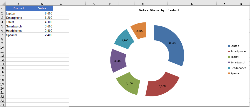
FAQ
The created chart is blank with no slices
Cause: The chart has no valid data series. For example, the DataRange or Values points to an empty range or a range without numbers, so the chart has no data to draw.
Solution: Assign a data range that contains the data to the chart, for example:
chart.DataRange = sheet.Range.get("A1:B7");

const cs = chart.Series.get(0);
cs.CategoryLabels = sheet.Range.get("A2:A7");
cs.Values = sheet.Range.get("B2:B7");
Want to show percentages instead of values in the data labels
Cause: Pie and doughnut charts are usually used to show proportions, but the data labels show values by default, or the percentage labels are not enabled.
Solution: Disable the value labels and enable the percentage labels, for example:
const cs = chart.Series.get(0);
cs.DataPoints.DefaultDataPoint.DataLabels.HasValue = false;
cs.DataPoints.DefaultDataPoint.DataLabels.HasPercentage = true;
Obtain a Free License
Spire.XLS for JavaScript offers a 30-day full-featured free trial license with no functional limitations. Apply here to evaluate before purchasing.