
A pie chart transforms rows of data into an instant snapshot, making proportions, market share, and survey results far easier to understand. Microsoft Word may be known primarily as a word processor, but it also includes capable charting tools that let you create polished, professional pie charts without leaving your document.
Whether you are a student preparing a presentation, a business professional writing a report, or a developer automating document generation, knowing how to create a pie chart in Word can save time and make your message clearer.
This guide covers three practical methods:
- Using Word's built-in chart tools – for quick, manual creation
- Generating charts with C# – for automation and batch processing
- Copying a pie chart from Excel – for reusing existing work
Why Use a Pie Chart in Word?
Here are the key benefits of creating pie charts directly in Word:
- No extra software needed: Design charts entirely within your Word document without switching to third-party tools.
- Seamless document integration: Charts align seamlessly with existing text, formatting, and page layout for consistent, clean output.
- Fully customizable: Adjust colors, labels, styles, and layout to match your brand or document theme.
- Easy data updates: Edit your chart data anytime without recreating the entire graphic.
Pro Tip: For readability, limit your pie chart to 3–7 data categories. Too many slices will make the chart cluttered and hard to interpret.
How to Create a Pie Chart in Microsoft Word
Microsoft Word remains the most popular word processor. Here is the quickest way to make a pie chart in Word:
- Open your document and place your cursor where you want the chart.
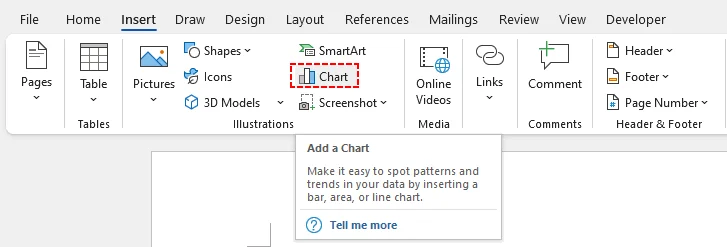
- Navigate to the Insert tab in the top ribbon.
- Click on the Chart icon located within the "Illustrations" group.
-
A pop‑up “Insert Chart” dialog box will open. Select Pie from the list on the left panel. Word provides multiple pie‑chart variants for different use cases:
- Pie: The standard 2D version.
- 3D Pie: Adds depth for a modern look.
- Doughnut: A pie chart with a hole in the middle (great for a "hollow" aesthetic).
- Bar of Pie: Combines a pie chart with a bar graph for complex data.
-
Double-click your preferred pie chart style or select it and click OK. A sample default pie chart will be embedded into your document.
-
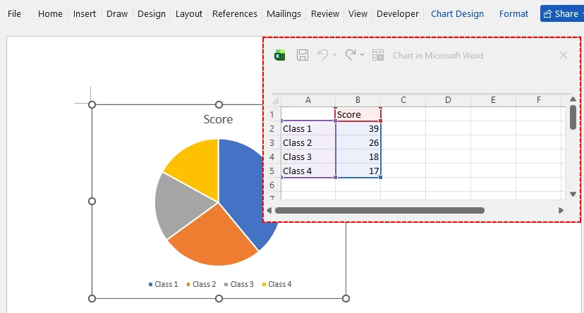
A mini Excel spreadsheet will open. Replace the placeholder category names and numerical values with your own dataset. The chart updates in real-time.
Pro Tip for MS Word
Use the Chart Design tab that appears after clicking the chart. Here, you can:
- Change Colors to match your brand or report theme.
- Add Data Labels to show percentages or values directly on the slices.
- Switch Chart Type to a "Pie of Pie" chart for better readability of small slices.
After finalizing your visuals and report content, you can add an extra layer of protection by setting your Word document to read‑only before sharing it with others.
How to Insert a Pie Chart in Word Using C# Code
For software developers automating document generation, manually creating a pie graph in Word is impractical for batch workflows. You can use the Free Spire.Doc for .NET library to dynamically build Word documents with pie charts.
This method is perfect for automated monthly reports, bulk document generation, or integrating document output into web and desktop applications.
Prerequisites
First, install the Free Spire.Doc library via NuGet Package Manager:
Install-Package FreeSpire.Doc
The Complete C# Code Example
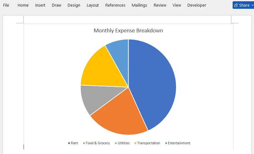
The sample below creates a Word document containing a pie chart showing monthly household expense breakdowns.
using Spire.Doc;
using Spire.Doc.Documents;
using Spire.Doc.Fields.Shapes.Charts;
using Spire.Doc.Fields;

namespace CreatePieChart
{
    class Program
    {
        static void Main(string[] args)
        {
            // Create a new Word document
            Document document = new Document();

            // Add a section
            Section section = document.AddSection();

            // Add a paragraph to hold the chart
            Paragraph paragraph = section.AddParagraph();

            // Append a pie chart (single series)
            ShapeObject shape = paragraph.AppendChart(ChartType.Pie, 500, 300);

            // Get the chart object
            Chart chart = shape.Chart;

            // Clear any default sample data
            chart.Series.Clear();

            // Add the expense data as one series
            // Categories: Rent, Food & Grocery, Utilities, Transportation, Entertainment
            // Values: 1200, 600, 300, 450, 225
            chart.Series.Add("Monthly Expenses",
                new[] { "Rent", "Food & Grocery", "Utilities", "Transportation", "Entertainment" },
                new double[] { 1200, 600, 300, 450, 225 });

            // Set the chart title
            chart.Title.Text = "Monthly Expense Breakdown";

            // Place the legend at the bottom
            chart.Legend.Position = LegendPosition.Bottom;

            // Save the document
            document.SaveToFile("PieChart.docx", FileFormat.Docx2019);
        }
    }
}
How This Code Works:
- Initialization: It creates a blank Word document and adds a new section/paragraph to host the visual element.
- Chart Creation: AppendChart() generates a pie chart with defined dimensions.
- Data Binding: The Series.Add method takes three parameters—the series display name, category label array, and numeric value array.
- Formatting: Sets the chart title and moves the legend to the bottom to maximize usable chart space.
- Export: Saves output as a modern .docx file.
Result preview:
Pro Tip for Developers
You can easily modify the arrays to pull data from a database or an external CSV file. Free Spire.Doc also supports other chart types (like column charts) by changing the ChartType parameter and providing the appropriate data series.
How to Copy an Existing Pie Chart from Excel to Word
If you have already built and formatted a pie chart within Excel, there is no need to recreate it from scratch in Word. Copy‑and‑paste preserves your existing work.
- Open your Excel file and locate the pie chart.
- Click on the pie chart to select it.
- Press Ctrl+C (or right-click and select Copy).
- Go to your Word document and place your cursor where you want the chart.
- Press Ctrl+V (or right-click and select Paste).
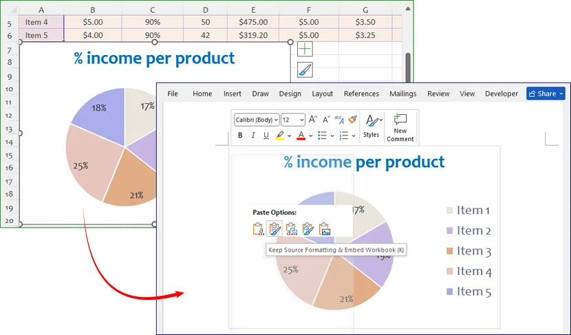
A small clipboard icon will appear at the bottom corner of the chart. You can choose to paste it as:
- Destination Theme: The chart matches your Word theme.
- Keep Source Formatting: The chart retains its Excel look.
- Picture: The chart becomes a static image (great for ensuring it doesn't change by accident).
How to Edit & Update Pie Chart Data Later
One of the best features of Word's pie charts is that the data remains editable. You do not need to rebuild your chart from scratch when source numbers change. Follow these steps to refresh your chart:
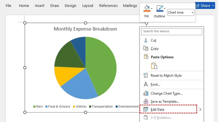
- Right-click anywhere on your existing pie chart.
- Select Edit Data from the drop-down menu.
- The embedded mini‑Excel spreadsheet will reopen. You can edit existing labels and values, or add brand‑new categories.
- Close the spreadsheet window. Your pie chart will automatically recalculate and refresh.
All custom formatting (colors, labels, layout settings) will remain unchanged during data updates.
Note: For charts generated via the Free Spire.Doc for .NET library, modify your source data arrays and re‑run your code to produce an updated Word output file.
Pie Chart Best Practices for Word Documents
To ensure your pie chart is clear, accurate, and professional, follow these expert tips:
- Stick to proportional data only: Pie charts only work for parts of a whole. Avoid using them for comparing independent data sets (use bar charts instead).
- Avoid too many categories: More than 7 slices create tiny, unreadable segments. Group small values into an “Other” category.
- Use percentage labels: Always label slices with percentages or values to eliminate guesswork for readers.
- Skip overly complex 3D styles: 3D effects can distort visual proportions. Use 2D pie charts for formal reports and official documents.
Conclusion
Adding a pie chart to a Word document can significantly enhance the impact of your data. Whether you prefer the manual, interactive approach of Microsoft Word's built-in tools, the power of copy-pasting from Excel, or the automation capabilities of programming libraries like Free Spire.Doc, you now have a complete toolkit at your disposal.
The best choice depends on your goals: interactivity, reuse, or automation. Whichever path you take, the result is the same—a polished pie chart that makes your data easier to understand and your document more persuasive.
Frequently Asked Questions (FAQs)
Q: How do I save a Word pie chart as an image?
Right-click your pie chart and select Save as Picture. You can save it as a PNG, JPG, or SVG file for use in presentations, social media, or other documents.
Q: Can I import Excel data into a Word pie chart?
Yes! When editing chart data, copy your pre-made Excel data and paste it directly into the Word embedded spreadsheet. The chart will update instantly with your imported data.
Q: My pie chart will not update after I change numbers. What is wrong?
First, confirm you are editing the live embedded dataset via Edit Data, not just text boxes overlaid on top of the chart. If you pasted it as a static picture, no updates will occur. For embedded charts, close and reopen the edit‑data window, or restart Word to resolve rare refresh glitches.
Q: Can Free Spire.Doc for .NET generate Pie of Pie and 3D Pie charts programmatically?
Yes. Free Spire.Doc for .NET supports both Pie of Pie and 3D Pie charts through the ChartType enumeration. You can generate them programmatically by passing the appropriate enum value to the AppendChart method:
// Pie of Pie chart
ShapeObject shape = paragraph.AppendChart(ChartType.PieOfPie, 500, 300);

// 3D Pie chart
ShapeObject shape = paragraph.AppendChart(ChartType.Pie3D, 500, 300);